
Unless he’s visiting the farm himself, the average American has no idea what GMOs, or genetically modified organisms are in his dinner.
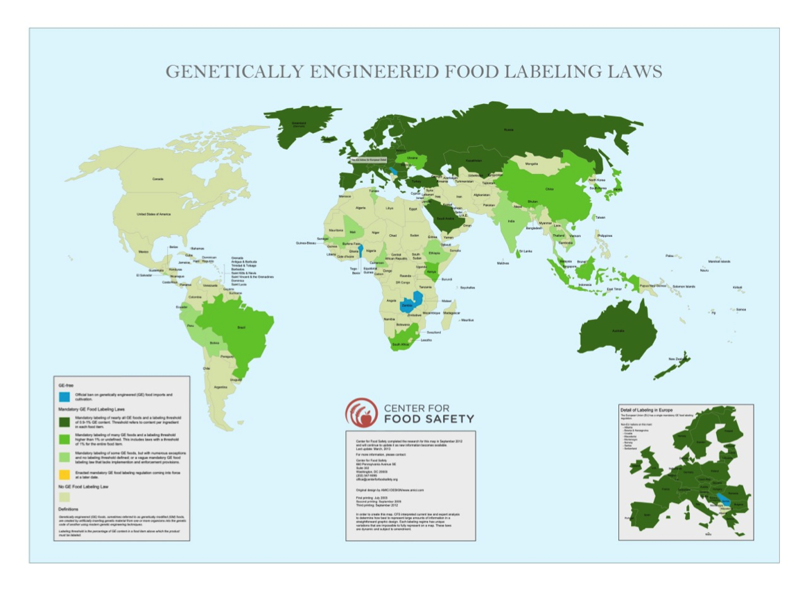
However that’s not for lack of us condemning the practice. According to a 2013 New York Times poll, 93% of Americans want genetically engineered foods to be labeled, with about three-quarters concerned that GMOs could carry negative health side effects. Many feel it’s time for the United States to catch up with the sixty-plus other nations that have mandatory labeling on nearly all GE (genetically engineered) foods. The issue concerning GE food is transcribed in this map entitled “Genetically Engineered Food Labeling Laws.”
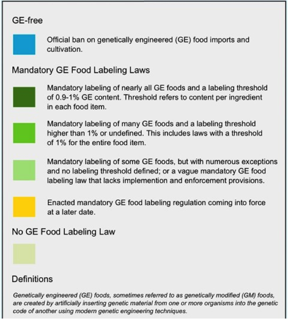
This world map, drawn simply with only the individual countries’ outline and title, is overwhelmingly political. It measures the strictness of GE food labeling regulations in shades of blue and green and represents the most stringent laws with a dark, forest green. The presence of green, traditionally a color of healing, gives the illusion that the dense, dark European epicenter is safest, most advanced. In contrast, the vast majority of North America isn’t highlighted at all, indicating the absence of government-enforced laws regarding food labeling. To further emphasize this point, the map includes a small pop-out – a close up of Europe – that brings to light which nations regulate and how very few do not. The mapmakers point out facts that would perhaps shock the US public to learn; even stereotypically disadvantaged, impoverished nations have GE food regulation, but we do not? Are big businesses and the government deliberately deceiving Americans by letting the food we eat go uninspected? The mapmakers here allude to the outdated system of First World vs. Third World. In the decades following the Second World War, countries included in NATO were classified as “First World,” those in the Communist Bloc were “Second World,” and all remaining unaffiliated nations were termed “Third World.” Much of the Global South, including Africa, was cataloged “Third World,” and the term consequently became synonymous with poverty, sickness, and civil unrest. As the majority of Africa and North America are uncolored in this map, it draws a connection between the former First and Third World countries. Given that these phrases have since been replaced in the post-Cold War era by the terms developed and developing, the mapmaker’s claim is deemphasized by using this obsolete method of comparison.
It’s also relevant to note that this map is produced by the Center for Food Safety, a national non-profit advocacy organization which asserts its mission as “working to protect human health and the environment by curbing the use of harmful food production technologies.” As a nongovernmental organization raising awareness on behalf of its personal goal, the Center for Food Safety uses the “neutrality” of the map to make a visual argument. The organization name draws the eye; it’s large and easy to read, with “FOOD SAFETY” bolded. The logo beside it is red, the only bright non-green, blue, or yellow color to appear on the map, a decision that argues its importance aesthetically. Both sit right in the center, between the legend and a close up of Europe. This institution is sending an obvious message out through this map: the labeling of GE foods should be government mandated and the US, as a developed nation, is behind in this regulatory business on the world scale. The cartographers are endorsing the belief, whether it is true or not, that public health is dependent on how sensitive we are of what we eat, and Americans are not at all attentive. As opposed to reading prose, where an author is clearly present, people often take maps as unrefuted fact since virtually only cartographers deal directly in their creation. Using a map as a public service announcement is in fact a mainly political tactic. Cartography as a medium of communication is extremely useful in creating the impression of total objectivity.
When discussing food production and distribution, it seems important to discuss the underlying origin of the issue as well. Who is growing this allegedly unsafe food? Who is buying it? How prominent are GMO seeds on a national scale as compared to non-GMO and heirloom varieties? Closely attached to the issue of consuming a product is the question of its origin, or, in the case of endangered public health, any harmful side effects. If this cartographer’s intention is to truly further our understanding of how health is affected by GMOs, the map could also list rates of sickness, perhaps, attributed to consumers ingesting them. Relatedly, such a minimalistic, broad map does little to highlight the economic situations of specific communities, or even general regions. The availability of non-GE foods can vary widely from place to place; high-priced non-GMOs could be unattainable to low-income citizens, which introduces a new disparity to the GMO vs. non-GMO food argument. This map does not illustrate any other related centent, leaving the viewer with partial, debatably unfounded information connecting public health and GE food. The map is arguably anti-genetic engineering propaganda, subconsciously connecting the idea of endangered wellbeing with harmless GMOs. The cartographers contend that we are blinded by our limited knowledge of GE food, and their map only confirms our blindness.
This map is a fairly recent publication, only published in 2013, and deals with a very current issue. Despite overwhelming evidence of Americans in favor of labeling laws, we have yet to embrace the system. Petitions and protests against GMOs is an ongoing battle between human health advocacy organizations and corporations claiming to help ease farmers’ woes concerning low harvests and supermarket price hikes. The pros and cons of using (and accordingly, overusing) GMOs are relatively unknown. Any long term studies observing the proliferation of negative side effects are only in their infancy. Hence, we can predict that national and international regulations will be fluctuating constantly in future years to reflect new findings and perfect laws meant to protect consumers and raise international discourse. The fact that the map was initially published as an interactive map means that it can be updated as time goes on to keep pace with the introduction, adoption, or alteration of new policies around the world. If we continue to add to our knowledge of foreign as well as domestic issues, our understanding of the world develops. Cartography, as demonstrated in this map of genetically engineered food, provides a medium for organizations to share their opinion. This map is, in essence, a timeless scale we use to measure our legislative progressiveness and compare nations of the world in terms of global policy changes.
Link to the interactive map in detail: http://www.centerforfoodsafety.org/ge-map/#
“Center for Food Safety | About Us.” Center for Food Safety. N.p., 2014. Web. 01 Oct. 2014.
“Center for Food Safety | Reports | Genetically Engineered Food Labeling Laws Map.” Center for Food Safety. N.p., 02 Apr. 2013. Web. 01 Oct. 2014
Kopicki, Allison. “Strong Support for Labeling Modified Foods.” The New York Times. The New York Times, 27 July 2013. Web. 01 Oct. 2014.
I thought your response was a very interesting take on this map and I agree that the Center for Food Safety is using this particular map as a piece of strong rhetoric in favor of establishing GE food labeling laws. I really liked how you interpreted the dark green to mean safety and advancement. Now that I think about it, the density of color over in Europe and Asia really emphasizes how pale, sickly, and alone the U.S. looks. Something that caught my eye was the abundance of water in this map. It almost seems like too much water, with the continents just floating around haphazardly. This might inspire more feelings of isolation in Americans, pushing them to implement more GE labeling laws to become a part of the rest of the advanced world.