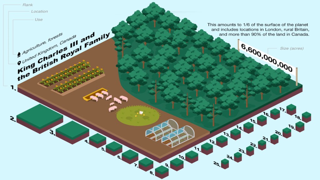
When asking the question “What percentage of dry land does the largest private landholder in the world own” you might think some megacorporation owns maybe 1% or even less. It raises the question, how much land could one human even own? With 8 billion people and only 36 billion acres there would be four and a half acres per person, if distributed equally. However, in life very few things are given equally, and in this case one person owns 17% of the world’s dry surface. That is over 6.6 billion acres of land, or 3 times the size of Brazil. This is more than 37 times larger than the second-place holder, the Catholic Church. The Catholic Church owns the majority of its land from religious buildings such as churches and abbeys. Before revealing who holds the title of first place, let’s look at some of the other top spots. The majority of the major land owners are ranchers and farmers. In these occupations it is not uncommon to have agricultural operations that are the size of entire nations. For example, the largest agricultural operation in the world, run by Gina Rinehart, is 24 million acres which is the same size as Portugal.
Now the moment you all have been waiting for, the largest private land owner on earth is…King Charles III. This might be shocking to hear for many because the 21st isn’t the era of kings and queens, and the British Monarchy holds no real power. But, thanks to some special caveats the British Crown can technically claim to be the world’s largest private land owners. The British Monarchy acts as a symbolic sovereign head of state for the United Kingdom and several other countries that are part of the British Commonwealth. The largest of these countries in Canada, the second largest nation on earth. Canada is made up of 89% crown land which is technically owned by the Crown, but acts as public land and is purely symbolic. The British Crown does still own a large portfolio of real estate called Crown Estate. This portfolio includes 55% of beaches in the United Kingdom, all of the territorial seabeds in the United Kingdom, 241 properties in central London(including an Apple store), vast real estate holdings(most famous of which is Buckingham Palace), and dozens of retail and shopping venues. All of these properties are estimated to have a yearly revenue of $12 billion.
The reason I picked this map was because of its very fun iconography on a topic that could have been very bland. When looking up largest land owners it would be easy to find a list with large number that lack any true sense of scale. But, in this map we can clearly see the true difference in scale between the largest and 25th largest private land owners. Number 25 (which is almost 5 million acres of land) pales in comparison to the enormous landmass in 1st place. The cute cartoonish style of the map also makes it clear at a glance what the lands are being used for. It also helps add to the very digestible nature of the map. This is because the map combines both cartographic elements and infographic elements. This allows the author to cram what would be several pages of a typed out explanation into a single image. For me this shows one of the powerful abilities that maps posses-being able to turn complex topics into a more digestible and approachable form. However, this also shows the dangers of maps and their ability to be taken out of context. On one hand, this map could be used to reinforce the idea of private property and ownership, especially in the case of the British Crown. This is not an uncommon theme when it comes to maps, for most of their history they have been used to consolidate and reinforce land ownership. On the other hand, it could be seen as a protest to the gross inequality present in our modern world. That is part of the beauty of this map. If taking the map at absolute face value, as we often do, a viewer would be reasonable to assume that the British Monarchy holds more power on Earth than even the Catholic Church. However upon closer examination and realizing the caveats of this map you would realize that isn’t true. Does this mean that the map is incorrect? No. A map has to balance a multitude of factors and cannot execute them perfectly. Thats why maps are as much an art form as they are a science.

I like how you began by stating the fact that one person owns 17 percent of the world’s dry land before revealing who this landowner is, and giving context that this is three times the size of Brazil. It is fascinating that one person owns about 6.6 billion acres, while the largest agricultural operation in the world is 24 million acres. I was surprised to read that the largest owner of private land on earth is King Charles II and the British Crown. I agree with your argument that this map gives a sense of scale to land owned by people and organizations throughout the world. The cartoon and infographic elements certainly turn what could be pages of information into pictures that make the map easier to comprehend. I enjoyed your final analysis that this map could be taken out of context and used for one of two purposes, to reinforce the power of the British crown or as a protest map to claim that one entity should not own this much land.