
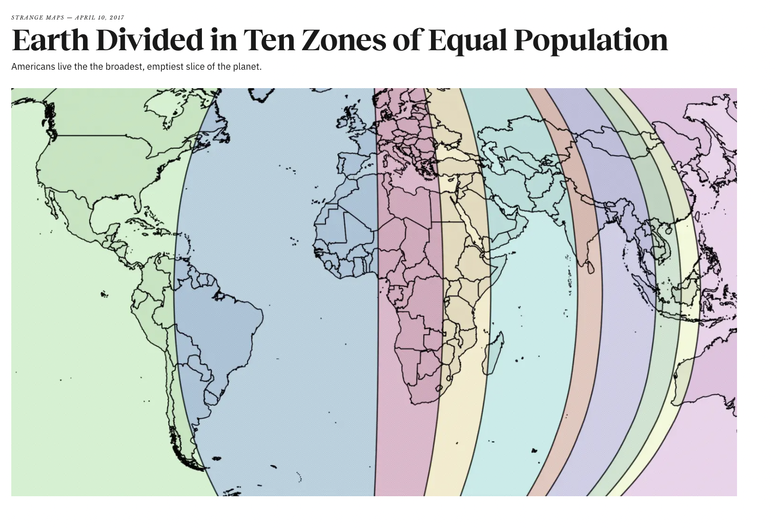
Have you ever considered how the 7.8 billion people or rather the (7.5 billion when this map was created in 2017) are dispersed throughout the world? This map called “The Earth Divided In 10 Zones of Equal Population” does just that; it visually divides the world into 10 parts each with 10% of the world’s population, displaying the variation in population density. The subtitle “Americans live in the broadest, emptiest slice of the planet” is a comical, yet accurate, interpretation. The green slice–that contains the United States–seemingly depicts an overall more dispersed population as it is a comparatively large section.
This taps into the Americentrism present–the idea that the United States is superior. Even though the large slice indicates less people, in a way this highlights the American centered view; the slice with the United States takes up a lot of physical space on the map. There are thoughts that it is the best nation, but as the nation is wasting land. As indicated by the subtitle, a lot of land is owned, but not being used. While this may be beneficial for the environment, areas of the country are still extremely polluted. Also, there are developing nations that do not have enough land for all the people, but the United States has many rural areas. These countering ratios of people to land really highlight the differences in power politically and economically. The ability to waste land indicates power.
Furthermore, cities such as Boston have a much higher population than rural areas in the south. Therefore, in some ways the subtitle is accurate, but it also is an exaggeration highlighting the downfalls of the map itself. It displays a misconception. The possible misinterpretation that the 10% of the population is equally distributed throughout the slice.
The map relies on viewers’ prior knowledge to understand that within there is population density variability. For example, the narrow reddish-orange and yellow zones get the majority of the population from a singular highly dense area. In the red zone the majority of the population comes from “the most densely settled parts of India, at 1.3 billion the world’s second-most populated country” similarly in the yellow zone it passes through “empty Siberia to empty Western Australia but passes through the most densely populated slice of China” accounting for the very thin slices (bigthink.com).
The map’s division across east to west is interesting because it is not based on any of the man-made borders of countries, states, etc. It also does not rely on the idea of the number of humans per continent (which is a more natural description of dividing up the world than the former two as it is based upon landmasses). It differs from typical population rendering (a population cartogram) that interprets population density by manipulating the physical space the countries take up based on their percentage of habitants.The slices are man-made, provoking the viewer to question our preconceived notions surrounding land square distance and actual space used by the human population. Furthermore, this map incorporates oceans into the slices. There are small islands that have some human population count, but overall most of this physical space or distance is empty. It portrays a false sense of emptiness due to the ocean to land ratio in each slice. This in turn exaggerates the density differences across. The water is distorting the map.
As indicated, in some places such as highly populated cities or even countries people are residing everywhere whereas there are other places (that take up the same physical space in the world) that have much less human significance. This has particular importance when compared to development. Comparing overall trends shows that a higher Human Development Index (HDI) is typically proportional to a lower population density. For example, according to worldpopulationreview.com in 2021 Norway has an HDI of 0.957 and a population of 5,465,630–this can be compared to Nigeria’s 0.539 HDI and 211,400,708 population.
This suggests that prosperous nations have fewer people–it displays that governments managing fewer citizens can achieve more. Further, the nations with fewer people and higher HDI are typically democracies and similar government systems that give citizens more rights. This relates to the idea of developing vs first world countries. Developing nations are those with too many individuals and not enough resources or the government is not adequately distributing the resources to aid all. The map visually indicates our bais surrounding third world countries as the thinner slices–indicating more people–are the ones considered developing. Similarly, the wealthier nations are in larger slices suggesting less people.
It is important to consider the current global population increase of 1.05% per year–will this rapidity cause a downfall of the prospering nations? It is also interesting to consider that while the population is growing immensely–faster than some nations can handle–there still is space. As explained above with the yellow slice for example there is a very densely overpopulated China, but empty surrounding countries. China’s population is on the decline due to government initiatives but is still very crowded. This raises questions that even as the population is increasing it continues to grow in overcrowded cities. There is immense empty land that is not as viable for many due to the distance from jobs and the economy.
Although, as Earth’s human population continues to grow we have ventured into using more of the empty land. This also has negative effects. The growing population is destroying the planet through climate change. This map disregards–or rather does not incorporate–the empty land.When considering the negative impacts of overpopulation on HDI it seems reasonable to consider spreading development into the untouched land. This, however, will continue to impact global warming and other natural processes corrupted due to humans’ footprint. I do not have a solution for what to do about overpopulation or global warming, but it is important to think about the intersection between these complex issues.
Works Cited
“World Population Review.” Developed Countries List, https://worldpopulationreview.com/country-rankings/developed-countries.
Roser, Max, et al. “World Population Growth.” Our World in Data, 9 May 2013, https://ourworldindata.org/world-population-growth.
Jacobs, Frank. “Earth Divided in Ten Zones of Equal Population.” Big Think, 30 Sept. 2021, https://bigthink.com/strange-maps/earth-divided-in-ten-zones-of-equal-population/.
This map is a really great interesting choice, it was really neat to see how the population density is divided amongst the world. I also enjoyed reading your analysis of the map as you brought up some really interesting points. To your point about having to know prior knowledge to understand that there is variability in the population density, the purple section with Europe and Africa particularly intrigues me. From my past knowledge I would’ve guessed that this would be a more dense section of the world compared to others, given the population densities in many of the African countries, along with the given European countries such as Germany, Italy, and Poland. I also think something that is worth being noted at the end when you talk about population growth and climate change, should be the population growth and effects on pandemics and other viruses spawning. As the population continues to grow so will the frequency of pandemics and new viruses spawning, as in the more dense areas we’re encroaching on animals habitats and causing some to go extinct all of these are direct contributors to new viruses. So it’ll be interesting to see in 15-20 years time a new version of this map and relate it to current health risks at the time.
I was actually deciding between this map and the map that I ended up choosing for the Mappenstance Blog Post. I think “The Earth Divided In 10 Zones of Equal Population” is really cool to look at, and it’s really surprising too. I was surprised that the orangeish-yellow and turquoise-blue sections have 1/10th of the human population. There aren’t countries in those zones that I immediately think of that have huge populations. It would be really interesting to see what this map looked like 20 years ago, or 50, or 100, or even 500, as they all would have looked drastically different from each other. The darker orange, darker green, and yellow are SO thin! I assume they are so thin mainly from India and China, but I wonder if some of the other countries they encapsulate are dense as well.