
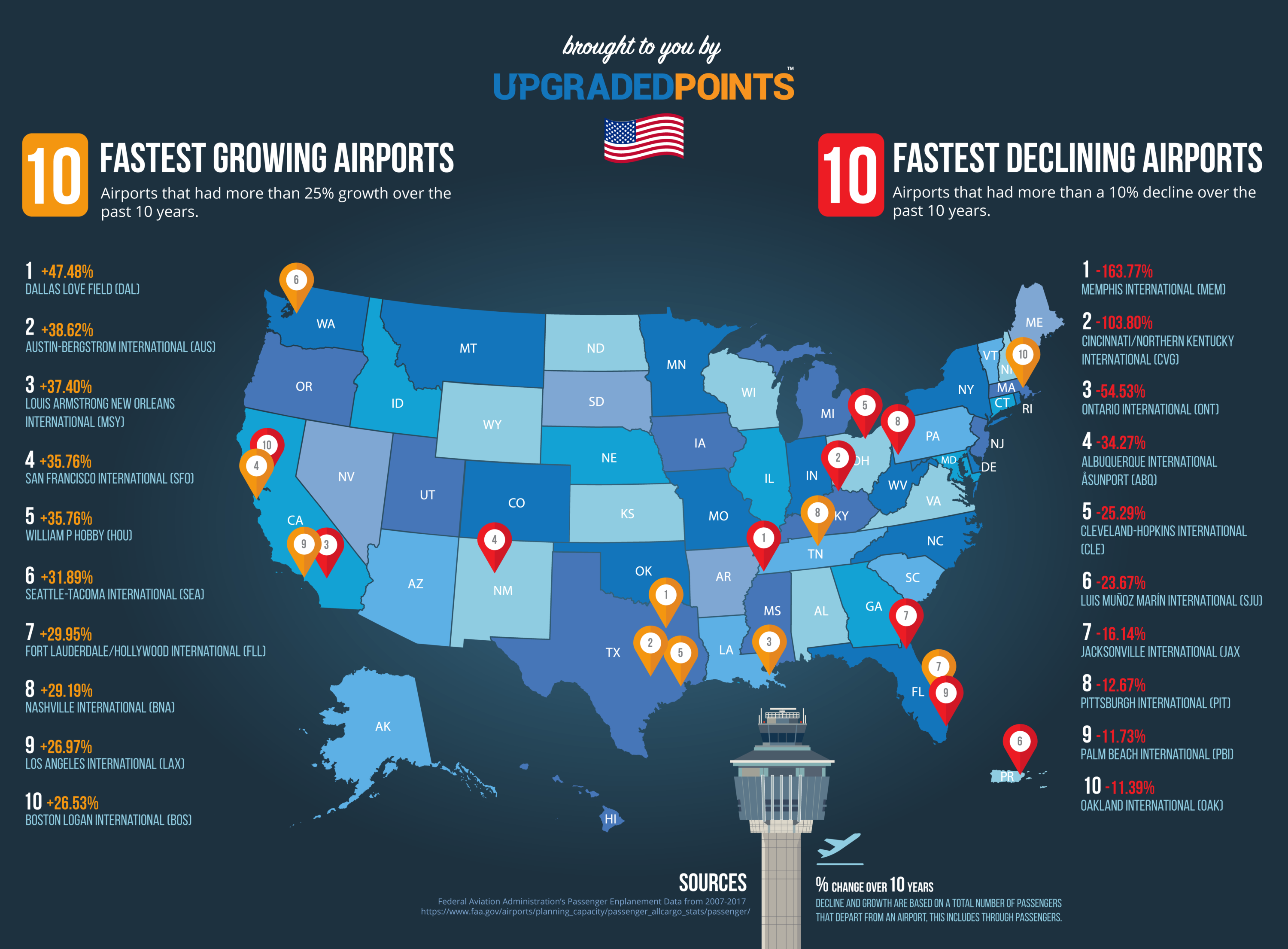
If you have ever been anywhere in the United States then chances are that you’ve been to one of these airports marked on the map above. With over 3.7 million square miles of sights and sounds to see, the United States and its 50 states to visit have become quite an attractive tourist destination. The airline industry marks the most popular means of long-distance travel in the United States, as traveling by car is often an arduous task, and the United States has failed to advance high-speed trains as a viable option.This map from Upgradedpoints.com depicts the top 10 fastest growing airports in the United States, along with the top 10 fastest declining airports in the United States. The map is based on data collected from the Federal Aviation Administration(FAA), from the years 2007-2017. The criteria to be counted for the study is that the airport must exhibit over 3 million passengers in foot traffic a year, which categorizes it as a midsize airport in the United States.
The map representing the top 10 fastest growing airports, and the top 10 fastest declining airports in the United States, is a fairly basic map. It is easy for the average viewer to interpret the map and recite the main points of it, as on either side of the map there is a bulleted list either representing the category growing or declining. These lists are clearly labeled 1-10 and give the name of the airport and its location with either the percentage the airport has grown in passenger traffic or the percentage it has decreased in passenger traffic. For example, Dallas Love Field airport in Dallas, Texas is number one on the fastest-growing list, and it has grown 90.39% over the 10 years. The information from the lists is then taken and pinpointed on the map of the United States for where that airport is located. The map makes it clear that airports that grew are represented by an orange pin on the map, whereas airports that decreased are represented by a red pin.
While looking at the map, something I found to be interesting has to deal with the location of the airports. The majority of the locations of the airports that are decreasing are further away from the coast and more inland in the United States. This is compared to the growing airports which are mainly cities in states that aren’t deadlocked. Based on this observation and further observing the map one could infer where trends of Americans are traveling and which cities are most popular. Destinations such as Austin, Texas, and Nashville, Tennessee are perfect examples of popular destinations that are on the growth list. These cities have gained large popularity for people to move to and visit. As effective as the map is in telling the story of US airports, a critique that I have, which is a major silence of the map, is that the map offers no explanation as to why the specific airports made their respective categories, and leave the viewer to infer on their own. I believe that the map can include a brief sentence or two below each airport to explain,which will strengthen the overall map. These sentences may include reasonings such as an airline hub was relocated here or moved from here showing its increase or decrease. In addition, another possible reason could be that the airport is either newly renovated or needs major renovations causing it to decline.
In 1978 President Jimmy Carter introduced the airline deregulation act which offers an explanation to the major silence of this map. Before this act, the airline industry was heavily regulated by the Civil Aeronautics Board(CAB). The CAB controlled where flights can fly to and from for each airport, along with what the price was for the ticket is allowed to be, and much more. In addition, before 1978 the airline industry was monopolized by a few players, but the new law promoted more startup airlines into the business.This gave way to new players in the market who operated out of new hubs. Airline hubs also mark a major player in the increase and decrease of airports as before 1978 hubs didn’t exist. For example American airlines up until 1978 operated flights to 36 destinations, after 1978 it created a large hub at the Dallas airport in which it operates flights to over 100 different destinations from Dallas. With the deregulation of the airline industry, we’ve also seen more competition between the airlines which has a direct impact on the map. Airlines want to move their hubs to the hottest markets and even the markets of their opponents to try and steer profits away from opponents. (Singh)
Provided the proper background information to the map, along with a brief explanation included on the map, the map will be stronger than it already is. Though the average viewer can already infer the main points of the map, there is still a whole story to be told of this fascinating industry that the map silences. The airline industry will indeed continue to be the most popular method of long-distance travel in the United States for years to come. It’ll be intriguing to see the differences on the map during the next 10 years, as this industry is always evolving for the better.
Works cited:
Rodriguez, C. (2021, April 26). The 10 fastest growing & Declining airports in the U.s. [data-driven study]. UpgradedPoints.com. Retrieved September 17, 2021, from https://upgradedpoints.com/travel/airports/fastest-growing-and-declining-us-airports-in-the-us/.
Singh, S. (2020, July 31). How the airline Deregulation Act shook up US AVIATION. SimpleFlying. Retrieved September 17, 2021, from https://simpleflying.com/airline-deregulation-united-states/.
I found this map really interesting as, like you have mentioned, air travel is a major component of American life and will likely be as relevant––if not more so––in the upcoming years. Your analysis has been very insightful since the pattern of where an airport is located and whether it is declining or growing appears somewhat random at first glance, with some orange and red pin almost overlapping. Something that I think could be really interesting is to compare this map with a new one made inclusive of post-covid lockdown data. Since the pandemic has affected air travel greatly, it’s very possible that a lot of these trends would be widely different with that influence.
The role the aviation industry plays in the global community, and more specifically in the U.S., is undeniable. This map does a sufficient job at covering such an important aspect of our nation’s travel industry in a simple and easy-to-understand nature. However, like you mentioned, this clarity comes at a cost. One major issue that I found when looking at this map is the lack of a definitive title. Because there is no outright statement as to what this map is depicting, I was not able to immediately understand what I was looking at. By simply saying “declining” and “growing”, viewers are left wondering how exactly these trends are measured and in regards to what factors. It is only because of the fine print in the bottom right hand corner that viewers are able to understand the contexts of this information. As you had written, I think more background information as to why these pattern are emerging would really enhance the map overall. One particular trend I am interested in is the three pairs of increasing and decreasing airports that appear in California and Florida. Further elaboration could help to explain why two airports so close in proximity are experiencing such different success levels.
Brenden, I loved this map because I know many of us can relate to the dreaded-long waits at airports and going through security checks. Not to mention the fact that we are beginning to head home for the holidays and well flying, for most of us, is the quickest way to make it home to our loved ones. I really enjoyed your analyzation of the location of the airports and how airports that are further inland are trending at a decline. Based on my little knowledge of passenger aviation, I assume this is also because of the amount of business travel that occurs domestically. Therefore, it seems that these major metropolitan areas are getting a boost in growth, since these are typical destinations for those who travel for business purposes. Furthermore, I like the fact that you included relevant historical context regarding aviation in the United States, it really helps set the perspective for the map and allowed me to fully grasp the trends that are displayed. Additionally, it would great to see the connection between America’s fastest growing airports and America’s fastest growing cities and see if there are somehow correlated. Finally, my eyes were pulled to the Midwest region due to the three airports in the region that are at a decline in growth. To me, this was quite a surprise, seen as this region of the United States used to be an economic center of manufacturing for many years. Overall, I really enjoyed the selection and your in-depth analysis of the map, I really appreciate you for sharing this with us, Brenden.