
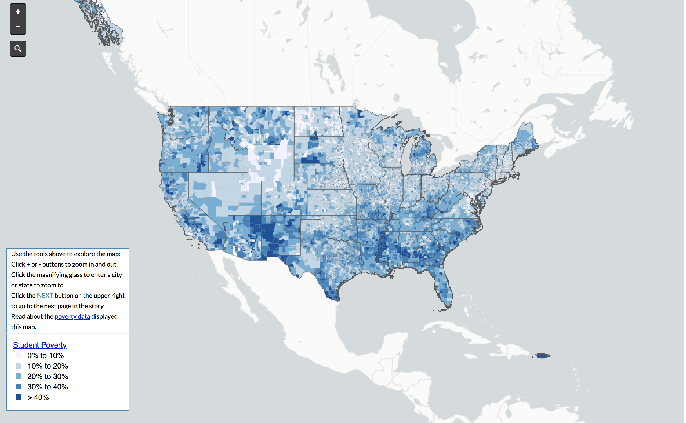
America is known as the land of opportunity, and to an extent this holds true. While it is a country of great education and many chances, there are some parts of the U.S. that are poverty stricken. Through varying shades of blue and distinctive shapes, this map reveals student poverty within the 13,000 plus school districts in the year of 2013. This simple and easy to understand map was created by the organization EdBuild. The map’s focus, only on U.S. school districts, provides us with a narrow view of American education. It is helpful in providing information such as how education funding is being allocated in America as well as displaying American values on the educational system. However, the map can be problematic because it does not reveal the causes of this inequality and poverty which is essential to understand the entire issue. The purpose of EdBuild’s map is to highlight the division within the counties educational system and to spark activism to combat this issue within the nation.
Off the bat, it is clear that the southern half of the United States is much more poverty stricken than the north when it comes to students’ education. The increased poverty levels are most likely due to the fact that a lot of public-school districts receive funding through local property taxes. This creates an unequal between property values of rich and poor districts. It causes the wealthier school districts to obtain better resources and opportunities, while the poorer districts remain inadequate or not up to par. One of the reasons student poverty is more prominent in the south may be due to a lot of the property up north being worth more money. An influential factor that explains why the south is so “poor” can date all the way back to the Civil War. The south was so set on investing in slaves while the north invested in machinery and technological advances. So, post-Civil War the south had cities in ruins, lost a majority, if not all of their slaves, leading to a depleted economy (Zandt). Fast forward to more recent years, the south continued to lag behind the north in regard to economy, explaining why there are more impoverished areas within the south.
The author chooses to use a map because maps offer a ton of information that other tools, such as a graph, could not. Maps can provide statistics and clear-cut visuals that make it easier to take in information. For example, it would be complicated to graph the percentage of school poverty in every school district, but a map can show all of this through different elements such as icons, colors, legends, etc. This specific map provides us with informational visuals of school districts within America. This is possible because the author has the power to decide what to include and what not to include on the map. The author was able to distinctly separate each school district within every state while giving us a close approximation of the percentages of poverty within each district. This puts the focus on America and is helpful in understanding school poverty. Going back to the author’s power to pick and choose what to put, the author of this map made sure it was very zoomed in on American education only. It remains silent on global education even though that is also a big issue. Schools in poverty in America do not compare to those in different countries.
While being very informative, maps can also be very influential. This map is a prime example. The creators of this map not only want to highlight inequalities within the educational system but want to spark a sense of activism within the viewers. They want people to push for equality or do what they can to help. According to the legend on the map, there are many areas where school districts have greater than 40% of student poverty that is right next to a school district with 0% to 10% of student poverty. To put things into perspective, a student who goes to school in a district with greater than 40% of student poverty will receive an inadequate education with very limited resources. On the other hand, a student who goes to school in a district with 0% to 10% of student poverty will receive a much better education and will be provided with much more resources, such as laptops, iPads, better teachers, more food options, etc. The authors of this map want people to push for reformation of the educational system and for the government to dedicate more money so that schools across the country will be equal. Less student poverty means more opportunities in the future and better education for children.
As someone who has experienced both ends of the spectrum in American education, I can attest that there are definitely inequalities in rich and poor areas. Also, I can say that if my family kept me in the poorer schools, I probably would not have gotten into college. This map is also a couple of years old, so I think that if a map of the same information were taken today it would be much different. Considering that our current Secretary of Education, Betsy DeVos, is trying to cut down Education Department funding (Johnson), there may be more school districts that will have a darker shade of blue. While there are many different ideas and underlying messages that can be pulled from this map, one thing is for certain, this map is pushing for action to be taken in order to fix our educational system and make it more equal no matter if students are poor or rich.
Works Cited
Alyson Zandt. “What Went Wrong with the South?” Facing South, 9 June 2016, www.facingsouth.org/2015/11/what-went-wrong-with-the-south.html
Johnson, Stephenie, et al. “Trump and DeVos Continue to Undermine Public Education with Their Proposed Fiscal Year 2019 Budget.” Center for American Progress, 12 Feb. 2018, www.americanprogress.org/issues/education-k-12/news/2018/02/12/446423/trump-devos-continue-undermine-public-education-proposed-fiscal-year-2019-budget/.
Clark, what a great map to analyze! It’s so important to mention the fact that the underlying causes that create the impoverished setting are not alluded to in the creation of this map. However, the fact that this map encourages the audience to look deeper into those issues, is heartening. I, too, have experienced the stark contrast of a privileged school and a far less privileged school. Education is often trivialized and overlooked by the government (especially in present times), however, the education of young people determines the future of the country and the world. Great map selection!
-AG
This map is great because we see a big problem directly effecting people our age in our country. Its amazing how big the difference is between the north and the south, which goes to show how important location is for education. I have not had the same experiences as you have had but realize that the resources given to poor areas is not sufficient which in the end negatively affects innocent kids. Education is often overlooked by government because those of voting age are usually past that point, so hopefully maps like this get more coverage because it is a clear problem that needs a solution.