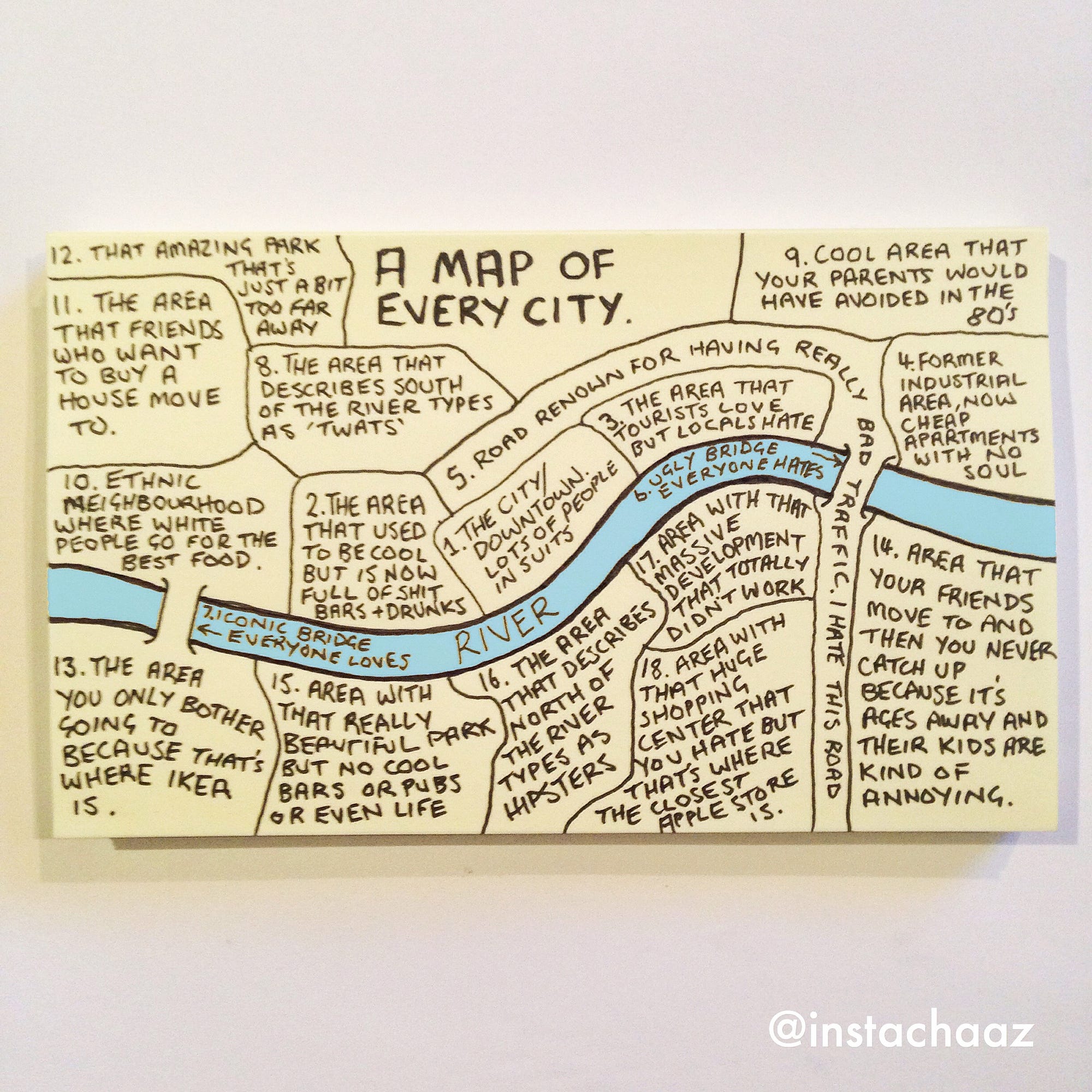
Growing up in a rural area, at the base of an extinct volcano, outside Penshurst, Chaz Hutton would be one of the last people to come to mind in being able to create a somewhat accurate interpretation of something so complex, such as a city, more or less on a Post-It Note. Yet, he achieves what most mappers fail to do, which is to connect with the audience on a personal level. Maps denote credibility, intellectual competence, and scholarly ability. When one looks at Hutton, we see his gelled hair, outgrown facial hair, and a crumpled T-shirt. We do not see a cartographer. Like the initial impressions of a person, maps too, fall under the same surface judgment. Hutton’s A Map of Every City is simple, almost child-like, far from any type of cartographic material to praise. After a close reading of the intricate descriptions within, one can immediately appreciate and acknowledge the complexity and social constructs of class and race present, but with every map comes a perspective: a middle-aged white man, profoundly showed through the acknowledging reference to the “ethnic neighborhood” where white people go to for good food. In order to display his interpretation in a non-judgmental and conflicting way, Hutton forgoes labels, intricately selects neutral colors, acknowledges his race’s influence, and uses humor as a unifying tool.
Maps usually include labels, color differentiation, and the ignorance of the influence of certain cultures. Yet, with the inclusion of those characteristics, also creates division. Labels are restrictive. By naming what something is, one is narrowing the spectrum for imagination and foregoing the connective tissue between the mapper and audience. General descriptions gradually and subtly paint a picture of the place by slowly engaging the audience into the atmosphere and scenery. Cartography is not science but art. When we think of art, color is an integral part, because they denote emotion and mood. What makes Hutton’s map so unique and interesting is his choice to use the Post-It note’s default color. Doesn’t that counteract the choice of no labels? No. Cultures have different interpretations of colors, but to put it simply and universally, dark tones are usually tied to negativity, while bright and light to positivity. If Hutton’s purpose was to help connect people, then his choice is valid. By placing color on an area, it is again, narrowing the spectrum for imagination and restricting the area to its color. Blue is an anomaly. Cultures usually have no emotional attachment towards it, making it the perfect color and contrast for the river and the map. His contrasting use of blue is vital towards the “readability” of the map because it provides a point of reference where one can distinguish south and north. The creation of separate labels to different parts of the city catalyzes the notion of sovereignty between the two, invoking certain social stigmas being north to wealth and south to poverty. Yet, the only mention of stark class differentiation based on geographical placement on the entire map is the playful banter between the northern “hipsters” and southern “twats” in areas 8 and 16, creating an almost uniform area layout.
By using colloquialism as a transport for his humorous acceptance in his work, he touches upon the fragile subject of gentrification and the dominating influence of his culture, further expanding his reach and relatability towards the audience, either agreeing or acknowledging his interpretation. Humor, magnified through maps’ and cartography’s general absence of it, creates a pathway where people of different backgrounds can relate to him. In areas 4 and 17, he highlights the pitfalls of gentrification: “Cool Area that Your Parents Would’ve Avoided in the 80’s” and “Area With that Massive Development That Totally Didn’t Work.” Area 2 displays the effects of time, “The Area That Used To Be Cool, But Now Is Full Of Shit Bars + Drunks” Most importantly and as mentioned earlier, is his mention of the “ethnic neighborhood.” By including that area, he is not only including his predominantly white perspective on the city but also allowing for relatability from the minorities. It is not to say that by including this, completely dissolves the social barriers present between, but creates a peephole into the perspective that of Hutton, for isn’t that all an artist can do.
Hutton, his perspective, and his map are different from the norm but isn’t that what mapping and mapmaking are about. Mapping, specifically, should change with time. It should progress with the technology and historical context around, so to say that Hutton is not of worthy cartographic ability, is to go against the very characteristics that serve as the foundation. By intricately choosing general descriptions over labels, uniformity over differentiation in colors, and humor, he achieves what most cartographers fail to do, which is to connect and unify people of different race and class.
