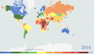
The Failed States Index Map is a collection of maps produced annually since 2005 by Fund for Peace, an independent nonprofit research organization based in Washington DC. Fund for Peace uses 12 indicators such as security apparatus and state legitimacy to determine the stability of countries, in order to fulfill its goal of preventing violent conflict and promoting sustainable security. The maps are published by Foreign Policy magazine. For our presentation, we compared the 2006 map and the 2016 map, to see the evolution of countries and compare them to others in the region.
Produced in the post-9/11 era, both maps emphasize the growing concern of security and stability. These maps reflect an interconnected world marked by globalization and reiterate how the state of one nation can dramatically affect others.
Consistent with the idea that every map has a purpose no matter how neutral it seems, the Failed States Index Maps use a scientific projection in order to appear credible and legitimate. With Fund for Peace and Foreign Policy magazine being American organizations, the maps perpetuate the idea of US superiority as America is giving itself the authority to define what nations are considered failed. Despite the organization’s use of a standardized system for establishing what makes a failed state, there is always someone deciding what each country gets as a score, further proving that every map has a bias. A significant portion of the class discussion arose from the definition of a ‘failed’ state.
In our presentation, we asked vital questions like “why did the cartographers change the name from failed states to fragile states,” and “how does the definition of country borders affect a state’s status.” In doing this we aimed to progress the idea of perspective, as different nations hold different views on the global politics that influence modern day cartography and this map in particular. With modern maps like these, keeping a neutral stance is important to avoid alienating readers and forcing nations to censor the presented information. However, we believe it is important to draw distinctions between the different ratings (i.e. fragile states vs. HDI) in order to better establish what the fragile states map really represents in a country.
We also used the interactive feature of the maps by having classmates test their assumptions of failed states while exploring the index. The way that their perceptions aligned and contrasted with the map reinforced the idea of maps as a social construct, as maps have the ability to influence opinion.

