
During the Cold War tensions between the United States and Soviet Union were at an all-time high. Both superpowers were locked in fierce competition to best each other, whether that was in sports, science, and most deadly of them all, nuclear power. The races that took place over this forty year period arguably advanced humanity much further than had these two nations not been at odds. The root of this tension could be found in a fundamental ideological disagreement over how nations should be governed; communism or democracy. Therein lies the source for multiple deadly wars and the division of the entire globe into these two camps. Emerging from this period is the Warsaw Pact, headed by the Soviets, and the North Atlantic Treaty Organization, otherwise known as NATO, which was headed by the United States. These two institutions fought for their respective ideological beliefs using both military and economic aid.
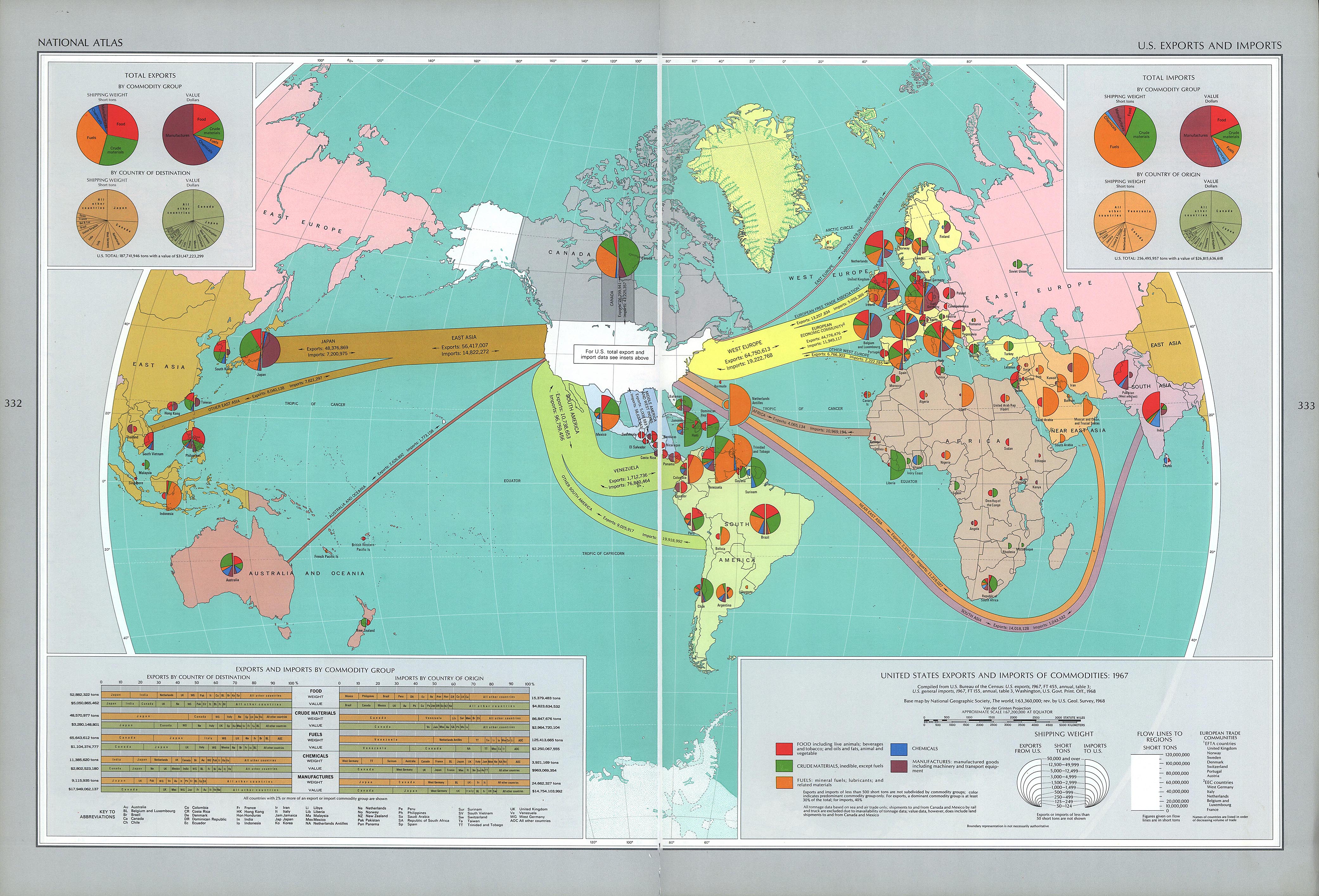
The economic aid that came from the United States goes as a perfect example of how soft power can be effectively used to drive a message or goal. The United States during this period were concern with first containing communism and then eventually destroying communism wherever it stood. In the National Atlas of the USA, specifically the Map of Exports and Imports, cartographers and scientists attempt to show the spread and distribution of American aid throughout the globe. As you observe on the map, there is no place on Planet Earth that the United States’ money and supplies could not reach 1970, even within the Soviet Union itself.
Through the use of overarching trade lines that connect with foreign nations, the map shows the dominance of the US Economy in respect to the rest of the world. The lines reach every corner of the globe and draw all nations towards the US. As a glistening, pristine white colored nation, the United States is strategically situated in the middle of the globe to stress its integral nature to the complex global economy that existed in the 1970s. The creation of pie charts within each nation offers a insight into the rich and diverse trade that existed and was unique to each country that the United States exchanged with.
Furthermore, the straightforward numeric statistics present on the map seek to show the vibrancy of the US Economy, while hiding many of the cultural and social implications that the Cold War created. For instance, trade to South East Asia is shown on the map, though effects of the Vietnam War (which was at its peak during the production of this map) are selectively hidden so that the viewer is only exposed to the economic prosperity of the global economy that hinged on the United States.
-Reece Syal and Quincy McKoy