
This map, though simple, establishes a sense of internationalism and power through its visual rhetoric incorporated in intentional choices and silences about its perspective on world oil consumption. At first it appears a very basic map: it’s a rather traditional, all-encompassing view of the world with brightly colored countries set against a basic backdrop. Yet with further analysis, the map contains a number of decisions which set it apart from other similar maps. Through bright colors and linked trade routes, the oil map creates a global perspective backed by the biased influence of its creator, the oil company BP.
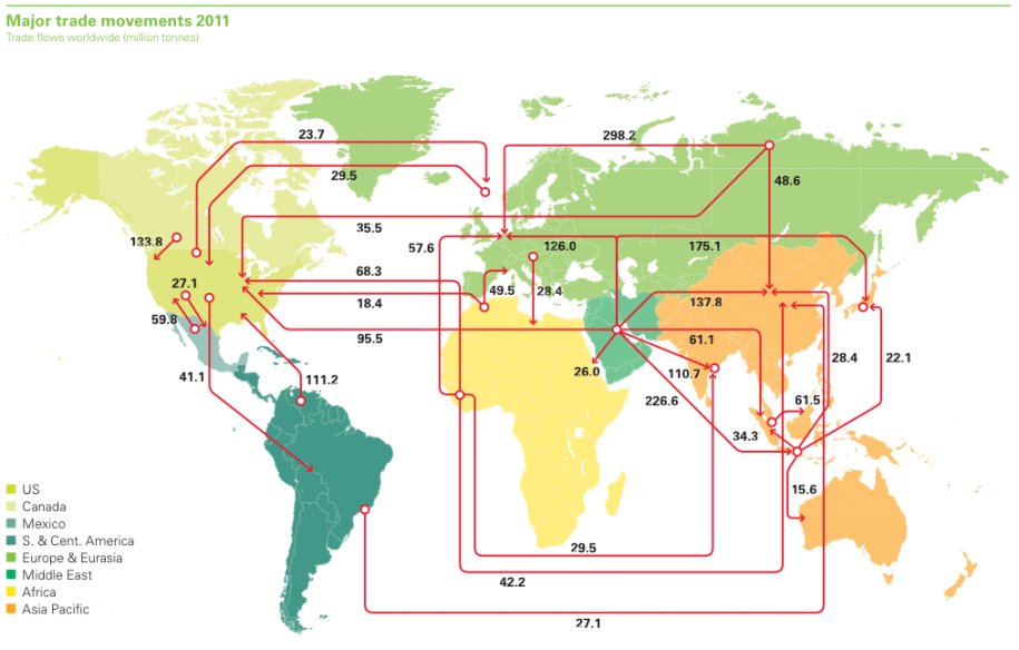
Though the countries’ design isn’t complex, the map’s top layer contains a series of interconnected lines which are somewhat puzzling at first glance. In fact they’re symbolizing the world oil trade in 2011, with the numbers given in millions of tons. Pieced together in a spider-web of lines, they appear to show common trade routes between the chosen countries. Although the continents are color coded, the colors seem somewhat sporadic and not very symbolically important. No land masses are directly labelled; instead a legend appears at the bottom left corner which strangely chooses to label only three countries: The US, Canada, and Mexico, while the rest encompass far larger regions. Without any explanation, the US appears in a unique color, a light green, while Australia and South Asia share a bright orange. Therefore an important question arises: why solely these three countries? Like any map, these choices aren’t made without motive, as mapmakers and those who sponsor them must make biased decisions. In this case especially, the business intended to showcase their own product as a crucial, globally connected good. BP chose to include the countries it found financially important while ignoring those of lesser monetary importance. Because they focus on North America in their labeling, this continent must be of importance and the map’s other details encourage this view.
Through including visually undivided countries while uniting the world with systematic trade routes, BP creates an integrated, easily conquered earth. Here the world isn’t cut in half by the Atlantic, but is easily connected through a number of routes. Product easily flows from one point across international borders to its final destination. These orderly channels create a structured network, creating a parallel between the actual process of oil trade and the map. They box in parts of the world while attaching countries to one another in a uniform, neat system. The regions proclaimed most important by the number of lines are the United States, Middle East and what the map deems “Asia Pacific”. This sense of internationalism is constructed through the flowing lines as well as the silence of boundaries. They connect certain regions in uninterrupted movement, while other parts of the map are completely devoid of any lines. The map, and therefore its creator BP chose to surround the most important sectors which its business manages. Cartographically the map ignores a number of common conventions while choosing to highlight the creator’s intentions of globalization. This map doesn’t exist solely to further knowledge about politics or even geography. Instead it ignores these traditional themes to focus on visualizing data of one particular commodity, while seeing the geography through this company’s corporate lens. Oil is an extremely lucrative world resource that consists of an extensive trade industry as indicated by the map.
Reflecting its creator, the map focuses on the nations where BP has its largest shares— hardly a coincidence. The map is largely interested in oil and ignores other features prominent on most maps, including any presence of water or indication of topography. By focusing on such a narrow theme, it creates the sense that this is the world’s most important product. Mapmakers define maps through their personal interests, where in this case they are asserting their world power and creating the idea that the world in dependent upon this one product. According to the map, millions upon millions of oil flow from nation to nation yearly. A title declares the routes shown to be only “major trade movements”, hinting there are even more existing trade routes than the ones depicted. By only including the routes deemed most important, it ignores smaller countries and those less financially dependent upon the product.
Even simple maps are layered with countless implications. In this case, BP wishes to appear as dominant and organized as it manages its single good throughout the world. With further knowledge of map rhetoric, a reader can more fully comprehend the nuances all maps include. Here a seemingly basic map becomes an object to further an idea of an interconnected, powerful world which is ruled by oil.
larger image here: http://www.businessinsider.com/maps-that-explain-the-world-2013-2?op=1
Works Cited
“BP.” In America. N.p., n.d. Web. 14 Oct. 2014. .
Wile, Rob. “36 Maps That Explain The Entire World.” Business Insider. N.p., 04 Feb. 2013. Web. 8 Oct. 2014.
Ellen-
This is an awesome map with lots to talk about. I think you do a great job decoding the map itself as well as explaining the cartographer’s message is in your commentary. It strikes me as deceptively simple – just colors and lines and numbers – but I had to really look closer to tell what they mean. Even the title is small, so there’s no way I could have known this map was created by an oil company without outside information. On a related note, as I read this and I looked at the map, I couldn’t help but remember the 2010 BP oil spill. I think the fact that this map, which quite clearly shows BP’s dominance in a heavily structured world, was published in 2011 says a lot about how the company wanted to present itself to consumers. After such a horrible economic and environmental disaster, BP’s public relations staff was probably floundering in an attempt to restore their reputation and reinforce their place in the global oil trade. As a continuance of this essay, we could also discuss the reasons why the map was even produced in the first place and what connections it has to recent events.
Cool post!
-Maggie
Great choice! At first glance this map does seem very basic, however your critique really sheds light on the importance of lucrative countries throughout the world, as well as the economic factors that are taken into account when creating a map. You make a strong argument that there is a constant struggle between the mapmaker and the audience. The selectivity issue comes into play as to what the mapmaker should reveal and conceal. In this case, the mapmaker is interested in the oil market, particularly the financial gains associated with oil. Economic incentives are clearly what drive the map. I’m impressed with how you took a relatively simple map and went “nerd deep”, really getting to the core messages within. Nice job!
This is a really interesting map choice, especially because there is always so much to be said when it comes to the oil trade throughout the world! I really liked how you questioned the color choice for the areas of the U.S., South Asia, and Australia. From there you found BP’s motives of highlighting countries of financial importance. I definitely agree with your statement that says BP “easily conquered earth” through their connection of the global trade routes. BP’s dominance is clearly seen and you do a great job finding their ways to show their power through this map! You do an excellent job of breaking down this map to find what it is really trying to portray.
-Ellen Silka