The Swiss Cheese Map Reflection
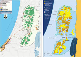
I think Shari Motro did a great job explaining her point about map visuals and what to include or exclude when creating a usable map. In order to cleanly and efficiently display information, cartographers must have an element of style in their craft and avoid “chartjunk,” or excess detailing that can crowd a map. Whether or not the mapmaker intends it, maps can have real world consequences and make forceful arguments. The gaudy “Swiss Cheese” map used in the 1995 Oslo II peace talks between Israel and Palestine illustrated how a simple difference in the way in which a map displays data can portray an extremely different feeling to the reader. In a situation like the volatile Israeli-Palestinian conflict, it is extremely important that peace talks go over smoothly with little argument. Later reworking the map aesthetically, not the data itself, proved to be much more helpful in later talks to show the area in a more positive, uplifting way. I especially love how Motro equated a mapmaker with no sense of graphic design with a bad writer using a word processor – both are useless because neither could make a practical product.