
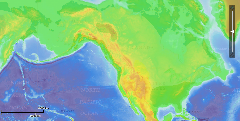
This website is an interactive tool that allows you to view various criteria for different regions of the world simultaneously, along with being able to edit the map with markers and drawings. Though it is similar to ARCGIS software, this interactive map from National Geographic makes for a fun mapping experience. The criteria to view are grouped by categories including Physical Systems (land, water, climate), Human Systems (Populations & Culture, Political & Economic), and Environmental and society. The coolest thing about the map is being able to view multiple criteria at once, so for instance being able to see the human footprint of a region overlapping with volcanic eruptions to see if there is any correlation between the two. The drawing tools can be extremely useful, especially for measuring distances. If you select the ruler tool you can click between two points to measure the distance in km or miles. A variety of map modes are offered to view including terrain, topographic, satellite, streets, national geographic, and outline. All in all, this site is a great tool for geographers of all ages looking to explore different statistics and features of the world.
Check out the tool at http://education.nationalgeographic.com/education/mapping/interactive-map/
This is a very cool site! Like you highlighted, the fact that you can look at multiple layers at once in order to uncover any correlations if very interesting.
I bounced back and forth between the carbon footprint and the precipitation layer and found that in a couple instances, particularly in the eastern region of the U.S. and in India, there were high footprint levels with also high levels of rainfall. I was thinking if it could be argued that areas that had sufficient rainfall have higher footprints? Possibly because higher levels of precipitation lead to more development and production. In other words, areas that have little rainfall and exasperate drought perhaps have less development and therefore a lesser carbon footprint. I have no idea if this is a credible idea, but your MapMaker program was a cool way to think about the correlation.
Good site find!
This website is great. As a huge fan of maps, I think national geographic does an awesome job of creating an interactive map display that allows users to explore so many facets of the earth and its natural processes. This website is also great for any kind of audience, as it has a simple interface and doesn’t require expertise knowledge (comparable to GIS). This map maker is a great tool to produce an holistic view of physical geography by mixing data layers and interpreting the interactions between processes. Yay maps!
Even though we’ve worked with ArcMap Explorer a few times in lab this year, I like how this interactive program is a little bit more user-friendly. It also includes a plate tectonic layer, which I have never seen before in an interactive program like this! That was definitely my favorite part – seeing exactly where all the plate divisions were and how those divisions might affect different areas of the world. I know we’ve been talking about this in class a lot lately, but this website allowed the concepts specifically related to locations of plate divisions to be much more tangible. AND it was fun!
I agree with Audrey about the accessibility of the site. We’ve used similar tools in my human geography class to compare the distribution of things like religion and ethnicity so I like how this takes that idea and applies it to physical geography. It’s really useful to be able to select the layers and the compare them, allowing you to observe trends and relationships between the layers. I could play around with this for a long time but the final is in thirty minutes so I’m going to have to wait.