
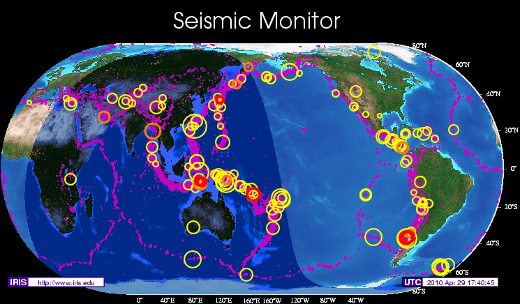
The website for the Incorporated Research Institutions for Seismology offers many fascinating and interactive visuals. My favorite by far is the Seismic Monitor. This map displays up to date information on the size and location of the world’s earthquakes. The earthquakes are represented on the map by various-sized circles, to show the quakes’ magnitudes, and colors, to represent the dates of the earthquakes. The map displays information from the past five years, which helps to illustrate the important role that plate boundaries play in the location of earthquakes (especially around the ring of fire). If you zoom into a region on the map you can click on a specific earthquake to learn more about its date, time, latitude, longitude, magnitude, and depth. Enjoy!