
In 1981, English cartographers Michael Kidron and Ronald Segal published “The State of the World Atlas”. The atlas was composed of zealous, vibrantly colorful maps that highlighted an array of international affairs by translating economic, political, and social indicators into visual form. Among these maps was the “Nuclear Club” map. The “Nuclear Club” was intended to generate support against the Cold War and paint a cynical image of the United States and Russia.
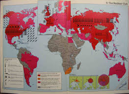
First, the map is titled the “Nuclear Club” because it divides nations into those who have nuclear powers, those capable of having nuclear powers and those who do not have nuclear powers. Countries with nuclear powers are symbolized by a harsh, dark tone of red, while countries without nuclear powers are symbolized by a dark tone of gray. For the countries with nuclear powers, their militaristic powers are symbolized by icons of missiles, planes and submarines. Further, the spatial projection of this map shows viewers that Europe is geographically caught in between the United States and Russia, thus caught in between nuclear war if the Cold War were to escalate. By using phrases such as “kill capacity” and “kill zone” the map becomes more radical, and, in turn, plays to the audience’s emotions during a time of fear and crisis. In essence, the projection, harsh colors, militaristic icons and warlike language are intended to evoke fear in viewers, specifically European viewers, so that they are swayed against the Cold War and mass weapon stockpiling.
William Roberts and Ellie Ronan