
The “Exports and Imports of Commodities” map was published in 1970 by the National Atlas, whose stated purpose was to help US government officials visualize country-wide patterns and phenomena. With the Cold War going on during the time this map was printed, the tensions between the US and USSR are visible through the map’s design and hidden interests.
Because a war was transpiring between two large global powers, competition for control was a huge factor in escalating the problems between the US and Soviet Union. Each country wanted to assert their dominance through any means necessary, whether that was political, economic, or social. The commanding difference between these superpowers was their preferred systems of government. While the Soviet Union made decisions based on expanding communism, the United States took measures to promote democracy, including through the creation of this map.
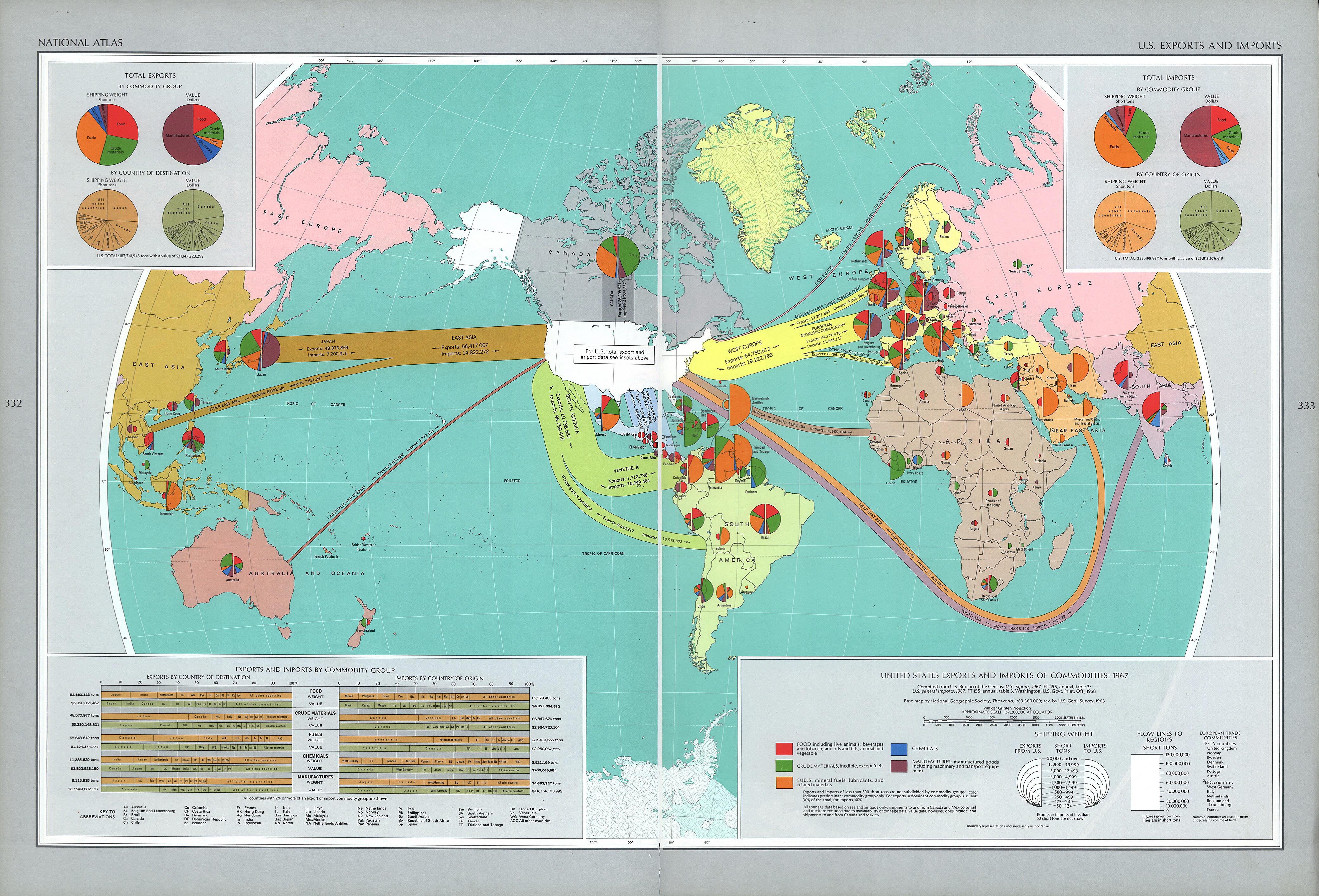
By creating an exports and imports of commodities map, the US expanded their global control. With a projection that is US-centric, it depicts the United States as the center for all international trade. This gives off the impression that the rest of the world is dependent on the US to sustain their own economies. This is in complete contrast with the USSR which is covered up by a chart in the far right corner. This gives off the impression that the Soviet Union is not nearly as important when it comes to international trade. Also, the arrows pointing to all regions of the world show that there isn’t anywhere that the US cannot reach, even the Soviet Union. The use of the arrows link the US all across the globe, proving that they are essential to everyone else’s well-being. Because the US is all white and the rest of the world is colored, it depicts Americans as morally good and untouched by communism. The map also lacks the complete truth about America’s international standing. In 1970, the Vietnam war was going on, which was obviously not a successful time in American history. However, no where in this map is that apparent. It only shows the US in a positive light, making it seem like we have no problems and are readily available to help save other countries from the threat of communism. Although this map seems to be purely informational, it actually serves to protect US political interests during the Cold War era.