
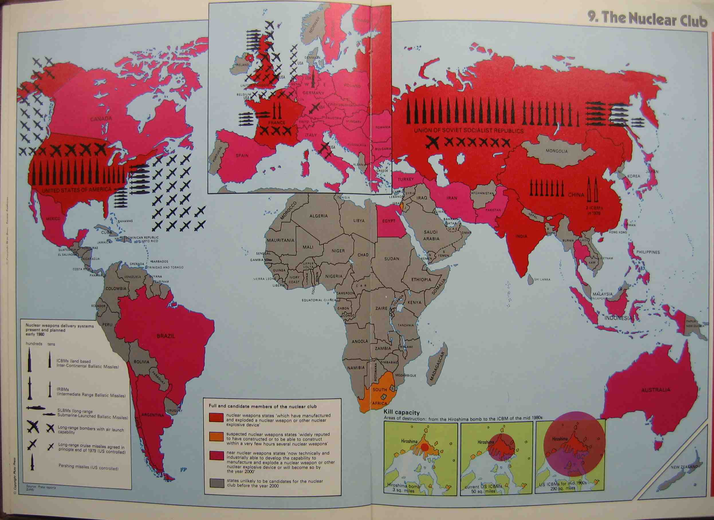
The Nuclear Club map was created in 1981 in London by Michael Kidron and Ronald Segal. This map can be found in State of the World Atlas, which was part of the Pluto Project. The Pluto Project was the work of economic and Marxists theorists, who believed that Europe was more than just an area between Russia and the United States. They wanted to highlight Europe and show that it had real power on a world scale. Most maps in this atlas drew on doomsday imagery and could be considered radical maps. These radical maps contained overt propaganda and did not try to mask any bias or preconceived notions. The Nuclear Club map is a perfect example of a radical map that plays on the fear of nuclear weapons to make an impact. This map uses the Mercator projection, but also contains an enlarged version of Europe. This is a testament to the authors who attempted to highlight Europe in their maps. The map is colorful with outrageous text and includes a “kill-zone” chart that gives the readers a glimpse into the power of nuclear weapons. The map also reflects the historical events at this time. In 1981, Reagan was elected president, and he intensified the Cold War in the early stages of his presidency. Just two years before, the Soviets had invaded Afghanistan. Additionally, both the US and the USSR exponentially increased spending on missile production. The choice by the authors to include pictures of nuclear weapons, as opposed to numbers, indicates how they wanted to create a map that made a statement about the impending nuclear war and strike fear into the hearts of the readers.
For our team project, our group was tasked with dissecting a Cold War era propaganda map. During our presentation, there were several rhetorical elements of The Nuclear Club that we went into detail about in order to help convey a basic understanding of our map. One of the first tasks anyone trying to gain an understanding of a map should do is find out who was responsible for the creation of the map. In this case, it was published by the Pluto Project and created by two economic Marxists. Right from this start, this indicates that there will be heavy bias in favor of a more European centric map with economic and political interests in the forefront of the discussion. Color also plays a crucial role in shaping this map. We noted that the map creators used bright colors such as red to draw the reader’s attention to areas of the map that the authors wanted to stress. Accompanied with these colors was a generous use of militaristic imagery. This is a perfect example of imagery and color being paired together to create a powerful message. The combination of these two elements play into a major rhetorical element of this map in that the authors were in no way trying to hide their political message. They wanted people who were looking at their map to take away a certain message, that message being that the nuclear buildup between the USSR and the US was going to leave destruction. When viewing The Nuclear Club, the audience needs to keep these elements in mind as they all shape how one should contextualize the map.
-Maddie S. and Zach C.
This map is extremely pertinent in its relation to the themes in our class. This map represents cold war interests in a different way than most cold war maps are shown. Many cold war style maps that we have worked with in this class look at the Cold War from a western perspective. The authors of this blog post do an excellent job in identifying that this map comes from an anti-west perspective. They show that it was created by Marxist economists who had a certain agenda which was not necessarily pro-west. They point out this agenda by showing the imagery used. The imagery that is pointed out includes the words “kill zone” which is used to describe areas in which people would die if a nuclear bomb went off. A second example is the words “kill capacity” used in the same context. This creates even more propaganda. These maps are similar to the “Nuclear War Atlas” made by William Bunge. These maps are another example of cold war propaganda against the West. His Hiroshima map, in which it shows where people would die depending on where they live, is similar to the inset at the bottom of the map in this blog post. Both of these maps place as a menace the Cold War nuclear situation and the United States’ influence.