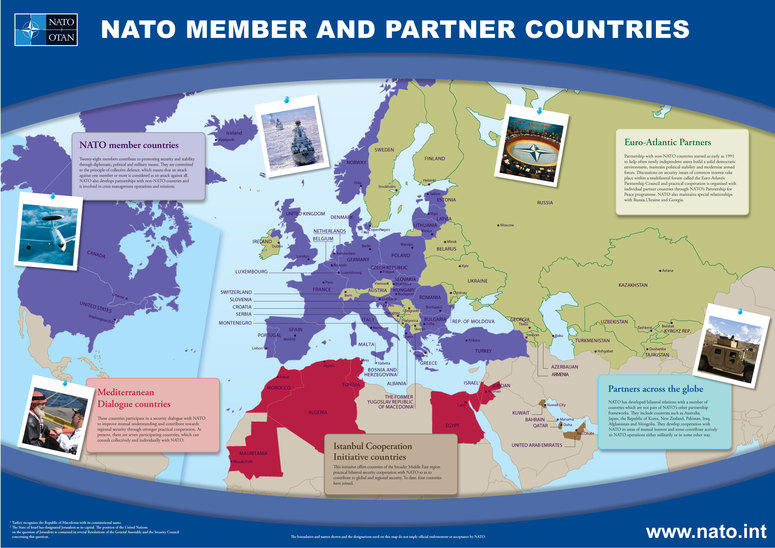
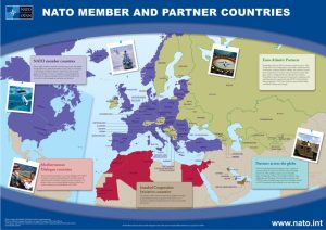
Lunar Map

USAF Lunar Wall Mosaic

The first instance of telescopic based lunar mapping occurred in the 1600’s, illustrating human’s obsession with the moon further. Poems, songs, books, motifs in the later–all of have been centered around the moon. As technology increased, humans began lunar mapping through photographs at the turn of the 20th century. After this advancement, lunar mapping was left to the amateurs as science moved towards mapping other extraterrestrial bodies in our system. This all changed in the 50’s when the possibility of putting humans on the moon became a reality. The effort to map the moon was re- galvanized and astronomers revamped their efforts to get clearer pictures of the moon. The space race–between the USSR and USA during the Cold War–fueled the sudden flurry of effort to be the first world power to put humans on the moon. On Earth, technology can be one upped, but you can only be the first person on the moon once. The US also used the space race as a way to shield the world’s eye away from the issue of the Civil Rights movement that was taking place in the US.
The map itself is very clinical. It leaves out any decorations and any cartouches. Instead it appears to be a map of complete science and therefore complete silence. It was not designed to make a point, but instead was one of the hundreds of maps that carefully mapped the surface of the moon to allow humans to navigate the treacherous landscape of the moon. The audience of the map is not laymen, therefore it seems almost overwhelming in its information. Every minute feature is mapped and it feels confusing to look at. There is so much detail but no information associated. The information that it does provide is drowned out with the silences the map does not answer.

Lunar mapping as a practice became something of an art. There were so many challenges astronomers had to face such as lunar librations and calculating the equator of the moon despite its constant shifting.  Finding “sea level” with no water on the moon was difficult due to photos being too low resolution to make any concrete findings. The moon is thousands upon thousands of miles away, yet we know more about it than our oceans. Why? Because the precision with which the moon needed to be mapped in order to safely carry out the Apollo 11 mission was required in its utmost. Not only was mapping the moon a statement of power–a claim that allowed the US to project ownership onto a technically international extraterrestrial body–but coupled with the landing of Apollo 11 a clear statement was made: the US’ power is nearly omnipotent, they can map and send humans to the moon within a few years of study.


Posted in Uncategorized | Comments Off on Lunar Map

Atlas of the Week: New State of the World Atlas

51P3wMrxk8L._SX354_BO1,204,203,200_

The New State of the World Atlas

The 1980’s were a chaotic time in European and American history, and nothing personifies this better than The New State of the World Atlas. Part of the Pluto Press, an organization who wanted radical change in Europe, this collection of maps does not attempt to hide the true intentions of its creators as it focuses its efforts on pointing out the flaws of the Cold War. This atlas would provide anyone who is interested in exploring the nature of the Cold War with a good read.

Posted in Atlases of the Week | Comments Off on Atlas of the Week: New State of the World Atlas

Blog of the Week

http://www.nationalgeographic.com/people-and-culture/all-over-the-map/

Every week, National Geographic publishes new captivating and informative maps on their website. The maps posted cover a wide variety of topics including, but not limited to, basic topography, bike routes, art, and just plain old mapping history. If you are interested in high quality maps that are focused on important subjects, this is the blog for you.

Posted in Uncategorized | Comments Off on Blog of the Week

NATO Members and Partners

141030_memb-part-e_rdax_775x548

Larger Image

http://www.nato.int/nato_static/assets/pdf/pdf_publications/NATO_member_and_partner_countries-2011-ENG.pdf

As we enter 2017, the world has never been closer than it is now. Communication and information have completely revolutionized society and how countries interact with one another. As members of this society, it is important that we look to the past to see how it is currently shaping the future. One of the best ways to achieve this is to look at the institutions that define humanity. Therefore, I have decided to draw your attention to this map above, NATO Member and Partner Countries, as it is necessary to see how an organization such as NATO has evolved into its current state and how it influences our world today.

In the years immediately following World War II, once-allied nations began to drift further away from each other as their respective viewpoints and ideological values tore apart the friendship that had once helped end one of the greatest catastrophes in human history. The East and the West, the capitalists and the communists, democracy and tyranny all became synonymous with the two sides that would square off in the newly conceived conflict that would shape foreign diplomacy for nearly the entire last half of the century. This “Cold War,” as it would come to be known, put the countries of Western Europe against the countries of the Soviet Bloc. Fearing the new-found power of the Soviet Union, the United States turned to her closest allies, those nations of Western Europe as well as Canada, to contain this new threat. In 1949, these twelve nations came together and signed the North Atlantic Treaty. Perhaps what made this treaty so critical was the creation of the North Atlantic Treaty Organization, or as it is most commonly referred to, NATO. This new organization would play a key factor in the continued polarization of Europe and serve as a reminder that even though there may have been no fighting in the Cold War, there was most certainly a symbolic divide that would have massive political and social implications for years to come [1].

One of the crucial provisions of NATO was that any member nation that was under the protection of the United States also fell under its “nuclear umbrella” [2].  At first glance, this seemed like common sense. If a group of nations were going to get together under the pretense of mutual protection, why wouldn’t they include every aspect of their arsenal? The main issue with this policy is that it put the use of nuclear weapons on the forefront of any military or political issue between NATO and the Soviet Union. This escalated even the most minute issues into full-blown conflicts since the nuclear option was always on the table. This provision in the treaty also helped to create the arms race. With the induction of Turkey into NATO in 1952, the United States was literally able to put nuclear weapons on the border of the Soviet Union. What were the Soviets to do about this? They couldn’t attack Turkey without fear of retribution, and a peaceful solution seemed next to impossible. In response, the Soviet Union began to stockpile missiles and created their own version of NATO in the form of the Warsaw Pact. These actions rendered by both sides in the name of self-defense ended up having many unintended consequences. This information is important in the process of understanding this map.

This map, NATO Member and Partner Countries, seems simple enough. It is just a depiction of the member nations of NATO as well as the organizations that they work with. But, as with every map, it is never quite that simple. As my professor would say, “we must go nerd deep.” Now what do I mean by this? When one looks at this map, they must be willing to look at the various decisions the makers of this map made and the social and political implications of these decisions. The first thing I want to do is to draw your attention to the creator of the map, NATO. When discussing what their organization does, they tend to focus on the positive aspects of their actions and have a perspective that nations who are not a part of their group may not share. A treaty organization as large as NATO is going to have broad reaching impacts on nonmember nations. While the organization’s main interests seem to be in Europe, they are clearly seeking to spread their influence into Northern Africa and the Middle East. These new initiatives that they claim to reflect purely positive reasons for working with these nations may not be as innocent as they seem.

Even though the age of imperialism and expansionism may be over, the countries with power are still finding ways to exert their control over weaker nations and are still actively trying to preserve their influence throughout the world. This is made even more apparent by the fact that the nations that are not a part of any NATO initiatives are purposely represented with a bland beige while the rest of the nations involved are given vibrant colors. It makes it appear as these other nations do not matter. Map color is a powerful tool in this sense. Another interesting aspect of this map is its use of cartouches that are all militarily related. This is just another example of the subtle ways the creator of this map draws the viewer’s attention to the power of NATO. One can tell that NATO must be mighty if they are in control of such incredible machines of war.

The way this map is divided exposes how NATO decides the various political and social issues that they are involved in. The focus is clearly centered around Europe and it excludes almost all South America, Southern Africa and most of Asia. This may seem obvious because NATO is designed to reflect the nations of the Northern Atlantic, but what it is subconsciously doing is making the viewer believe that those parts of the world that are not included are irrelevant. Essentially, how can such a fundamentally important group such as NATO ignore half of the world? This is a clear example of the dynamics of power and how a map creator can reflect their views in a seemingly unbiased representative map. This map also frames NATO not as a group of powerful players, but rather a humanitarian group that ensures the protection of others while simultaneously helping countries around the world. This choice of dialogue makes the viewer infer that NATO is a righteous and necessary organization and that these nations they claim to be “helping” must need this help or are simply not as capable of functioning as those in NATO.

It is also important to note that even though the Cold War may be over, a quick look at a map that has been produced as recently as 2011 can show that a divide still exists. Even though several nations that were part of the former Soviet Union joined NATO, there are still quite a few that remain distant from this group. Much of Eastern Europe and the Asian countries that were under Soviet control remain aligned with Russia. Further, many of the nations that are green in Europe traditionally have been neutral in times of war, such as Ireland, Switzerland and Sweden, while others remain uninvolved because of past treaties. This continues to highlight the militaristic nature of NATO and how the organization may not be as humanitarian or peaceful as it claims to be.

NATO has a significant effect on the modern political state of the world. Even though the divide between NATO and Russia may have moved further East, the two sides are still fighting for influence. The current conflicts in Ukraine and Syria exemplify this. If one wants to understand the current state of geopolitics, this map would be an important place to start. Many of the world’s issues can be traced back to the geography and mapping of the world, and this map is no exception to this concept. But is also vital that one keeps in mind some of the biases this map may contain and look for its deeper meaning. Keep in mind, this map only represents one perspective of the complicated issues of today’s politics. One should look elsewhere as well to further understand this issue.

References

[1] History.com Staff. “Formation of NATO and Warsaw Pact.” History.com. 2010. Accessed March 30, 2017. http://www.history.com/topics/cold-war/formation-of-nato-and-warsaw-pact.

[2] Randolph, Stephen. “North Atlantic Treaty Organization (NATO), 1949.” Office of the Historian. Accessed March 30, 2017. https://history.state.gov/milestones/1945-1952/nato.

Nato. “NATO Member and Partner Countries.” NATO. May 1, 2011. Accessed March 30, 2017. http://www.nato.int/cps/en/natohq/topics_81136.htm

http://www.nato.int/nato_static_fl2014/assets/pdf/pdf_publications/NATO_member_and_partner_countries-2011-ENG.pdf

Posted in Maps of the Week | 2 Comments

Stretched Out Colonial America

Colonial Map.jp2

The absurdity of the portrayal of the colonies’ extension across America is not quite like any other map that I have seen. Few maps are as dramatic in their presentation as John Mitchell’s map of the colonies. Its colonies sweep out all the way to the pacific coast without even knowing what lies beyond the east coast. This map of the territories in North America is pivotal in its rhetorical power and geopolitical influence on those who viewed it. The full name of this map is “A map of the British and French dominions in North America, with the roads, distances, limits, and extent of the settlements, humbly inscribed to the Right Honourable the Earl of Halifax, and the other Right Honourable the Lords Commissioners for Trade and Plantations.” (Congress) This map came about before the Revolutionary War and during the French and Indian War. John Mitchell was commissioned by the Board of Trade of Great Britain to produce this map in the year 1755. By viewing this colonial map three themes occur in regards to its appearance and power. This map is highly detailed, rhetorically significant in its manipulative power over foreign policy, and shows colonialism in its portrayal of the colonies.

The attention to detail can be seen in almost every part of the map. Inscribed at the lower right hand corner is a cartouche that identifies the recipient of the map – The Earl of Halifax. The Earl of Halifax at that time was George Montagu-Dunk who was the head of the Board of Trade. He had major influence over the colonies including expanding trade in the region earning him the name “father of the colonies.” (George Montagu-Dunk, 2nd Earl of Halifax) Maps such as this act as a symbol of power. By having a map with his name on it George Montagu-Dunk can legitimize himself through the ownership of the map. The attention to detail can also be seen in the inset on the upper left that examines the Hudson Bay and the areas around it showing its importance to the population in that region. In addition, there are strategically placed comments throughout that map pointing out information about the natives and French and English settlements. On the overall appearance of the map, some of the thirteen colonies are identified in bright colors and New France is identified to the north of these colonies in green. The map itself is brightly colored and hand drawn, identifying different territories during that time period. In regards to points of interest, the map includes, “roads, distances, limits, and the extent of settlements.” This attention to details plays into the maps function as a rhetorical device.

Rhetorically this map has a significant amount of power over British foreign policy. The comments in this map exist to shape the viewers understanding of the situation in the colonies. These comments are as much of a rhetorical device as the selection of one map projection over another. All maps make decisions about leaving things in, versus taking things out. These comments are an example of those decisions. For instance, there are two long paragraphs explaining Native American movements in what is today Illinois. These comments and others serve as a way to purport a major Native American influence in this region. This serves to use fear to convince the British people that the Native Americans were a problem that needed to be dealt with. This map was produced during the French and Indian War and helped to gain support for Britain’s involvement in the war. The Colonial Williamsburg Foundation owns this map and has done research on its origin and overall context. The Foundation has concluded that this map was extremely influential in its ability to swath the British people to keep control of the colonies. (Foundation)

The rhetorical decisions do not stop with the remarks about the Native Americans. In addition, comments about the French are sprinkled throughout the map creating the idea that the French are sweeping through North America. For instance, on the south of Lake Erie a comment states “usurped by the French 1751”. (Congress) By placing this comment the author creates a narrative that points toward French encroachment.

In addition to these comments, the way the colonies are portrayed shows a noticeable colonial arrogance. The colonies of Virginia, North Carolina, South Carolina, and Georgia are all extended to the edge of the map. This is done in a manner that lacks regard for any people groups in the areas that are bulldozed over by these arbitrary borders.  These lines seem to be drawn arbitrarily westward with no real understanding of the implications that the boundaries create. This was a time period when the seeds of rebellion were being sown and discontent with the Crown was more evident every day. It could have come off as a major insult that the Crown was claiming almost all of America for itself and fueled rebellion. The colonies seem to push infinitely into the west claiming all of the territory in the name of England. The map shows the British claiming land that they barely knew existed. This creates an incorrect perception that the British people have a right to all the land. Unfortunately, today, we seem to forget that we were once a colony that was taken advantage of by a stronger power and not given a say in how it wanted to be governed. We must see that this map, in its attention to detail and rhetoric, points toward us today and asks what kind of country we want to be in our dealings with our less powerful counterparts.


References

Congress, Library of. A MAP of the/ British and French Dominions in/ North America,/ WITH THE/ Roads, Distances, Limits, and Extent of the/SETTLEMENTS,/ Humbly Inscribed to the Right Honourable/ The Earl of Halifax,. n.d. 21 March 2017. <http://emuseum.history.org/view/objects/asitem/classification@17/15/title-asc?t:state:flow=06387ae4-812a-4ad4-943f-f337cdd89396>.

Foundation, Colonial Williamsburg. “A map of the British and French dominions in North America, with the roads, distances, limits, and extent of the settlements, humbly inscribed to the Right Honourable the Earl of Halifax, and the other Right Honourable the Lords Commissioners for Trade &.” n.d. Library of Congress. 21 March 2017. <https://www.loc.gov/resource/g3300.np000009/>.

George Montagu-Dunk, 2nd Earl of Halifax. n.d. 21 March 2017.

Posted in Maps of the Week | 1 Comment

Atlas of the Week: Atlas of the Lewis & Clark Expedition


Lewish and Clark

Atlas of the Lewis & Clark Expedition

The Lewis and Clark Expedition was not only an expedition that explored uncharted territory but expanded American influence through contact with the Native Americas. This trip has as much to do with foreign policy as it does with exploration. The Atlas is filled with drawn maps of the regions that were explored including their rivers and mountains. In addition, the native populations that were encountered are mentioned on the map showing just how important this trip was for American foreign policy.

Posted in Atlases of the Week | Comments Off on Atlas of the Week: Atlas of the Lewis & Clark Expedition

Blog of the Week

https://mapsdesign.tumblr.com/

Beautiful maps, created by Dannys Hess, is a blog dedicated to old maps of every kind. On his blog are maps of everything from Panama to Manhattan, and even star charts. He chooses maps that not only show information but do it in an artistic way which brings to together an array of colorful and thought provoking maps.


Posted in Uncategorized | Comments Off on Blog of the Week

“World Distribution of Spirochaetal Disease”

The “World Distribution of Spirochaetal Disease” was produced near the beginning of the Cold War in 1955 as one of 17 other maps included in The Atlas of Disease. In collaboration with the American Geographical Society, the United States Armed Forces, and international pharmaceutical companies, Dr. Jacques May and cartographer E. D. Weldon diagramed the spread of three spirochaetal diseases (yaws, pinta, and bejel) present throughout the Southern Hemisphere. The map is split into five distinct maps– a large, world-view map and four smaller maps, each highlighting a different region of the world. Within these maps, the prevalence of disease is shown in relation to its organic and inorganic factors, for example the region’s geology, soils, temperature, vegetation, and rainfall. This information is more or less repeated in the text box in the lower right hand corner, where more detailed (and biased) information on the factors and specific outbreaks is located. Here the mapmaker’s preference for the western world shines through as he describes disease as “an expression of miserable living conditions, of densely populated areas, of crowded savanna villages markets, [and] of a primitive way of life in dark, windowless huts.” While all countries are labeled, the same cannot be said for cities and regions. These seem to be placed pell mell around the map at the mapmaker’s discretion. The result is a confusing and nearly illegible mass of names and lines, that makes the bright splash of disease the only clear information on the map. One of the features of the map that cannot go unmentioned is its use of pictures. Placed in a central location on the map, they jump out at the viewer with their human appeal and the grotesque deformations that spirochaetal diseases have left in their wake. Visually captivating, in the end the map calls the viewer’s attention to the perceived plight of the sick and impoverished Third World and calls the healthy and prosperous First World to take responsibility.
In our presentation we critiqued several rhetorical choices made by the mapmakers. We discussed the photos included in the map and their prominent placement over the northern hemisphere, signaling to the audience that, within the topic of disease, the north is irrelevant. The photos themselves display the harsh and uncomfortable realities of spirochaetal diseases, and we discussed the heart-wrenching, emotional effects these images have on the audience, effects which are similar to those caused by the images on the Gulag Slavery map. A second rhetorical choice we critiqued in our presentation was the projection. The Briesemeister projection was created specifically for the Atlas of Disease maps and intentionally places Africa front and center, encouraging the audience to conclude that Africa is the center of disease. Color choices are a third rhetorical device the mapmakers employed. The dark red chosen to depict the incidence of the disease looks like rash physically plaguing the bottom half of the map, furthering the belief that disease is a southern phenomenon to which the north is immune. A final rhetorical choice we critiqued in our presentation was the inclusion and exclusion of certain diseases. Syphilis is a spirochaetal disease that falls into the same family as yaws, pinta, and bejel, but was surprisingly left off the map. Further research indicated that syphilis had not yet been eradicated in the U.S. at the time this map was produced, so its inclusion would have compromised the U.S.’s image as a clean, disease-free nation. One main goal of our presentation was to convey the Cold War rhetoric embedded in this map, because at first glance one may not notice this as a Cold War map. We discussed the two different Cold War tensions this map depicts (north v. south and east v. west); not only was the north seeking influence in the developing south, but individual northern powers were also competing against each other for that influence. The democratic U.S. and the communist U.S.S.R. were vying to spread their ideologies to the developing world. In our class discussion, we began by asking what the purpose of this map might be and ended by discussing its effectiveness in achieving this purpose. We agreed that this map, however biased or misleading, was certainly successful in achieving its goal; this map and others like it were used in such a way that they contributed to the separation and distinction between the so-called First and the Third Worlds and perpetuated ideas of northern superiority and southern inferiority.

– Cathryn F. and Lauren S.

Posted in Uncategorized | Comments Off on “World Distribution of Spirochaetal Disease”

Blog of the Week

http://www.cartogrammar.com/blog/

Andy Woodruff’s cartography blog is full of interesting and creative maps that he created using different techniques. Cartography is a continuously evolving field due to the new technology that is being created for data collection as well as for making digital graphics. Woodruff explores these new methods in producing out of the box, new types of maps ranging from turning the state of Ohio into a piano based on different districts to the flow of rain water on different terrains around the world. His blog is full of fun interactive maps  that you have to check out.

Posted in Uncategorized | Comments Off on Blog of the Week

Atlas of the Week: World Atlas of Coral Reefs

World Atlas of Coral Reefs

http://fnad.org/Documentos/worldatlasofcora01spal.pdf

When thinking of Maps and Atlases we often jump to think of land masses above sea level, but below the oceans surface there are massive networks of ocean floor topography, covered in coral and thriving with life.  But these delicate ocean ecosystems ecosystems are put in danger by changes in the environment and tourism. This atlas gives a comprehensive look into the current state of the world’s coral reefs in all of their splendor as well as their decline. The atlas shows the state of coral reefs in one of the most expansive and up to date collection of maps, and images of what inhabits the ocean floor.

Posted in Atlases of the Week | Comments Off on Atlas of the Week: World Atlas of Coral Reefs