Atlas of Disease: World Distribution of Spirochetal Diseases

The “Atlas of Disease: World Distribution of Spirochetal Diseases” was created by Dr. Jacques May, a French surgeon, and the American Geographic Society in 1955 during the Cold War era.  During our presentation on this map, we questioned why the curators of the map included unpleasant photographs of children with skin diseases, why they used the color red to represent the spread of disease in the Southern Hemisphere, why they used the Briesmeister equal-area projection, and why they choose to represent the skin diseases (bejel, yaws, and pinta) specifically.  We also questioned how the time period of the map influenced how the map was portrayed.  We came to the conclusion that this is not a bad map, it presents accurate information, but one must be smart when using it if they want to truly understand it and what it presents to its audience, since it does present biased opinions.  We also decided that the “Atlas of Disease: World Distribution of Spirochetal Diseases” proves that even the maps backed by scientific evidence were political during the Cold War era.  Lastly, we figured that this map shows us the importance of context in mapping, as if this map was made today, it would not have the same implications and insinuations it did when it was created.  When classmates commented on our presentation, they said they enjoyed how we asked good questions and kept the class involved.  They also said that we made good connections between our map and what we have learned previously this year.  They enjoyed our visuals and presentation effects, as well.  We greatly enjoyed following the rhetorical life of this map and critiquing what it presents to its audience.  Never stop asking questions!

Sincerely, Anna Ricci and Kayla Connelly

Posted in Uncategorized | Comments Off on Atlas of Disease: World Distribution of Spirochetal Diseases

North Korean Ballistic Missile Map

Since the 1980s North Korea has been developing and building a nuclear arsenal in order to secure a stronghold amongst the modern day world powers. Under the reign of the current president, Kim Jong Un, North Korea has become especially hostile and open in regards to their nuclear program. Kim Jong Un has made it clear that he will stop at no means to continue to strengthen his armory. While his people are starving and dying, and major world peace organizations continue to threaten him, Un continues to allocate billions of dollars to his nuclear program with his intentions unknown. The map above shows the strike radius for each nuclear weapon that North Korea is known to possess to date. The map has specific features that, upon further examination, show the author’s purpose for making this map.


This map titled simply: Range of North Korean Ballistic Missiles, is made by an unknown author by the United States Geological Survey. This organization is a government funded organization which holds a $1.1 billion dollar budget. In its mission statement, the organization claims that its main goal is to “provide science about the natural hazards that threaten lives and livelihoods; the water, energy, minerals, and other natural resources we rely on; the health of our ecosystems and environment; and the impacts of climate and land-use change” (U.S. Geological Survey). This does not explain why the organization would be making a map on North Korean ballistic missile capabilities. Perhaps it speaks to the duality and ambiguity of the bureaucracy. Nonetheless, this map is most definitely authored by the United States government in an effort to give its citizens a perspective on the growing concern in North Korea. The map is North-Korean-centric and projected in a more three-dimensional matter. These selections are chosen by the map maker so that the missile ranges, the subject of the map, are not distorted, and so that the map is easy to read and more visually appealing to its audience. Upon further examination into the choices of the mapmaker, the intentions become clear. The overwhelming majority of the locations highlighted and labeled by the map are areas of US interests. Tokyo, Guam, Anchorage, Hawaii, San Francisco, Denver, and Los Angeles are all locations that are part of the United States or serve a particular US interest. All of these locations are shown within the missile range of North Korea. The map also highlights other major American cities of New York, Chicago and Washington D.C., which do not appear within the radius of the North Korean missiles but lie just outside of it.

These choices by the mapmaker are obviously pointed and show not only his biases but also his intentions of making the map. By choosing mainly places of US interests to highlight on his map, the map maker is overtly trying to persuade someone to take action in North Korea. The map may work better than a graph or chart in this respect to show the people the imminence of a long-range missile threat. Graphs and charts may be able to show this idea, but it is not This map is clearly designed as a fear tactic aimed at American politicians and their constituents to provoke action. The mapmaker is showing that the North Korean nuclear program is a real threat, and seems to suggest that Americans should take action. However, the mapmaker does this in a more abstract way than one might expect. He does not include destruction or human costs in his map, but instead, he only includes missile names and ranges. This aspect of the map is attributed to an effort to make the map concise. The mapmaker does not want to include too much information, he instead wants to make his map easy to read and straightforward. He is using a type of fear tactic, but it seems he would rather help his audience understand a threat instead of scaring his audience.


The situation in North Korea continues to be a growing issue. The UN has been pressuring North Korea to give up its nuclear aspirations, but Kim Jong Un and his posse continue to execute tests and develop the more advanced nuclear technology. The United States is aware of the growing threat in North Korea and uses maps like this one to inform its people of the threat. Such information from the U.S. government may be seen as a type of propaganda, but it is an essential component of uniting the American people against imminent threats like North Korea’s ballistic missile program.


References:

Estepa, Jessica. “From the Armada to ‘Rocket Man’: A brief history of Trump’s war of words with North Korea.” USA Today. September 22, 2017. Accessed October 31, 2017. https://www.usatoday.com/story/news/politics/onpolitics/2017/09/22/armada-rocket-man-brief-history-trumps-war-words-north-korea/692376001/.

“Ex-N.K. military chief says its long-range rocket can hit U.S.” Thai Military and Asian Region. June 06, 2017. Accessed October 31, 2017. https://thaimilitaryandasianregion.wordpress.com/2016/02/04/ex-n-k-military-chief-says-its-long-range-rocket-can-hit-u-s/.

“North Korea Nuclear Timeline Fast Facts.” CNN. September 04, 2017. Accessed October 31, 2017.

http://www.cnn.com/2013/10/29/world/asia/north-Korea-nuclear-timeline—fast-facts/index.html.

“U.S. Geological Survey.” USGS.gov | Science for a changing world. Accessed October 31, 2017.

https://www.usgs.gov/.

Posted in Uncategorized | 2 Comments

Empowering WW2 America with the American Airlines system map

It’s 1945. The Second World War is raging, but quickly nearing an end. Europe is in rubble and the world will never be the same again. Millions have tragically lost their lives and the future of the world seems grim. Yet one nation seems unscathed by the destruction and chaos that is terrorizing Europe. Across the Atlantic Ocean, stands tall the United States of America.

Separated from the European theater of conflict by almost five thousand miles of water, the United States is not in threat of invasion, and has managed to largely avoid direct attacks on its soil, with the exception of the attack on Pearl Harbor and numerous other small attacks.

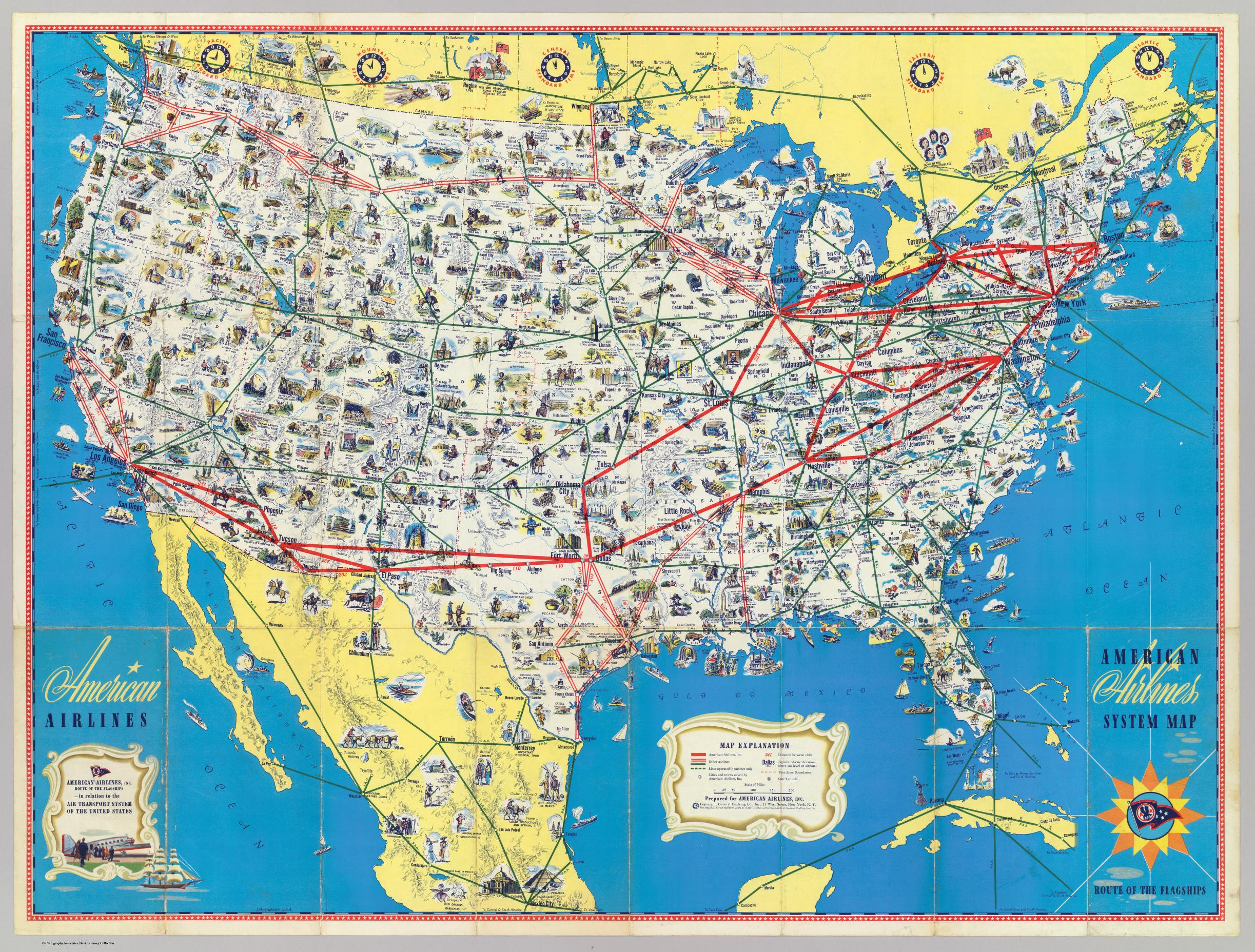
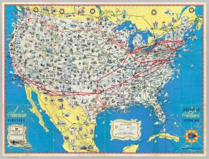
While the war storms Europe with gloom and devastation, back in the US, American Airlines releases a new system map detailing the numerous routes it offers between cities in North America. This map features cultural landmarks, touristic destinations, and points of interest; all of which are interconnected by the US’s comprehensive air transport systems.

How bizarre.

While this may seem like any regular map advertising American Airlines to an American audience, it was not. This map had immense influence and significance, and achieved many different aims and purposes. Why? Because at the time, the airplane remained a relatively new invention which was used typically for postal service, leisure, and since 1914, war, but rarely for commercial air travel, at least not for regular Americans. And thus, the display of the commercial airline infrastructure of the US on a map portrays America as mighty, powerful, and prosperous. And since morale and support for the war was fast diminishing on all sides during WW2, it was essential for America that it emboldened its people and army. Since morale can make-or-break entire armies, this seemingly innocent map uses many devices, including imagery and iconography in order to empower America.

This map effectively raises the morale of the US population and army, and diminishes that of their enemies, by depicting the US as a powerful and unwavering force in the face of war, while the European nations neared collapse. Simply through its existence and publication, this map creates a rhetoric which is extremely influential: the map predicts and practically guarantees the victory of the US in WW2 and its survival and stability in the post-war era. The release of a map detailing America’s air-travel capabilities shows that America expects to be stable in the future and to remain in control, therefore implying that it expects to win the war. This intimidates America’s enemies and empowers it and its allies.

This map portrays the US positively as a growing superpower. Taking a look at the legend, titled ‘Map Explanation’, this tool provided to aid map readers can tell us more about how this map creates a sense of American superiority, both for Americans and for their enemies. The legend includes explanations of symbols, such as a solid red line which denotes routes operated by American Airlines, and a double red, or green to signify routes operated by other airlines, even including a dashed green line which represents seasonal routes. This shows that this map’s purpose is not only to promote American Airlines, even though it may be the producer of the map, but in fact intends to promote US aviation as a whole. Several other symbols and icons are labeled, including cities, state capitols shown by different dots, distance between cities shown in red numbers; time zone boundaries, and even elevation are also displayed. This density of information provided to the map-reader boasts the information collection capabilities of America, again in an attempt to instill a sense of superiority of the US to the rest of the world. This map is dense with information; each inch of the US mainland is covered in small illustrations and icons representing the many cultural and historic spots in the US.

The map proudly exhibits the abundance of cultural, historic, and touristic landmarks and sights in America, which creates a strong sense of national identity and pride. In the map, the mainland US is covered by a dense assortment of places to be, and things to see, while also showing some locations in Canada and Mexico. The points of interest shown include important buildings such as the White House ­– representing the government’s power and authority –different types of agriculture, farming and industry, such as cotton farming, fishing, and oil refining – indicating economic success – and also include important cultural and industrial landmarks of different regions within America, such as wine production, areas of forestation, the Grand Canyon, light houses, and beaches – portraying a deep culture shared by all Americans. This, coupled with comprehensive airline routes overlaid atop North America illustrates the image of America as a thriving, prosperous, and very connected society, creating a strong shared national identity.

Interestingly, while hundreds of landmarks are shown in the US, less than fifty are shown in all the surrounding countries combined. This creates the image that America is a prosperous paradise, while the rest of the world was suffering, and gives Americans the sense that they have something to fight for and protect. Compared to its neighbors, such as Mexico, on which icons mostly only represent traditional customs such as horse-riding, and dancing, and not much industrialization, coupled with a low density of landmarks, America appears to be unique, industrial and advanced like no other. In addition, the map shows routes reaching well beyond America, to destinations in Canada, Mexico, Cuba and more. This creates the rhetoric that America has a heavy influence on its neighbors, and growing power; the routes act as figurative “strings” which the US can pull.

The airplane did more than connect far-away places together; it practically redefined the American people’s geographic imagination. Before the airplane, Americans on one side of the country would need up to several weeks to reach another side of the country. However, after the introduction of the airplane, the world suddenly shrank, and previously very “far-away” places are suddenly accessible, and in a relatively very short time. Cartographers refer to this period as “air-age geography”. This allowed Americans to create a strong national identity, as large distances no longer separated Americans. However, this also threatened America’s isolation from the conflict zones, since now America’s enemies in Europe and the Pacific are closer than ever. This creates a sense that America is in danger of attack, which creates fear and panic within the US population, prompting more support for America’s military in the war in order to defend America, especially after a strong national identity was established – it gives the American people something to fight for and protect.

In addition, the inclusion of time zones in this map also plays a role in exaggerating America’s power; it stresses on the enormous size of the US, and how the airplane was able to shrink it. Spanning four time zones, the US appears to many times larger than its European enemies. The effect of this is great: America appears to be a daunting and invincible enemy to its European enemies, and Japan, but to Americans the map creates within them a sense of pride for their country, and a feeling of superiority to others. This matters, again, since an important part of the war effort was the support of the population at home for the war, and its acceptance of rationing and other negative consequences of it. However, after the introduction of the airplane, one could simply fly any of the routes shown on the map and reach any corner of North America. This empowers America because it appears that they have conquered the sky and have the capability to reach far destinations with airplanes.

This map intimidates America’s enemies, where war has been far more devastating through its portrayal of America as the dominant superpower: if America appears to be less harmed by the war, both economically and militarily, then that means it can continue to wage it longer than they can, thus empowering America, and stripping power away from her enemies.

Now imagine yourself back in 1945 once again. Which country would you rather side with? America, which was largely unharmed by the catastrophic world war, – and even benefited economically from the industrial demand that was created from the war– or the axis powers which were bombed to rubble and facing almost certain defeat? I’ll leave that for you decide.


Works cited:

“American Airlines System Map.” David Rumsey Map Collection, General Drafting Co., 1945, www.davidrumsey.com/maps890029-24336.html.

Posted in Uncategorized | Comments Off on Empowering WW2 America with the American Airlines system map

Blog of the Week- MapBrief

For the Blog of the Week I chose MapBrief. This is a really interesting blog that links geography, economics, and visualization. MapBrief takes a look at different theories of economics, such as the theory of supply and demand, and analyzes them using maps.

Blog link: http://mapbrief.com

Posted in Uncategorized | Comments Off on Blog of the Week- MapBrief

How Communists Menace Vital Materials


“How Communists Menace Vital Materials” of 1956 conveys deliberate and overt American biases as the U.S. finds its place within the Cold War climate. During the 1950s, American life was wracked with the paranoia of the Red Scare, which was only magnified with Joseph McCarthy’s strong accusations and the following espionage trials. The map itself was published in a 1956 Congressional report by the Research Institute of America, and the report arose out of the Committee on Un-American Activities. With large arrows and stark contrasts between darkened and lightened countries, the map depicts how the Soviets attempted to “conquer world capitalism” by exploiting raw materials around the world. The text at the bottom of the map reveals the tactics by which the Soviets managed to acquire these resources, such as by subversion or negotiation.

Regarding its point of view, the map portrays an extremely conspicuous American bias with the usage of words like “menace” and “thrust”, and the size and expanse of the arrows instills a sense of urgency within viewers. Nevertheless, the map hosts other more covert interests; it also holds a very economic purpose. Some of the resources included rubber, copper, and lead, all of which could be used for war-making or industry-building. The U.S. demanded these materials for its operations, as well, so the Soviets’ “menacing” of these materials creates an economic motive for the U.S. to aid these exploited areas. By the same token, the map connects the regions and countries to their resources. With this clear visual, these countries possess larger economic power, and audiences can more easily understand what drives the economies in each of these areas. Furthermore, the usage of projection inherently stirs up more bias. The map appears to demonstrate a Mercator projection that is more Euro-centric. Therefore, the cartographer guides the primary focus back to the brewing conflict between the U.S. and the U.S.S.R.

One anomaly is that there is no legend on the map. Many would argue that it does not quite need one, but this lack of a legend distinguishes the map from most others. In addition, the map essentially defines countries by their resources and economic power. Their names and other functions are either difficult to read or not present on the map; therefore, in this sense, they are stripped of their sovereignties and defined by solely one trait. A third critique is that although the mapmaker criticizes Soviet methods of resource extraction, the U.S. used similar methods during the colonial period to obtain economic and political dominance. Americans thus contradict themselves by illustrating themselves as saviors and models for others. Finally, the mapmaker made conscious decisions to include the listed resources over others. Why were these resources chosen? They likely served some sort of military significance to both the Americans and the Soviets, but this choice is most certainly a political one.


By Nora Geer and Heather Neiman

Posted in Uncategorized | Comments Off on How Communists Menace Vital Materials

The Poetic Power of Maps


Whitman Poem transformed into a map of Brooklyn

Maps create a space for envisioning the world in unconventional, even poetic ways. Such is the case for Gretchen Culp’s map which turns a Walt Whitman poem into a map of Brooklyn. Born in 1819, Walt Whitman was a prolific poet and Brooklynite himself. The poem depicted in the map is Whitman’s Crossing Brooklyn Ferry, originally published in 1856 under the title Sun Down Poem. The Poem turns a seemingly mundane ferry ride from Manhattan to Brooklyn into a, “ Metaphor for the Journey of the Soul”. Just as Whitman is said to have written the poem whilst on a ferry ride, the poem has a sense of movement and transformation. By turning conventions on their head, Culp allows the viewer to perceive the world in a new way. Further, Culp’s map reminds us that maps do not need to be scientific by nature, and can even take on the role of a more artistic agent whilst lending itself to the cultural and historical implications of the land.

This map is worthy of map of the week because of how it makes the viewer see the world in a new way. Through turning a Whitman poem into a map, Culp brings new life to both the poem and the city of Brooklyn. Paying homage to Whitman in this way reminds us of his roots in Brooklyn– almost implying that his presence still lives on in the city in an omnipotent way. The marriage of the land of Brooklyn with Crossing the Brooklyn Ferry allows a piece of Whitman’s soul to live on for the modern reader. Further, Brooklyn’s shape resembles a winged seahorse, lending itself to the map’s depiction of the rich and poetic beauty that is tied to the land of Brooklyn.

Wood once said that, “ Maps present us not with what the world can see, but to point toward a world we might know”. This quote embodies the essence of this map. Clearly, there are not really lines of prose covering the land of Brooklyn. Through metaphorically tying the land to the prose, the map points us towards a “world we may know”. That world is one in which Brooklyn is richly ground in its cultural and poetic history. Through transforming the poem into a map, Culp turns the map into an abstract symbol of the journey, both in soul and physically toward Brooklyn. This rendering of the map goes against conventions of what a map “should be”, as an agent for scientific exploration. Rather than providing geographic “facts”, the map shows us towards the transient, emotional parts of life. Rather than connecting science to the land, the map connects the art of poetry to it. Wood would consider this map to clearly be a product of the knowledge of the world it emerged from. We see this through the map’s tying of prose to the land it was created in. In this way, the map becomes a tool for observing the cultural and historical implications tied to the land.

This map assumes that the reader has background knowledge about Whitman and his role in both American poetry and Brooklyn upbringing. Further, one may argue that this map has similarities to the Mercator Projection in that it emphasizes poetry in a purely American context. Just like the Mercator projection over emphasizes the role of America, Culp’s map is directed towards an American audience and assumes the reader holds American land/history to high importance. The map maker is also from Brooklyn, revealing how she may assume that the viewer of her map is American/Brooklyn based. Further, the map maker is assuming that Whitman was envisioning the land of Brooklyn while writing his poem. The map also romanticizes Whitman’s role in Brooklyn life and ties his soul to the land. In doing so, the map assumes Brooklyn is a special and important place to Whitman, despite his poor and less than ideal upbringing there. Ultimately, this map brings new life to both Crossing Brooklyn Ferry as well as the land of Brooklyn but makes many assumptions in doing so. This map’s playful and unconventional elements makes it a powerful tool in the society it emerged from. Here lies the true power of maps– they shape our perceptions in all realms of life. Whether through art, emotions, or science, maps allow us to spatialize the world in different ways. This map forces us to suspend our disbelief and realize the plethora of roles maps can take on.

Sources:

http://bigthink.com/strange-maps/test-12

Wood, Denis. The Power of Maps. The Guilford Press, 1992

Posted in Maps of the Week | Comments Off on The Poetic Power of Maps

Atlas of The Week- Atlas of Cities

For the Atlas of the Week I chose the Atlas of Cities by Paul Knox. This atlas explores urbanization and how cities are developing as well as different aspects of their physical, economic, social, and political structures. It is an interesting atlas as the urbanization and development of certain places is relevant and will continue be important in the future.

Posted in Atlases of the Week | Comments Off on Atlas of The Week- Atlas of Cities

Knowledge is Power

What makes a great leader? What qualities must a person possess in order to have the ability shepherd others? These questions are essential to observe as they shine a light as to what traits one must foster in order to be a difference-maker or decision-maker within each population. This is especially relevant when talking about world leaders. These are people who possess the power to make significant decisions that affect millions of people all over the world. These leaders are some of the most influential people in the world and their ability to put themselves in that position is unique. There are many traits that these people have utilized to put them in the important role they are in. However, one of the most relevant quality a leader holds is knowledgeability. People want leaders who have the knowledge about the certain facets that they have to deal with given their authority. Knowledge is not only an essential part of a leader’s influence, but also directly impacts the people’s perception of that person in power. While knowledge is a valued trait across humanity, it is important to think about how different cultures interpret different types of knowledge and value some types more than others. In some cultures and societies one type of knowledge may be more relevant and important than another based on different issues that leaders have to face pertaining to their own country. The magnitude of the decisions that leaders make is the main reason why a society’s perception of the knowledge of their leader is so important. People want to know that their leader is knowledgeable enough to make informed and sound choices. But how does one obtain this knowledge? Knowledge can be obtained through discovery or experiences, but arguably the most direct way knowledge is obtained is through education.

In a fascinating map uploaded to Reddit, a user by the name of mareyv shows what world leaders and heads of state as of December 2013 studied for the highest degree they have earned. The map shows that the majority of the world is represented by leaders who studied Economics/Business/Business Administration, Law/Jurisprudence, and Political Science/History/Political Administration. This does not come as a surprise as these are three areas where knowledge is vital to making decisions regarding domestic and foreign diplomacy in each country. However, there are still many questions to explore when it comes to thinking about the views of certain types of education in each society. How do different societies view each type of education? Do certain countries value one type over another?

If we compare countries based on GDP, then we see some interesting data. There are six different areas of educational study within the top ten countries based on GDP. The leaders of the top five countries all studied different areas: Law, Economics, Political Science, Natural Science, and Interdisciplinary Studies respectively. Another surprising aspect of the data was that despite having the top GDP, The U.S. was the only country in the top ten that had a world leader who studied Law. Economics/Business/Business Administration was the area that showed up the most frequently in the top ten with China, Brazil, and Canada all having leaders who studied that discipline. The variety of educational backgrounds within the top ten countries is surprising and indicates that while there are a significant number of leaders who studied Economics, Law, or Politics, the most developed countries do not rely on a single educational background to lead their country. However it is essential to think critically about the map and understand the possible misconceptions this map may create. By only correlating the country with the educational background of its leader, it mislead people into thinking that one area of knowledge is more important to the people of a nation than another. While this may be true, educational background does not necessarily indicate that that certain type of knowledge is more prevalent to the people of the nation. There are many other factors that go into the knowledge of a leader than just their educational background. Perhaps an elected leader studied biology but through campaigning focused on showing that he had extensive knowledge about economics. This would lead to a misconception that that nation has a certain focus on biology as a whole when that might not be the case at all. Another aspect that is left off the map is other traits besides for knowledge. There is many facets of each leader and not all of them have to do with simply being smart. Personality, public speaking ability, political views, culture, religion, race, gender, and origin all play a role in electoral processes that decide these leaders. By only showing the educational background the map may lead people to form conclusions about certain countries that should not be taken as fact.

Another interesting thing I noticed about the map is that North America is solely made up of leaders who studied either Law or Economics while a continent with less developed countries, like Africa, have a large variety of educational backgrounds of their leaders. While most studied Economics, Law, or Politics, there are multiple areas represented within the continent. These backgrounds include Military/Intelligence/Police, Engineering/Architecture, Education/Social Sciences/Psychology, Biology/Zoology/Agronomy, Natural Sciences/Mathematics, and Interdisciplinary studies. One might chalk this up to the plethora of countries in Africa. But even other continents with a large amount of countries like Asia and Asia are heavily dominated by leaders who studied Law, Economics, or Politics, without a lot of variety in educational backgrounds. This may lead some to believe that studying one of these backgrounds gives one an edge in being a leader of a developed region. This is another example of an aspect of the map that is interesting but also potentially misleading. People may take certain things as fact when in reality there are many other factors that may have led people into leadership positions that the map does not show.

Of course there are many other aspects of a person beyond educational background which give insight to how effective one is as a leader. While looking at the educational background gives us somewhat of an idea at what certain places value when it comes to the knowledge and specialties of their leader, there are many other factors that the map does not touch upon when it comes to what people value in their leaders. While looking at any map it is important to consider certain biases and decisions that go into the making of a map. One must be careful as to not take certain things as fact based on the information, or lack of information, that is on a map.


Sources:

Nisen, Max. “This Map Shows What All The World’s Leaders Studied In School.” Business Insider, 18 December 2013, www.businessinsider.com/what-the-worlds-leaders-studied-2013-12.

Problem Bajpai CFA. “The World’s Top 10 Economies.” Investopedia, 7 July. 2017, www.investopedia.com/articles/investing/0022415/worlds-top-economies.asp


Posted in Maps of the Week | 3 Comments

Poverty Levels in Richmond, Virginia

Richmond Virginia is one of the top ten most wealthy cities in the state of Virginia.  However, at the same time south Richmond is currently considered to be one of the poorest and also most dangerous areas in the state of Virginia. In the current situation when equality and acceptation is the center of every news story, it is shaking to think that there is such a line of division in our local city.

In Denis Wood’s The Power of Maps, Wood introduces the idea of a map not just representing our current state, but defining it. As Wood says, “Through this map the owner has attached themselves with the school district, obligations to pay their taxes, and have similarly obligated themselves to observe a set of restricts set by their zoning maps” (Wood, 10.)  In the city of Richmond if your zip code is 23219 you have already been defined by the 12 registered sex offenders living in your neighborhood. We are tied to the maps of our lives without even agreeing to be, the mere acceptance as fact binds us with the resulting opinions. 

As depicted in the graph, the average poverty rate in the state of Virginia is just about ten percent. And although the city of Richmond can not be compared to the Potomac’s of Maryland, the northern suburbs don’t even break the eight percent mark. If one were to drive through Richmond starting in these Northern suburbs they would be absolutely astonished by the culture shock that they would endure in the short thirty minute drive to downtown and then the Southside.

The decisions made by the mappers of this project should not have been difficult. They were given the information by the 2011 census of Richmond and merely had to graph the data. However, they did have to decide on boundary lines and make simple conclusions on the color schemes. Although we can only speculate as to why we think the authors chose this particular topic to map out; we can assume it was made for economic research and reasoning for the city council or the planning board, but we could also assume that this map was made to create an outreach or an attempt at one by northern Richmond to southern Richmond. These ideas can only be speculated about, but we can read from the map that there is in fact a line of division not only in our very country but in the city that we live and play in.

Works Cited:

Wood, Denis. The Power of Maps. The Guilford Press, 1992


Posted in Maps of the Week | 3 Comments

Atlas of the Week – Atlas to Cursed Places: A Travel Guide to Dangerous and Frightful Destinations

For this week’s atlas, I chose The Atlas to Cursed Places: A Travel Guide to Dangerous and Frightful Destinations by journalist Olivier Le Carrer. This atlas depicts the stories of 40 locations that have been overcome with disaster, death,  and chaos leading to reports of paranormal activity. Le Career’s eery accounts, accompanied by over 7o vintage maps, all stemming from his true-life adventures. This atlas, provides readers the opportunity to “enjoy” the experience of a haunt without facing the truly horrific consequences.

Posted in Atlases of the Week | Comments Off on Atlas of the Week – Atlas to Cursed Places: A Travel Guide to Dangerous and Frightful Destinations