Blog of the Week: BIG Map Blog

For the Blog of the Week I chose an interesting site that contains numerous exciting and intriguing maps called BIG Map Blog. This blog has a collection of old maps that haven’t been seen by the majority of people. While the descriptions of maps on this blog aren’t extremely elaborate, the creator of the blog wanted to make certain maps that they had found accessible and easily viewable for others who were interested. For anybody interested in learning something new I guarantee you will find a map or a piece of knowledge that you have never seen before. I fully recommend checking it out if you’re interested in finding cool maps you haven’t seen before!

http://www.bigmapblog.com

Posted in Uncategorized | Comments Off on Blog of the Week: BIG Map Blog

Atlas of the Week: Political Atlas of the Modern World

For the Atlas of the Week I chose the Political Atlas of the Modern World. This atlas gives viewers an interesting insight into the political changes and preferences of all 192 countries around the world. Especially in today’s politically unstable society, knowledge about political views in the United States and in the rest of the world is extremely useful and interesting. Along with various maps included in the atlas, tables, charts, and other important information is also incorporated in this atlas. For anyone interested in certain political ideologies and beliefs around the world, I highly suggest checking out the information provided by this atlas.

Posted in Atlases of the Week | Comments Off on Atlas of the Week: Political Atlas of the Modern World

Map of the Week: Where Loyalties Lie

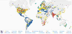
Waking up Saturday morning to witness the greatness of The English Premier League is done by millions of Americans each and every week. For some it is somewhat of a religion, while for others it may just be a slight interest. But one thing is for sure, the Premier League is by far the world’s most popular and supported soccer competition. It is made up of twenty clubs per season that each play thirty-eight games and ultimately, the team with the most points is concluded the winner. While the Premier League is limited to clubs within the United Kingdom, thenumber of supporters outside of the UK’s borders is incredible. Not only has the league been the leader in TV viewers and fan support for several years, but the backing for every club is prevalent around the world. However, why do certain clubs have more support from North Americans than from South Americans? Why do certain clubs have such popularity in the United States? Questions like these are represented and answered by the Premier League follower map.

This map, produced by Twitter based on the locations of each of the twenty club’s Twitter followers, analyzes the popularity of each club throughout the world. While the stationary view of the map solely allows viewers to asses which clubs are most popular at a glance, the interactive map produced by Twitter allows for more in-depth examination with specific statistics and percentages. The first option presented is the “Find Your Club” function, which allows one to search for a specific club and view all of their supporters. Second, the map offers a “Compare” feature, in which one can select two clubs at once and view the support of solely the clubs selected. Third, a viewer can use the “Popular” feature to determine who the most popular clubs are in a certain area. In addition to these useful functions, the viewer of the map can drag their cursor over a country in order to see the top three most popular clubs and their percentage of support from that individual country.

By creating an interactive map in which viewers can change certain aspects, it allows for more of an understanding about the data. While viewing the changing colors in each region, viewers can comprehend that the loyalty to specific clubs may or may not rely on where they are located. In the form of a map, rather than a chart or data table, viewers are able to better experience and understand geographically where supporters live. With a map, the viewers are more interested in the data presented because instead of reading charts they are more involved in the examination.

In the creation of this map, there are certain things that were included that allow it to be much easier to view. Each country contains different colors, and each color represents a certain club. This allows viewers to glance at the map and clearly determine which club is the most popular in that country. Also, the map is centered on Europe, specifically on the United Kingdom. This makes sense because the majority of the supporters of the Premier League as a whole are from Europe, and lets the viewer of the map glance at every continent at once without any trouble.

With each continent and country having differences in their most popular clubs, the United States of America has an interesting range. The support from the United States is perfectly reflective of the premier league as a whole. The known “Big Four” of the Premier League -Arsenal, Chelsea, Manchester United, Liverpool- dominate the top four most popular clubs of the UnitedStates. At 21.08%, Arsenal tops the list, with Chelsea, Manchester United, and Liverpool following in that order. While looking at this map, it makes the viewer think about the relationship between British soccer clubs and American supporters. While millions view the Premier League matches every weekend, one may wonder why Americans support these certain clubs the most. It may just be that Americans only want to support the best clubs because in reality, not many people like supporting a losing club. However, the impact of advertisement and propaganda can also be discussed. In this league, clubs with the most amount of money are usually the most successful. With success in the league, the clubs are able to gain more support and bring in more income from TV contracts and advertisement deals, and in turn have more success as they can then buy better players from other clubs.

Twitter allows for the viewer to get a general idea of where loyalties lie, but is not completely accurate in the production of this map. While data is based on each club’s twitter followers, not every supporter of every club has a Twitter account or even follows their favored club if they do have an account. Thus, the representation cannot be fully trusted because of the lack of substantial evidence. However, with the data that was obtained, Twitter has created an easy and accessible platform for learning about the popularity throughout the world of English Premier League clubs. Now, the millions of viewers across the United States who spend their Saturday mornings watching their favored clubs can fully appreciate and understand the amount of support others also have for their club. Personally, as I wake up tomorrow morning I will be glad to know that there are thousands of others, 18.02% of the United States population to be exact, that are rooting for Manchester United alongside of me.

Sources:

https://interactive.twitter.com/premierleague/#?mode=team&teamId=all

Posted in Maps of the Week | 3 Comments

Atlas of the Week: The Atlas of Design

With popularity of the internet increasing exponentially over the past few decades, modern cartographers have had to compete with colorful, vibrant, and eye-catching maps on the internet that appeal to the masses. These types of maps are often inaccurate and almost degrading to the art of cartography. This atlas, called the Atlas of Design, attempts to combine both eye-catching displays and a preservation of the art of cartography. This atlas includes anything and everything from bears in Finland to UFO sightings in the United States.

http://atlasofdesign.org


Posted in Atlases of the Week | Comments Off on Atlas of the Week: The Atlas of Design

Map of the Week: How Americans Die Abroad


By: Ben Hart

In 2016, nearly sixteen million Americans travelled abroad, that’s only about five percent of the United States’ population, however. “Why are so few Americans travelling abroad?”, you might ask. This map may be the answer why.

Americans love this country, we cherish it, become attached to it almost. We like what is comfortable and easy, that’s just a part of our culture. And for the most part, travelling is not easy. We give so many reasons not to travel, like the weeks of planning it takes, the huge amounts of money, not to mention the stress and worry, for most Americans to even consider it. However, behind all of these excuses we give not to travel underlies one universal reason: we are afraid. Our fears of the unknown inhibit our sense of wonder and innate curiosity we have about the world. I would argue that a large majority of Americans have a real interest in learning more about our world through travel, but their fears about being dropped into a foreign country full of strangers, language barriers, culture shock, and dangerous people and activities stops us from ever booking that plane ticket. This map reinforces that belief.

Within this map, there are nine categories a country can belong to, which include accident, drowning, homicide, car accident, disaster, terrorist action, drug related, suicide, motorcycle accident, and air accident. Each country is a single block of color, and each color represents one category. One question that comes to mind at first glance is: why is most of Africa not represented? I think the obvious answer here is that very few Americans travel to Africa, thus the U.S Department of State, where the data was taken from, does not have any data to represent those countries. The map utilizes a Mercator projection, which enlarges the poles and “shrinks” the equator, and places the United States to the left. If the map were to employ an “America centric” projection, with the United States in the center, it would have to split up Asia. Since countries other than the US are the main subject of this map (although Americans are also the subject), it makes sense to put the US to the left.

That being said, there are a lot of things I dislike about this map. The first of these is that this map enforces a lot of stereotypes about the dangers of travelling abroad to places deemed “unsafe” by American society. As Americans, we consider every so-called “third world” country (countries in Africa, South America, Asia, Southeast Asia) to be unsafe, full of drugs and terrorism. The map reinforces a lot of stereotypes about the dangers of non-western countries. Some American stereotypes about the third world include: Mexico: Murders and drug dealers, South America: drugs and bad roads (like the infamous Road of Death in Bolivia) Middle East: terrorism, Africa: unsafe, poor, Southeast Asia: drugs, prostitution, motorcycles. All of these previously held stereotypes about how dangerous the rest of the world are highlighted, in bright pastel colors in this map. This map only makes Americans fear travelling abroad even more. However, this should not be the case. After looking at the actual data from the US Department of State and other sources, I found out that this map is incredibly biased and placed out of context.

Here is why.

Over the past thirteen years, only 827 Americans have died of unnatural causes overseas each year. Considering how many Americans travel abroad each year, the chances of an American dying while travelling abroad is 0.00005169%. That number is incredibly small. However, that number is not represented at all in this map. This map severely inflates this fact by making it seem like a lot of Americans die abroad and deem certain countries unsafe simply by assigning it a color. The average viewer will look at this map and think “So many Americans die abroad, the whole world is dangerous”, when that simply is not true. This map perpetuates the fear that Americans have about travelling abroad, when in reality a very small percentage of Americans die.

I’d like to point out another reason why this map is deceiving. The way this map is laid out makes it so that each country can only be defined by one category. This leaves room for a lot of error concerning the accuracy of the data represented. For example, Mexico had the highest number of suicides by Americans compared to any other country (250 since 2002), however, that fact is ignored, since more Americans die by homicide (843). This is still an important fact, although that simply cannot be represented through this map. Here is another interesting point: Mexico has the highest death rate among American visitors. However, this is not something that is represented in the map. In fact, larger countries like Russia, Canada, and Brazil (large swaths of color) make it seem like those countries have higher death rates simply due to the fact that they are big, vibrant, and immediately catch your attention.

A question that arose in my mind when I was analyzing this map was, why would the U.S. Department of State create a map like this? I think that the creators of this map did not have the intention of scaring off cautious travelers by providing them with information that may influence their decision on where to travel, if at all. I do think however, that the creators wanted to ensure the safety of American citizens through a visual display of the dangers of foreign countries. Although I don’t think they realized that this map likely dissuades many Americans from ever getting on an airplane because they deem the rest of the world unsafe. The creators were perhaps unaware of the implications that came along with such influential information.

Now, let’s point out this massive yellow swath of color that overwhelms most of Europe and Australia with the label “suicide”. The overwhelming yellow color generates a question in the mind of the viewer: why are so many Americans going abroad to commit suicide? Suicidal people are often plagued by a number of issues and problems that establish a feeling of helplessness and extreme sadness in the mind. Sometimes, these individuals actually run away from their problems by getting as far away from them as possible: international travel. One of the most common places for Americans to do this is Europe. In addition to this, living in a foreign country is often times lonely. Both the language and the culture barrier makes it hard for “outsiders” to fit in. Not surprisingly, suicide rates abroad are the highest among the elderly and the young. A lot of these elderly include retirees and expats. The final reason for the high suicide rate is that many Americans have dual citizenship with European countries, however, when they return home they often feel out of place or like they don’t fit in with either country or culture.

Although I dislike this map for a number of reasons, it does make a point. That point being, a few Americans, each year, do actually die abroad, and a level of caution and care should be taken to ensure personal safety. The world is not completely safe, but most of it is not dangerous either. It’s somewhere in between, and this map fails to realize that fact. What this map has made me realize is that a majority of Americans simply don’t travel abroad either because of a lack of interest or a fear to do so. In addition, this map hints at the fact that Americans typically don’t travel anywhere besides Europe. Travelling to places like South America or Southeast Asia are almost considered taboo because we think they are too dangerous, thanks to both society’s warped view of the rest of the world, and resources like this map.

Sources:

https://travel.trade.gov/research/monthly/departures/

https://www.huffingtonpost.com/william-d-chalmers/the-great-american-passpo_b_1920287.html

https://thepointsguy.com/2017/01/record-number-of-americans-traveled-abroad-2016/


Posted in Maps of the Week | 4 Comments

Team Map Presentation—Atlas of Disease: World Distribution of Spirochetal Diseases

The Atlas of Disease: World Distribution of Spirochetal Diseases was created under the director Dr. Jacques May in 1950 during the Cold War period. Developed under the collaboration of three powerful organizations: the American Geographic Society, the U.S. Armed Forces, and the international pharmaceutical corporations, this map was included in a map series that documented the global spread of various diseases. Particularly, this map embodied the idea of “medical geography”, as it sought to demonstrate a connection between the geographical location of disease and the underlying social, cultural, and economic features of the environment during this period of time. In fact, this was a period of rapid decolonization for Africa that resulted in the emergence of a great number of newly formed countries, which were viewed as strategic forces as the tension between the US and USSR was increasing. Through the three producers of this atlas, it is evident that each group had particular interests that it wished to transmit through the; with all of these context and factors combined together, the Atlas of Disease lived an extremely rhetorical life and was used as a Cold War Propaganda.

Just as we discussed in class that a map always has a purpose no matter how neutral it looks, this map had a very scientific and technical display to seem “objective”, yet indeed contained strong hidden political implications as a propaganda. Serving as a powerful visual discourse, this map produced a distinct division, even a hierarchy, between the First and “Third” World countries, between the healthy and the sick. This segregated the “Third World” countries into a place of illness, defining illness as a political, cultural, and economic phenomenon of strategic interests in scientific, commercial, and political contexts during the Cold War. This constrained a “Third World” identity, and communicated the roles of these developing countries during the time.

These purposes of the map was hidden yet intensified by several elements on the map. One of the most powerful element that contributed to the influence of the map was the use of photography. The photos were placed purposefully over the center of the Northern Hemisphere, clearly exhibiting the assumption that there was no impurity in the first world countries; these pictures also created direct boundaries as to what countries were considered clean or contaminated. Additionally, only pictures of children, instead of adults, were shown as the visual symptoms, sparking a more emotional pull to the map. Moreover, the projection used to create the map—the Briesemeister projection—presented the land masses more centrally with lower distortion, making Africa the main focal point. The bold crisscrossed line plagued the African landscape, creating contrast with the deep colors that represent the spirochetal disease. With this projection, Africa became the least distorted of all the continents in this projection. Another notable element on the map was the color used, that there was only one main color as the authors intended for a simplistic approach when coming to the actual map.

Overall, May’s map emphasized the importance of modernization and development in the world through a powerful visual discourse that created a sympathy and fear illness for the audience. It reminded the audience that the development during the Cold War did not rely on a complete altruism. Instead, it equated Americans’ self-interest with the development interest of the rest of the world, serving as an American propaganda that helped heighten American power during the Cold War.

Thank you for reading!

Sincerely,

Lucy and Sarah

Posted in Uncategorized | Comments Off on Team Map Presentation—Atlas of Disease: World Distribution of Spirochetal Diseases

Atlas of the Week: The World Atlas of Coffee


This week’s atlas in called “The World Atlas of Coffee: From Beans to Brewing — Coffees Explored, Explained and Enjoyed.” This atlas shows where coffee is grown, who grows it, brewing methods and the world consumption of coffee. It covers coffee history country by country showing the key growing regions and taste profiles of the countries that produce the best coffee in the world. The Atlas is organized by continent and further specified by country or region with different colors dividing the brew. There is also maps of growing regions, detail maps and charts explaining the differences in growing regions within certain countries. American is the leading consumer of coffee with Americans averaging about 400 million cups of coffee per day, so all the coffee lovers out there should check out this atlas!

27 Best World Atlases For Map Lovers In 2017

Posted in Uncategorized | Comments Off on Atlas of the Week: The World Atlas of Coffee

Blog of the Week

The blog of the week this week is called “The EPA Blog: Cool Map.” This blog has different articles about different maps the authors have studied. For example, there is a map representing snowfall in 2012, a treasure map, a map mapping generic terms for streams in the U.S. and more. The maps are exotic and interesting and the bloggers analyze each one in their own way. It also talks about EPA’s new technology tool called NEPAssist that allows you to spatially discover the world around you from an environmental perspective. I enjoyed reading this blog, check it out if you are interested!

https://blog.epa.gov/blog/tag/cool-map/

Posted in Uncategorized | Comments Off on Blog of the Week

Map of the Week: What Makes Our World Go Round?

How do countries rely on each other? What comes from where? What makes the world go round? You may often wonder where exactly your diamond earrings came from or where exactly the coffee beans that made your morning coffee were grown…chances are the location you’re looking for could be much further away from home than you may think. The diamonds on your ears could be from the Dominican Republic and the coffee in your cup could have originated in Ethiopia. All countries rely on each other heavily for each others commodities and this is one aspect that makes the world go round.

In the “Commodities that Make the World Go Round Map,” produced by the Bank of America Merrill Lynch for their Transforming World Atlas, it is evident how countries rely on each other for basic necessities, as well as luxuries. This map shows each country’s main export. The exports were divided up into different groups and are represented by color, thus the map is very colorful, which automatically grabs your attention. There are nine categories the exports fit into, that are shown in the legend, which include: food/drink, oil, metals/minerals, textile/apparel, precious metals/minerals, machinery/transportation, wood products, electronics and other. The map is dominated by dark blue which represents oil. Our world depends on oil for transportation and humans are always on the move. In order to get the exports displayed in this map to its different recipients, oil is being used to transport it, thus an enormous amount of oil is used daily which makes it no surprise that the map is covered in dark blue. The Middle East, Russia, Central Asia, a big part of North Africa, Nigeria, Angola and Norway are all countries that are exclusively blue. Ecuador, Colombia, Venezuela, Bolivia and Indonesia also are blue. Not only are these countries shaded blue, the type of oil used is also specified. For example, Russia’s main oil export is Petroleum and Petroleum products, whereas Libya’s main oil export is crude oil and Bolivia’s is natural gas. This emphasizes the diversity of main exports under the subcategory of oil and how heavily it is relied on. This heavy reliance on oil makes the world one major commodity of oil. Oil is relied on everywhere, even if it isn’t a country’s main export, thus the main commodity of the world as a whole is oil.  

Red and Orange are also dominating colors on the map. Red represents precious metals or minerals and orange represents non-precious metals and minerals. Red is present in parts of Africa, India and Belgium. Gold, diamond and platinum make up a large part of  the African metal economy and India mines and trades diamonds. Although Belgium does not naturally have as many precious metals or minerals, it is home to the world trade center for precious stones which makes it a huge part of the metal industry. Australia, Mongolia and parts of Africa and Europe rely on non-precious metals and minerals for their economy. These countries focus on quantity rather than quality. For example, coal, copper aluminum, and rubber fall under this category, they are not as precious as gold or diamonds, however they are mass produced and used more frequently. The United States and China both fall under the green or electronics category which is very fitting because both countries are very technologically advanced leading the world with their technological inventions.

But why commodities? Why did the Bank of America chose to focus on just commodities for this map? The data for this map was obtained in 2014 from the CIA World Factbook, but was produced by the Bank of America Merrill Lynch. It is significant that a bank produced this map because this gives the reader explanations for some of the choices made within the map. Banks would be interested in commodities worldwide because they have the opportunity to profit off these commodities. Specifically the Bank of America chose to focus on exports in order to study where they have investments and where they should invest. This map gives the reader insight of each country’s economy and how stable it is, for example it is clear which country is stronger between one that is running on tea and one that is running on oil. For major banks like Bank of America, it is important to know the economic standing of each country in order to invest in the strongest places and profit the most. Condensing the map down to only representing exports also shows the political piece of this map, it emphasizes economics in the world. The fact that the data was obtained from a U.S. government source further emphasizes the political aspect in the map. The economy and the cycle of trading between countries is very important to countries like the United States which is shown clearly by labeling each country with their main export. This makes country seem like they are strictly a source for a commodity instead of a country.  From an economic viewpoint, it makes it easier to judge each country’s economy.

When observing this map from the perspective of Wood one may ask who created this map and why? Why did the mapmaker decide to project Africa in the center of the map and not the United States? This map is very proportional, no country is greatly distorted and even though Africa is centered there isn’t a big emphasis placed on the country, it is a standard projection. Each continent is divided by color accordingly, so the map reader gets a clear, organized view of each country’s main export.

According to Wood, maps are cultural products, history and culture comprise a map. He would ask about the intentions of the mapmaker and the cultural significance within this map. This map was created with a clear purpose: to show the main export of each country which reveals the main part of each country’s economy. However, it also relays information about each country’s culture and history. Each country relies on something different to stimulate their economy which means this export is a big part of their culture. For example, the country of Mali, in Africa, has a main export of cotton. This means agriculture is a main focus here providing jobs and money to its inhabitants through its cotton farms and production. This also shows that Mali has a history of cotton making that has contributed to the development of the country as time has progressed. Argentina’s main export is soybeans which means that agriculture is a big part of their culture as well. Thus, one can infer that at least some of the soy they consume in foods like bread, crackers, cakes, cookies and more, could have come from Argentina. This map allows readers to pinpoint the origins of specific things by learning the main export of each country.

So what does make the world go round? There isn’t one easy way to answer this question, but one piece of the answer can be found in this international commodities map.

Sources:

Wood, Denis. The Power of Maps. The Guilford Press, 1992

“See Which Commodities Make the World Go Round,” Big Think, last modified April 14th, 2017, http://bigthink.com/strange-maps/see-which-commodities-make-the-world-go-round

Posted in Uncategorized | Comments Off on Map of the Week: What Makes Our World Go Round?

Blog of the Week: Geographicus.com

This blog, founded by Kevin James Brown in 1999, continues to actively produce maps and critiques of maps from all time periods and all continents of the world about several topics. One particular map which caught my eye was of a plan from 1811 on the commissioner’s plan of Manhattan. The map can be related to the current map of the city, and it is interesting to see which parts they eliminated from the actual island. Overall, this map shows a lot of cool maps, especially ones on countries that we don’t often get to hear about. There is also a mysterious destinations section, which showcases different areas, landmarks, and bodies of water that are suspicious. Hope you enjoy the blog!

Blog: https://www.geographicus.com/blog/

Posted in Uncategorized | Comments Off on Blog of the Week: Geographicus.com