
Source: http://www.bigmapblog.com/2013/map-of-hawaii-rand-mcnally-191/
A map’s power derives from the decisions of what to include made by cartographers, which have an immense impact on their underlying meaning and importance. It is not apparent from a brief glance at a map, but the individual choices have the ability to completely change how a map is used and viewed. Dennis Wood even describes maps as “the interests of their authors in map form” (Wood, 71). This 1912 Rand-McNally map of Hawaii is a great example of this. At first, it seems to be a normal cut and dry map, which it partially is, but many decisions went into this map altering the audience’s view of it. The Rand-McNally cartographers decided how to obtain the information pertinent to this map, where to focus it and what colors to use, and the placement of various aspects.
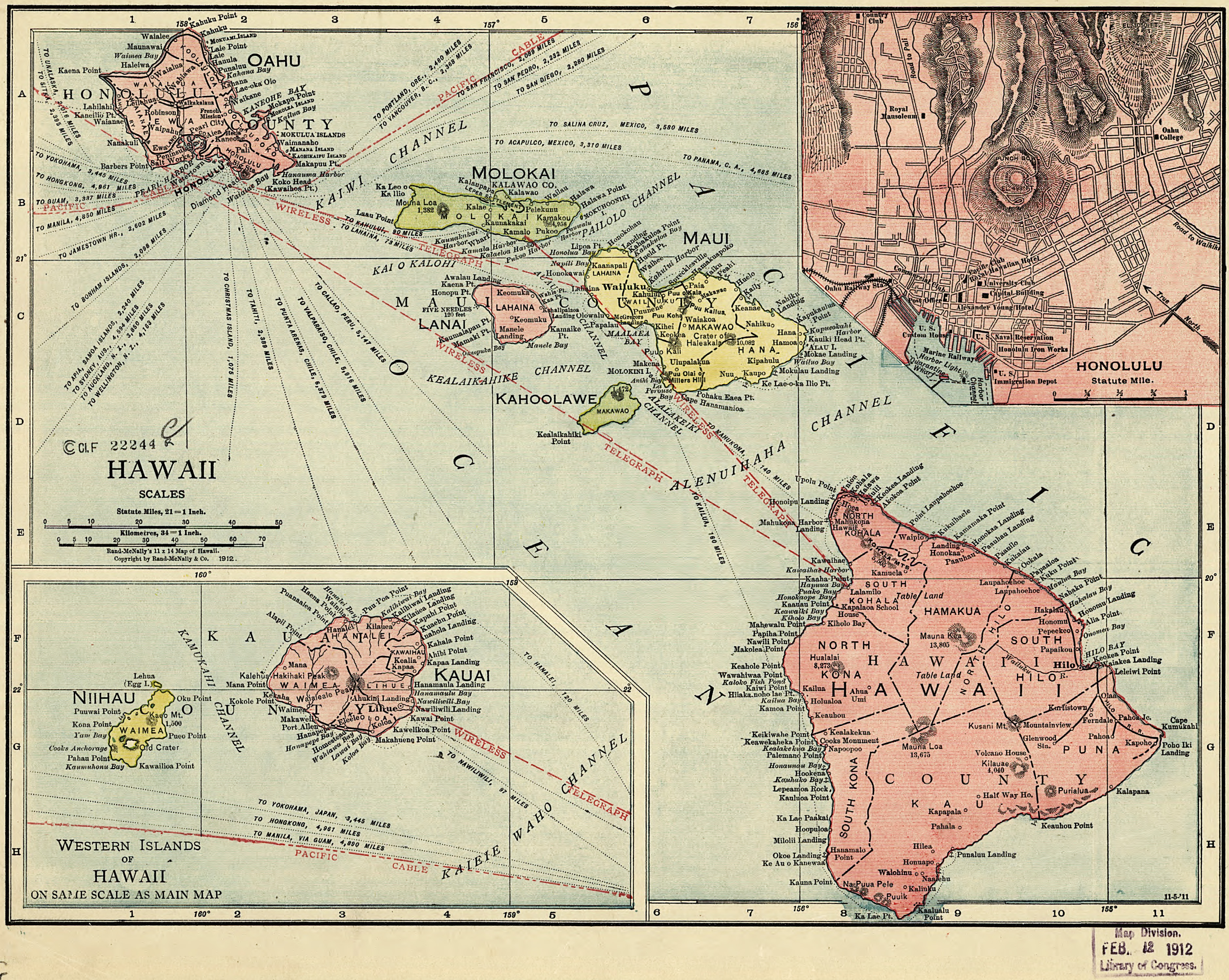
Cartographers obtain the ability to shape a map right from the beginning of the process in what to map and how to go about doing so. As Rand-McNally is a well-known industrial map-making company, this map would seem bland to look at. It was probably created for the common classroom or a household, but not much more. This makes observers wonder why in fact would they create this map of an island 47 years before it formally becomes a state in the Union (gohawaii.com). Interestingly enough, in 1912 and the years just prior, Hawaii was sort of making a name for itself, becoming more visible to the mainlanders (Americans in the contiguous 48 states). For example, in 1910 Honolulu, the capital of Hawaii, became one of the first cities in the world with dial telephone services. Then in 1912, Bird of Paradise, a Broadway play, was introduced to New Yorkers, making Hawaii more present (hawaiihistory.org). Americans had been involved with Hawaii in ways of poachers and large companies such as YMCA, but through these few years more common Americans were becoming aware of the small group of islands. One can only speculate that maybe the more prevalent Hawaii became to Americans, the larger was the demand for a map of the region. Now that the cartographer decided what the map would be of, data must be collected. The problem lies in how and from where the information is obtained. In 1912 there were not satellites floating around the world taking in depth pictures, and the flying capabilities were not very strong. Due to this we are left to ask where the information used to define borders and distances come from. This is a huge question that comes with the creation of a map because one does not know if the data is reliable or even accurate.
The colors used and the focus of the map are two major decisions that can alter how an audience views it. The distinction of color is clear on this map. The separate islands of Hawaii are clearly and perhaps purposefully shaded differently, with the big island and Oahu shaded red. Along with this, the center of the map is focused over the ocean with the two islands of Maui and Lanai nearest. What is so grabbing is that Hawaii island and Oahu are arguably the two main islands (both shaded red), which grab the audiences attention first. Then, almost as an attempt to not have the other islands forgotten, the center is not on either. The same color and the focus could easily be coincidence and a lack of space, yet it is thought provoking that the cartographer chose these.
Another choice given to the cartographer which can drastically affect a map is the placement of various objects and pictures. For example, almost every map will have a compass rose designating the four cardinal directions, and this one does not fail. Ironically the stand out feature of this compass rose is that it does not stand out. In fact, the compass rose is almost hidden in the top right corner, making directions either understood subliminally, or seemingly not important. Also, the deliberate choice to put a smaller map of Honolulu in the corner is thought provoking. First, one wonders if it was chosen as a highlight only because it is the capital of the island chain or for a separate reason. Then, it is remarkable how it clearly shows the different roads in downtown, yet there are no street names. Also only some buildings are labeled. This is problematic because this mini map can only be used to check if something exists, but even then many buildings that are there are not marked or labeled. In actuality, this close up of the city does not have many practical uses.
This Rand-McNally map of Hawaii may seem like an ordinary map, but the decisions made by the cartographer have a huge impact on the finished product. Even from the beginning of the process with the question of what to map and how, the mapmaker has a large effect. It is not only this map of Hawaii that is affected by decisions; every map has its information and gaps of it, and it is these differences that drive the effect a map has on its audience.
-Michael Beck
Works Cited:
Wood, Dennis. The Power Of Maps. New York, NY 1992. Print
http://www.hawaiihistory.org/index.cfm?fuseaction=ig.page&year=1912
Hello,
Is it possible to use any of your images in a website please. I am happy to provide links to you etc..