
How do countries rely on each other? What comes from where? What makes the world go round? You may often wonder where exactly your diamond earrings came from or where exactly the coffee beans that made your morning coffee were grown…chances are the location you’re looking for could be much further away from home than you may think. The diamonds on your ears could be from the Dominican Republic and the coffee in your cup could have originated in Ethiopia. All countries rely on each other heavily for each others commodities and this is one aspect that makes the world go round.
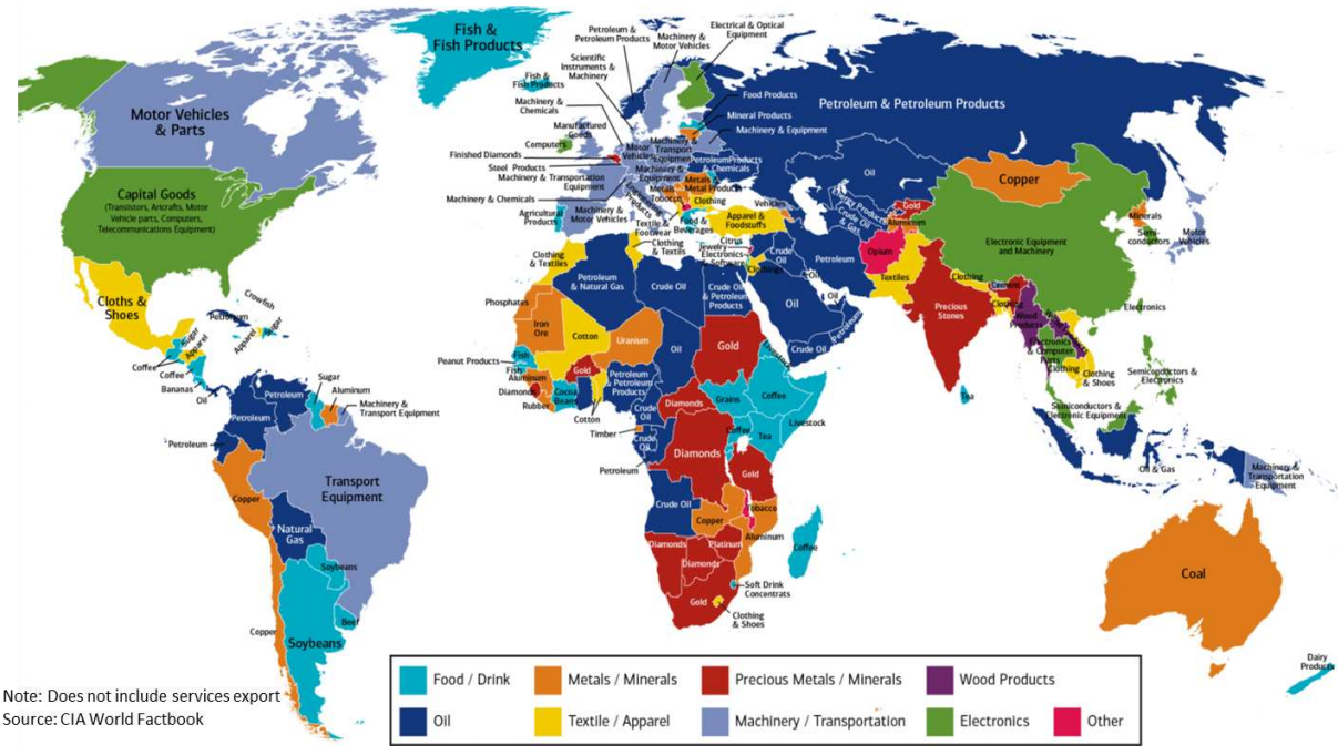
In the “Commodities that Make the World Go Round Map,” produced by the Bank of America Merrill Lynch for their Transforming World Atlas, it is evident how countries rely on each other for basic necessities, as well as luxuries. This map shows each country’s main export. The exports were divided up into different groups and are represented by color, thus the map is very colorful, which automatically grabs your attention. There are nine categories the exports fit into, that are shown in the legend, which include: food/drink, oil, metals/minerals, textile/apparel, precious metals/minerals, machinery/transportation, wood products, electronics and other. The map is dominated by dark blue which represents oil. Our world depends on oil for transportation and humans are always on the move. In order to get the exports displayed in this map to its different recipients, oil is being used to transport it, thus an enormous amount of oil is used daily which makes it no surprise that the map is covered in dark blue. The Middle East, Russia, Central Asia, a big part of North Africa, Nigeria, Angola and Norway are all countries that are exclusively blue. Ecuador, Colombia, Venezuela, Bolivia and Indonesia also are blue. Not only are these countries shaded blue, the type of oil used is also specified. For example, Russia’s main oil export is Petroleum and Petroleum products, whereas Libya’s main oil export is crude oil and Bolivia’s is natural gas. This emphasizes the diversity of main exports under the subcategory of oil and how heavily it is relied on. This heavy reliance on oil makes the world one major commodity of oil. Oil is relied on everywhere, even if it isn’t a country’s main export, thus the main commodity of the world as a whole is oil.
Red and Orange are also dominating colors on the map. Red represents precious metals or minerals and orange represents non-precious metals and minerals. Red is present in parts of Africa, India and Belgium. Gold, diamond and platinum make up a large part of the African metal economy and India mines and trades diamonds. Although Belgium does not naturally have as many precious metals or minerals, it is home to the world trade center for precious stones which makes it a huge part of the metal industry. Australia, Mongolia and parts of Africa and Europe rely on non-precious metals and minerals for their economy. These countries focus on quantity rather than quality. For example, coal, copper aluminum, and rubber fall under this category, they are not as precious as gold or diamonds, however they are mass produced and used more frequently. The United States and China both fall under the green or electronics category which is very fitting because both countries are very technologically advanced leading the world with their technological inventions.
But why commodities? Why did the Bank of America chose to focus on just commodities for this map? The data for this map was obtained in 2014 from the CIA World Factbook, but was produced by the Bank of America Merrill Lynch. It is significant that a bank produced this map because this gives the reader explanations for some of the choices made within the map. Banks would be interested in commodities worldwide because they have the opportunity to profit off these commodities. Specifically the Bank of America chose to focus on exports in order to study where they have investments and where they should invest. This map gives the reader insight of each country’s economy and how stable it is, for example it is clear which country is stronger between one that is running on tea and one that is running on oil. For major banks like Bank of America, it is important to know the economic standing of each country in order to invest in the strongest places and profit the most. Condensing the map down to only representing exports also shows the political piece of this map, it emphasizes economics in the world. The fact that the data was obtained from a U.S. government source further emphasizes the political aspect in the map. The economy and the cycle of trading between countries is very important to countries like the United States which is shown clearly by labeling each country with their main export. This makes country seem like they are strictly a source for a commodity instead of a country. From an economic viewpoint, it makes it easier to judge each country’s economy.
When observing this map from the perspective of Wood one may ask who created this map and why? Why did the mapmaker decide to project Africa in the center of the map and not the United States? This map is very proportional, no country is greatly distorted and even though Africa is centered there isn’t a big emphasis placed on the country, it is a standard projection. Each continent is divided by color accordingly, so the map reader gets a clear, organized view of each country’s main export.
According to Wood, maps are cultural products, history and culture comprise a map. He would ask about the intentions of the mapmaker and the cultural significance within this map. This map was created with a clear purpose: to show the main export of each country which reveals the main part of each country’s economy. However, it also relays information about each country’s culture and history. Each country relies on something different to stimulate their economy which means this export is a big part of their culture. For example, the country of Mali, in Africa, has a main export of cotton. This means agriculture is a main focus here providing jobs and money to its inhabitants through its cotton farms and production. This also shows that Mali has a history of cotton making that has contributed to the development of the country as time has progressed. Argentina’s main export is soybeans which means that agriculture is a big part of their culture as well. Thus, one can infer that at least some of the soy they consume in foods like bread, crackers, cakes, cookies and more, could have come from Argentina. This map allows readers to pinpoint the origins of specific things by learning the main export of each country.
So what does make the world go round? There isn’t one easy way to answer this question, but one piece of the answer can be found in this international commodities map.
Sources:
Wood, Denis. The Power of Maps. The Guilford Press, 1992
“See Which Commodities Make the World Go Round,” Big Think, last modified April 14th, 2017, http://bigthink.com/strange-maps/see-which-commodities-make-the-world-go-round