
Source: http://www.worldmapper.org/display.php?selected=169/
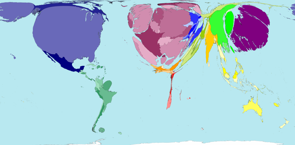
The gap between the world’s rich and poor is inconceivable. Worldmapper’s GDP Wealth map attempts to demonstrate the extent of this disparity by showing the shockingly disproportionate gross domestic product of each of the world’s countries, relative to each other. Worldmapper is a website that creates hundreds of such cartograms, embodying a variety of categories on a global level from languages to pollution to services. Land area on this particular map corresponds to the country’s GDP, not population or area. Color families are used to distinguish different regions, and shades differentiate between countries. The US, Western Europe, and Japan clearly have the highest GDP, while African and many Asian countries have the lowest. This map is effective because it quickly communicates the inequality of wealth in the world, and leaves a lasting impression on the viewer. By doing so, it reinforces the notion that cartography can be employed to present a strong argument about the ideas it represents.
The first thing one notices when looking at this map is how disproportionate the countries are. We instinctively label the map as inaccurate or skewed. However, it can also be argued that we have remarkably skewed perception of the world itself, and perhaps a biased map is more accurate than an unbiased map in this instance. The GDP Wealth map succeeds in showing us our own inflated views of ourselves and our lifestyles. Much as in life, our gaze is drawn to those with power and money, and we often try not to think of those less fortunate. To exemplify this, the map literally reduces the poor to silences. We tend to think of ourselves as living average lives. By no means are the lives we live as Americans average. Roughly 80% of the people in the world live on less than $10 a day, and nearly 50% lives on less than $2.50 a day. The stereotypical “average American” would never survive on this budget. The numbers get more frightening: a billion of the world’s 2.2 billion children live in poverty. An estimated one billion people are illiterate because of lack of adequate education. Basic human needs are not being met for astronomical numbers of people. 640 million people (twice the population of the entire US) live without access to adequate shelter. 1.1 billion people live without access to adequate water, and 2.6 billion (over a third of all people) live without access to basic sanitation. Additionally, an entire quarter of the world lives without electricity (Poverty Facts and Stats). The GDP Wealth map does not attempt to hide its bias and argument about world inequality, and its honesty makes it all the more effective.
No map is perfect, and likewise this map is not without flaws. It is just a snapshot of ever-changing economies, based on 2004 data. It has no doubt shifted since, but the general trends are still present and by no means has the world’s GDP evened out. Also, countries with smaller populations are naturally going to be depicted as smaller on the map, because fewer people are contributing to the GDP. In this case less populous countries may appear to be less wealthy, but their per capita wealth may be comparable to countries that appear much larger. Additionally, the map does not contain a legend, so its assertions of wealth are purely proportional. The mapmakers may have felt that their argument about discrepancies in global affluence is self-evident in the layout of the map, and therefore a legend would be redundant and unnecessary. Further, by not including any text on the map whatsoever, the mapmakers require viewers to have substantial prior knowledge about what the world looks like for a basis of comparison.
This map also hints at the opportunity for great inequalities in international relations. Countries that are tiny in terms of GDP are straining, and the focus is on countries bursting with wealth. Africa and parts of Asia are virtually nonexistent on the map, perhaps symbolizing the infinitesimal control many countries in these regions have over foreign policy issues. Countries with more wealth have unimaginable influence over those without. To a country overcome by debt and poverty, assistance is eagerly accepted no matter what strings are attached. The inequality between people of different countries can best be described by GDP PPP, the per capita purchasing power of citizens in a given country. The CIA World Factbook reports that the US, ranked fourteenth in the world, has a per capita GDP of $50,700. Conversely, the Democratic Republic of the Congo, one of the poorest countries in the world, has a per capita GDP of $400. Further, the world’s poorest countries, comprising 2.4 billion people (a third of the global population), only produce 2.4% of the world’s exports, which greatly limits their power on a global level. The map enunciates these discrepancies with its use of size and projection. Unlike the Peter’s projection or Mercator projection, the GDP Wealth map manipulates land area to correspond to a country’s wealth and thereby accentuates disparities across the globe.
In short, this map makes a strong statement about the startlingly unequal distribution of wealth in the world. The GDP Wealth map points out our inflated lifestyle while also bringing attention to the fact that poverty is the only reality for many people. Its depiction of squeezed poorer countries is remarkably metaphorical, much like its portrayal of richer countries that appear to be bursting at the seams. The image is almost grotesque—its wrongness is unsettling and to a degree repulsive. Naturally, this grossness translates to a clear condemnation of the world’s extreme inequality. Instead of using cartography as an instrument of power, Worldmapper actually employs this map to question power on a global level. Despite its flaws, the GDP Wealth map is more than qualified to be the map of the week, as it not only argues that some countries are inordinately richer than others, but also that a map that doesn’t disguise its political argument can actually be more accurate and enlightening in the long run.
-Sophie Holmes
Works Cited
“GDP Wealth.” Worldmapper: The World as You’ve Never Seen It before. N.p., n.d. Web. 21 Oct. 2013. <http://www.worldmapper.org/display.php?selected=169>.
“Poverty Facts and Stats.” Global Issues. N.p., n.d. Web. 21 Oct. 2013. <http://www.globalissues.org/article/26/poverty-facts-and-stats>.
“The World Factbook.” Central Intelligence Agency. N.p., n.d. Web. 21 Oct. 2013. <https://www.cia.gov/library/publications/the-world-factbook/rankorder/2004rank.html>.
This is an integral addition to our blog Sophie, and a really fascinating map that you found, as well as a really important one. I love the approach that you took with this, focusing primarily on the statement that maps and this map in particular make. This is a map that was stripped bare and displayed almost naked, with only one defining piece of information. I really agree with you, I feel like this is a map that recognizes political statements and biases, and attempts to simplify it as much as possible in order to clarify the lack of care it takes to disguise any political statement. It also, however, seems to accept these political statements, so it is simply doing the absolute bare minimum to portray a certain piece of information. And the way i goes about this is extremely innovative and takes a whole new perspective on cartography and even space. The map makes me think about what our priorities are when looking at a map. When you really think about it, size of the land is hardly the most important thing to consider for a map. This map really allows us to open our minds a bit more and see maps differently. Thanks for a great addition, Sophie!