
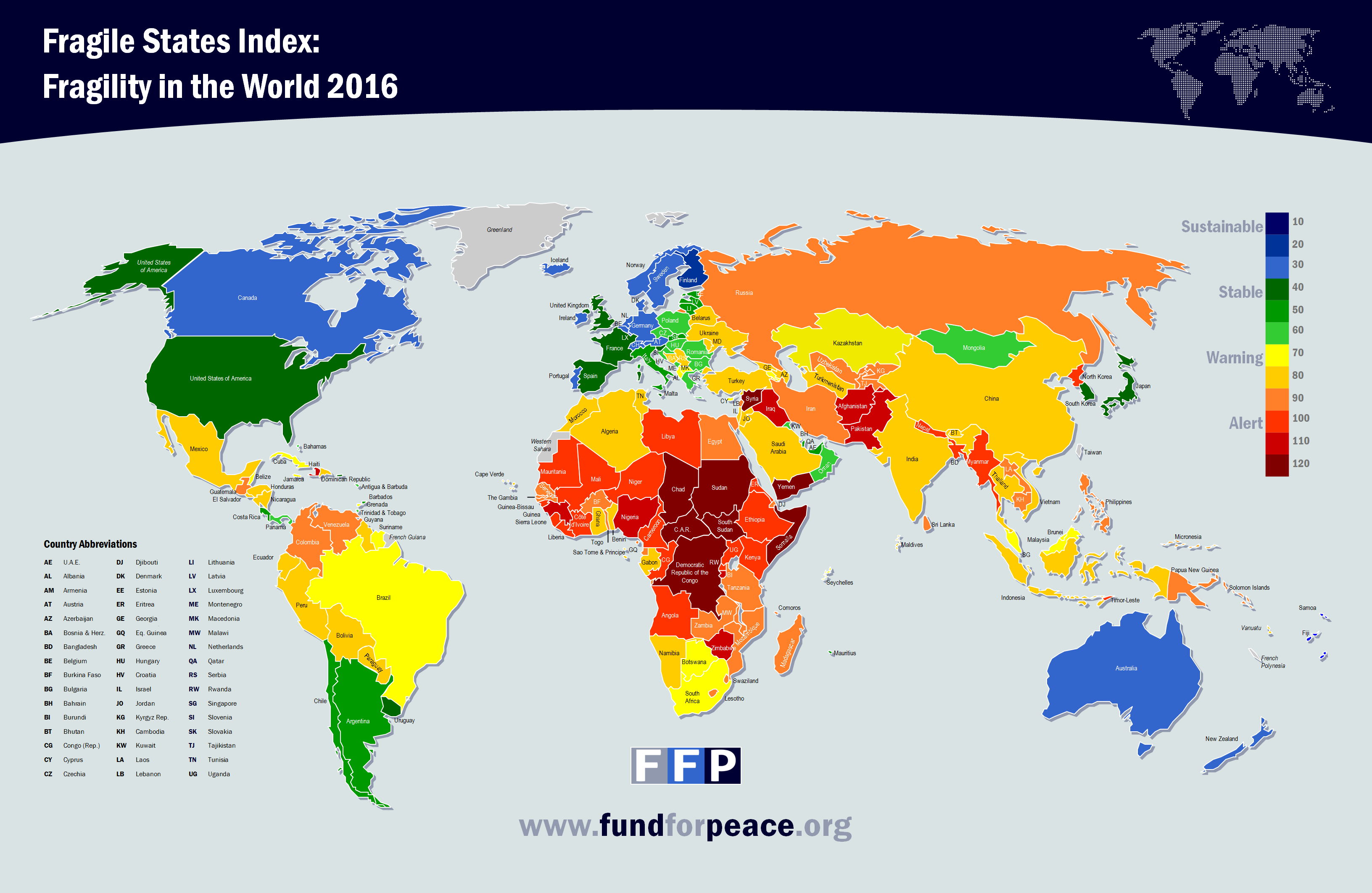
Our map was the 2016 Fragile State Index. It highlights, based upon several criteria, which states are at the greatest risk of collapse, and those which would likely remain stable for the foreseeable future. The categories nations fall into go from blue, being the most stable, to red, being the least stable. The criteria evaluate a country based on Demographic Pressures, Refugees and IDP’s, Group Grievance, Human Flight, Uneven Development, Poverty and Economic Decline, Legitimacy of the State, Public Services, Human Rights, Security Apparatus, Factionalized Elites, and External Intervention. The goal of the map is to predict future conflicts, and thus help to reevaluate public and foreign policy in order to avoid catastrophic conflict.
During our in-class discussions we analyzed the context of the map, and evaluated how the map relates to our previous studies. The map should be able to adequately represent the conflicts going on during the published year, and even predict future events. Some current events evident include the Civil War in Syria and North Korea’s nuclear threats. Still, we failed to see how the criteria, and the portrayal of any data, could be comprehensive or reliable enough to do so. We do not have access to the algorithm, and so cannot see how evidence is weighted. Further, the criteria themselves are dubious, as one issue in a nation could lapse into more than one category.
As for how we used the map to compare Cold War era mapping to the present day, there is a definitive shift in how we view the developing world. In Cold War era mapping, it was more black and white, with developed nations and undeveloped nations, wherein aid given to those nations were performed with the intention of gaining allies against the Soviet Union. In the Fragile States Index, it views the world as more complex, with a gradient view of the world’s stability. Also, in Cold War mapping the only relevant conflict was the impending threat of nuclear war between the United States and the Soviet Union. This is not the case in the Fragile States Index, as there is evidence of many, more complicated conflicts. Furthermore, the Fragile States Index does not uphold the United States to be the shining example for the world. Rather, the welfare based nations of Northern Europe are seen as the example. If this is caused by a bias, it can be attributed to the NGO that organized this project, as they are traditionally left leaning and see safety net policies as indicators of stability.
Even if we dissociate from the possibility of unseen bias, there are still obvious indicators of a political agenda, and more broadly, flaws in the portrayal of the data. For instance, Crimea is still included with the Ukraine. Macau and Hong Kong are considered to be a part of China, despite the fact that they are autonomous city-states (though it is debatable whether that is changing). Their stability should, be all means, be higher than mainland China. Other nations are presented without data, including Taiwan, French Polynesia, Greenland, and Norwegian Svalbard. More problematic is the presented dichotomy between failed and stable states, and the misconceptions that can form from an uneducated eye. Within a failed state there are pockets of wealth and success, while in a first world nation there are regions that would be more closely associated with the third world. The result is an uneducated, marginalizing view of those nations apart from Western society. While there is much that could be gained from an index of this kind, the execution of the data and its portrayal on the map avoid the very intentions set out by researchers in the first place.