
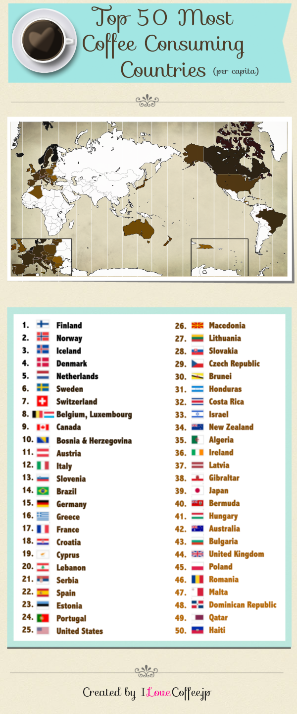
Whether it be Dunkin’ Donuts, Starbucks, or your at home Maxwell House blend, coffee is crucial around the world; this map titled “Top 50 Most Coffee Consuming Countries” is exactly what its name suggests, maintaining uniqueness in its orientation and appearance. It includes a list of the top 50 countries that drink coffee (per capita), accompanied by a map that shades in the most caffeinated countries with a brown pigment. The countries that drink the most coffee have a darker shade of brown, while the countries that are lower on the list have a lighter, almost tan, brown. Finally, the countries that didn’t make the list are an empty white. I think from this map, we can conclude that there is a high prevalence of coffee all over the world. In economic terms, coffee is classified as a normal good, meaning that there is an increase in demand for coffee as a result of an increase in wealth or income. Thus, the countries that have the highest GDP consume, typically, the most coffee.
In addition, the placement of the continents in this map is extremely significant. The map places a focus on Japan, the author’s home nation. Naturally, this would be a logical reasoning behind the placement of continents; still though, itdoesn’t stay true to the purpose of the map. The top coffee-consuming countries are the Scandinavian countries and Canada; surely, one would think the map would be focused on Europe or North American because of these nations. This goes to say a lot about the author; she is firstly and fore mostly a blogger. She tackles the cultural angle of this map and its implications, demonstrating a geographical love for coffee around the globe. In short, her focus isn’t entirely about cartography. Simply, she is a woman with a blog who seeks to represent something she loves and reflect on her home country as well. This map serves as a manner of adapting to new surroundings in the United States, while making the world seem much smaller than it is, democratically demonstrating how coffee affects all peoples of the world, not just those in a particular region.
Furthermore, the inset that she places in the bottom left-hand corner of the map to depict Europe is extremely important to the foundation of the map’s purpose. Europe clearly dominates the map with having almost all of its countries ranked on the “Top 50” list. Therefore, this inset proves to be quite useful to the audience that this map is directed toward. In addition, the other inset on the bottom right-hand corner of the map is showing a close-up shot of the island of Hispañola, consisting of the countries of Haiti and the Dominican Republic. This inset is useful because it is not easily visible at first glance on the entire map; it is necessary to place emphasis on this part of the world, making it known the audience that these countries are ranked as well.
In total, this map speaks a lot about the amount of coffee consumed all around the world, and that it is such a hot commodity anywhere you go, saying much about global caffeine culture. Asia’s area is whiter because of their high tea intake, coffee’s number one substitute. But other than there, North America, Europe, Brazil, Australia, and Japan take the cake when it comes to dominating the coffee world. In this map, the theme of authorship plays a huge part in its creation. The map’s center focuses are coffee and Japan, two things that the mapmaker is passionate about. This relates back to class themes that tell us that maps are simply products of their masters, meant for a purpose while also reflecting on the characteristics and attitudes of their cartographers. In this case, the author of this map not only chooses to express a personal interest in coffee, but also aims to expand her knowledge. As a blogger, she aims for her work to become viral with the capacity to be retweeted and/or reposted elsewhere. Clearly, this map has purpose deeper than realized at first analysis.
This map is a really interesting choice because of its overall uniqueness and because its hard not to like coffee! I really like how at first glance it is just a map of which countries consume the most coffee and how a country’s GDP can have an affect on their consumption. But after first glance you are able to pull the map apart showing how this blogger focuses on Japan, an unusual center point for a world map. You did really good job taking ideas from class while looking at the motives and characteristics of the cartographer. The map does an engaging job at bringing the world together through the international importance of a single everyday product. Overall, this is a really intriguing map analysis!
-Ellen Silka
Your map choice is an interesting choice which includes plenty of economic and social commentary simply by focusing on coffee alone. The projection alone is unique and defied my expectations, but with your analysis of the author’s background the central focus on Japan makes sense. The focus on the map isn’t limited to just the colors or placement of land, but also gives explanation of the colors through the list of top coffee consuming countries, which makes the map more readable and simple. Again, I was surprised that the US wasn’t higher up on the list, and that the countries which actually produce the coffee beans are not even on the list. The top coffee drinkers include mainly Western, established nations. I’d like to see a juxtaposition of this map with a map of coffee producing countries to notice the contrast I’d assume would appear.
Mike, this is a very interesting choice of map. Even though I don’t personally drink coffee I feel that this is still a very relatable map to the rest of the world. I took a chance to look at the map and analyzed it before I read your writing and I couldn’t agree more with everything that you wrote. Like you, one of the first things that stood out to me was the placement of the continents and based off of the authors origins it makes sense why she placed the continents the way that she did. I also liked how you not only went nerd deep into the map but you also discussed how the authors background could have influenced her choices on the map. The maps also showed some things that I did not expect, there were certain countries on the map that I was surprised were not listed and others that I was surprised were included in the top 50. You were also very clear in making these points. I really like how you concluded your essay when you stated that this map is a lot more than what meets the eye. Great job Mike and a very cool choice of map.
-Jack
I really love this map because of its fascinating and unique nature. I think at first a lot of people will only see the obvious meaning of the map: that it maps which countries consume the most coffee. I enjoyed how you went in depth with your analysis and spotted not so obvious things. For example, I was fascinated by the piece of information that stated that there is a correlation between higher GDP and higher coffee consumption. I also found it interesting how despite the most coffee consumption taking place in North America and Europe, the map focuses on Japan, due to the cartographer being Japanese. You make it clear that the author of this map is a blogger first, cartographer second. This map was eye-catching, and therefore a great map to choose because of its nontraditional depiction of the earth, and its topic. I think as college students, we can all relate to the universal need of coffee.
I was more than happy to uncover this great site. I need to to thank you for your time due to this fantastic read!! I definitely enjoyed every bit of it and I have you bookmarked to see new information on your blog.