
Have you ever seen a subway map? Do you ever wonder about the history of transit and the location the map is displaying? The “Map of Chicago rapid transit lines (1926)” depicts a historical period in Chicago when private business was a significant factor in developing Chicago’s early modern transportation systems. For example, by 1900, there were at least 17 distinct street railway enterprises and four elevated agencies each with their individual stations, stops, materials, and expenses.
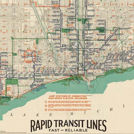
As a result of private enterprise’s involvement in the development of Chicago’s landscape, early transit competition emphasized systematization of retailing, manufacturing, and services in the center of Chicago’s main business district, known as the “Loop.” The “Loop” is “a half-mile-square section of downtown Chicago” consisting of almost 40 percent of the total assessed land value and has “L” lines (History).
This map relates to Dennis Wood’s The Power of Maps. Wood believes maps don’t just represent reality, they shape it. Moreover, Wood explains how maps can invoke a vision and create a sense of hope. Another aspect of Wood’s analysis is that he demonstrates how maps present the audience with what seems like straightforward pieces of data and truth, but they can erase the complexity of past contexts (Wood). The development of Chicago’s transportation system in the 1920s had many cultural and economic effects. For example, Chicago residents decided to distance themselves from the maelstrom of the Loop. On the other hand, upper class Chicago citizens lived in a suitable carriage ride away from the center of downtown. Individuals who could afford to live in these conditions, chose to live in lower density locations (History).
Consequently, the “Map of Chicago rapid transit lines (1926)” conveys the concept that maps are social constructions. Capitalism is presented at the core within this map. Wealthy private business owners bought and designed the new landscape of Chicago’s transit. The results were that lower class citizens faced the challenge of living in lesser developed areas than they already were. On the other hand, the upper class business owners and citizens profited on the new Chicago transit and the businessmen gained even more wealth (Wood).
Similar to Wood’s The Power of Maps, Deconstructing the Map by JB Harley emphasizes how context, conditions, and histories outside the map are just as important as what is in the map itself. Maps function as codes and structures within the mapmaker’s creation (Harley). In relation to the “Map of Chicago rapid transit lines (1926),” by the 1920s, competition, disputes over consolidation and fares, poor management, and the need to satisfy stockholders with profits were causing challenges for the city of Chicago. The city attempted to get the necessary help to buy the transit business and make them public, but ultimately failed. However, the city of Chicago was successful in reframing policies that would make the private enterprises develop better services (History).
The “Map of Chicago rapid transit lines (1926)” relates to Harley’s point of reflection that all maps are rhetorical. Maps make an argument, in which they function as texts. Moreover, maps depict the tensions between technical cartographic principles amongst social and cultural values. This specific map engages with social and political issues such as how private businesses’ emphasis on capitalism affected minority groups and other enterprises. Within the context of Chicago’s landscape and architecture in the 1920s, maps are shaped by cultural and social values. Maps legitimize potentially problematic aspects of power and social relationships as private businesses were able to capitalize on the suffering of lower class citizens in poorly developed areas (Harley).
As a result of “L” lines being incorporated into Chicago’s landscape and map, throughout the 1920s, the number of cars in Chicago increased significantly. This amount of cars caused the roads in Chicago to become clustered and The Cook County Superintendent of Highways gave a warning that construction of roads was not up to date with auto registration. Nonetheless, Chicago decided in favor of automobiles in the 1920s. Consequently, the “Map of Chicago rapid transit lines (1926),” according to Crampton and Krygier’s “An Introduction to Critical Cartography,” functions as a social process of persuasion and rhetoric. The “L” lines are visually appealing on a map to the people of Chicago. This map demonstrates to the audience that Chicago’s landscape has become wider and there is more space for automobiles to travel. Thus, the “Map of Chicago rapid transit lines (1926)” displays a powerful representation of economic opportunities and aspirations, despite the fact that the certain citizens in Chicago suffered and that the environment is being affected negatively (Crampton & Krygier.
Finally, historical cartography like this must be researched to discover some of the effects of “L” lines. For example, the “Map of Chicago rapid transit lines (1926)” has the title at the bottom stating: “Rapid Transit Lines … Fast-Reliable,” which is supposed to impress the user with efficiency. And certainly, the transit lines on the map demonstrate just how fast and conveniently local Chicago citizens can travel from one place to another using local transportation. But there are major consequences to this efficiency. These new transit lines and methods changed Chicago’s architecture and housing demographics as prices became more expensive. Also, the “L” lines created more space for automobiles, which caused Chicago roads to become too crowded and filled with pollution.
Works Cited
“Chicago: Transit Metropolis.” National Museum of American History, 25 July 2018, https://americanhistory.si.edu/america-on-the-move/essays/chicago-transit-metropolis#:~:text=The%201920s%3A%20Transit%20in%20Transition&text=Chicago%20residents%20increasingly%20chose%20to,offered%20mobility%20to%20many%20more.
Crampton and Krygier, “An Introduction to Critical Cartography,” 11-33 Kim, “Critical Cartography 2.0,” 15-25
Harley, “Deconstructing the Map,” 1-20 Special Issue of Cartographica (2015), 1-28, 41-53
Turnbull, “Maps and Theories,” 1-11
Wood, The Power of Maps, 4-27
I have seen subway maps when I go to New York City and they always confuse me in some way. There are so many lines darting every which way, which might be from the sheer size of the city itself. I do find it interesting that capitalism has a part in this map, and that the rich designed the transit systems to benefit themselves, and did not include the less wealthy into the transportation systems.