
The Executive Abroad – American Panorama
In our generation, it is hard to imagine living in a world with limited travel options. International travel by plane only became accessible to the public in the mid 1900’s. At this point in history, the world had already been through two world wars and numerous other global conflicts. Take a minute to consider how limited travel options potentially impacted foreign policy and relations. Now, travel has evolved to allow accessible plane service for our Presidents to fly out to anywhere in the world instantaneously. Do you think previous conflicts could have been avoided if global leaders were able to meet face to face? What are the positive and negatives to the addition of fast, accessible global travel from a political and social perspective?
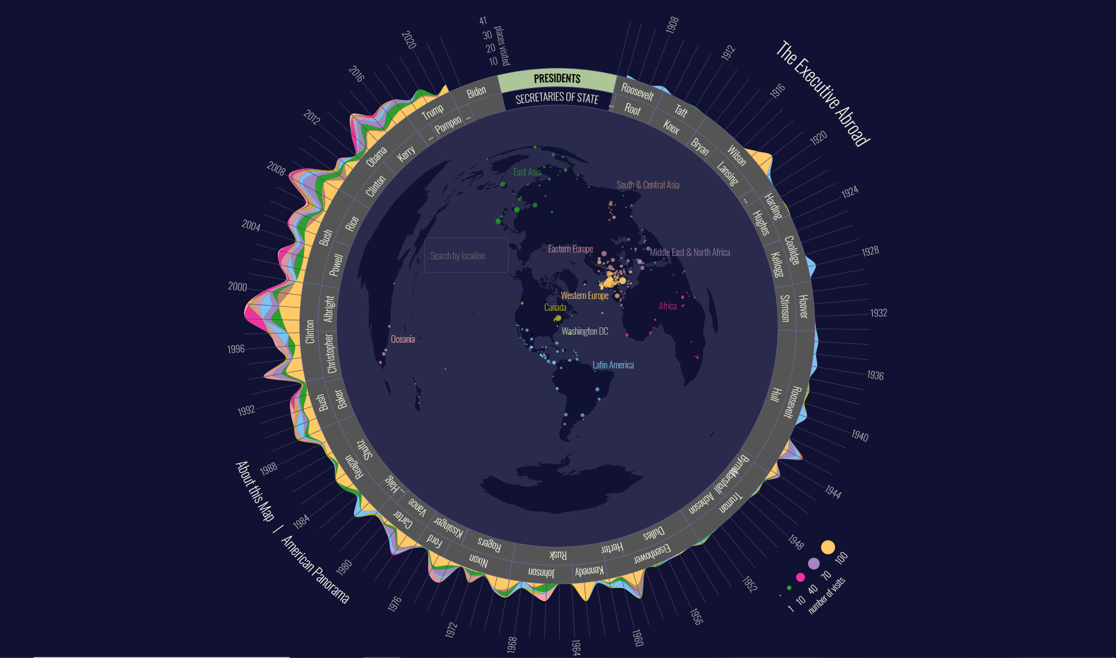
The Executive Abroad is a map found within American Panorama, a project by the Digital Scholarship Lab at the University of Richmond. American Panorama sheds light on American history, both past and present social issues, and important political topics through interactive mapping techniques. The Executive Abroad highlights the international travel of all presidents and secretaries of state. The map is important for understanding the evolution of travel and its connection to the United States’ evolving stance on foreign policy.
Except for Theodore Roosevelt and Winston Churchill, presidential travel was virtually non-existent before Franklin D. Roosevelt. FDR was the first president to officially travel by plane outside of the United States with the intention to meet with Churchill in North Africa to discuss strategies for World War II. Following FDR, as social and political issues began to become increasingly more prominent on the global scale, presidents began to place an emphasis on the importance of international travel. The map shows this spike in travel, representing the United States intention to establish themselves as an important international power. Placing Washington D.C. at the center of the map is a further representation of this, intentionally mapped at the center of the globe to affirm America’s strength, power, and influence on the international scale.
In addition, the map shows the frequency of visits to each geopolitical region over time. Through careful observation and research, viewers can see how each president and secretary of state approached their time in office through their frequent travel trends. Their destinations reflect the intentions of each president, some of their most important policies, or might even be the result of major events occurring during that specific time. For example, following September 11, 2001, George W. Bush had a greater number of visits to Western Europe where he addressed issues regarding the War on Terror. By displaying the number of visits, categorized by both color and density, viewers can pinpoint the important policies of each president or the critical international events of that time.
Visually, the map is colorful and fun to interact with. The bright colors contrast the navy-blue background, the separate colors representing different number of visits. The choice of colors is interesting, with yellow representing the densest areas of travel. Lighter colors are typically an unorthodox choice for representing dense areas, but the Executive Abroad takes a different and unique approach, using lighter colors to signify the frequently traveled locations. Another interesting feature of the map is a “How To Use” feature that proved to be both helpful and reliable. The guide instructs viewers how to select presidents or secretaries and explains what the graph shows. The short description is useful, allowing users to feel well-versed and knowledgeable upon opening the map.
Lastly, to critique the visual appearance of the map, it is important to discuss the proportions of the globe and how they differ from what we are normally used to seeing on traditional portrayals of the world. We can see certain areas of the map, like East Asia, are disproportionate to their actual size on a “traditional” map. Australia, which is portrayed on the left side of the globe, is completely disproportionate to both its size and location. I wonder if this is purposeful and possibly artistic. Since the cartographers had an intention to place Washington D.C. in the middle of the map, they knew this would skew the proportions. Again, I wonder if the intention was to place emphasis on the United States, making its scale reliable and near perfect while skewing other nations and areas to whatever fit the mold. Another small critique would be how the names of the president circulate the globe, making some of them difficult to read when they are upside down. It makes it challenging to find a president, but if you follow the years along the side, it makes it much easier, but you must be well-versed in knowing when each president served in office.
Overall, the map does a fantastic job exploring the evolution of both travel and the United States’ evolving role as an international superpower. This newfound idea of power, represented through travel, dismissed the potential power of other nations. It’s important to draw attention to the cartographers’ choice to make the president the central unit of the map. By doing so, the map is not only placing emphasis on the power of international travel, but the power of each individual president. Indicating through visual rhetoric that these presidents are the most important feature of the map is a symbol of individual power. Assuming the centrality of the presidency has its benefits, but also questions the American system of power and democracy. The U.S. prides itself on maintaining democratic values, but this map gives us a different look, one that portrays the presidents as holding a higher status. The United States crossing into international territory demonstrates their need to be in control and at the forefront of foreign policy. These presidents not only wanted to maintain peace but spread American ideas of democracy and stability. Traveling internationally reinforced these values, placing the United States at the top of the global food chain.