
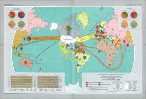
 This map was created in 1967 and published in “The National Atlas of The United States in 1970. The base map was published in National Geographic. The different colors help the audience easily differentiate thematerials being imported and exported. The legends in the corners show U.S. total imports and exports, the different shipping weights and materials, and categorize them by commodity group. The arrows and pie charts depict the amount of money and supplies being exchanged. The materials are categorized into food, crude materials, fuels, chemicals, and manufactures (manufactured goods).
It is an America-centric map which presents America as the main source of economic power and the center point of all global economic activity. Russia is cut in half and placed on the edges of the map to make it not look as big or powerful. This was a time where the U.S. and Soviet Union were battling for control of developing countries. The U.S. and Soviet Union were fighting for influence and this map shows the United States as a strong international power. The map makes it seem as if countries that do not work with the U.S will deal with economic trouble while also making the Soviet Union look weak. It reflects the United States as the “good guys” as they are helping these countries develop economically. The arrows reach out out all over the world and “trap” the Soviet Union. This enclosure of the Soviet Union reflects the United States’ effort to contain the spread of communism.