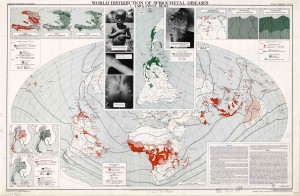
The Atlas of Disease: World Distribution of Spirochetal Diseases was created under the director Dr. Jacques May in 1950 during the Cold War period. Developed under the collaboration of three powerful organizations: the American Geographic Society, the U.S. Armed Forces, and the international pharmaceutical corporations, this map was included in a map series that documented the global spread of various diseases. Particularly, this map embodied the idea of “medical geography”, as it sought to demonstrate a connection between the geographical location of disease and the underlying social, cultural, and economic features of the environment during this period of time. In fact, this was a period of rapid decolonization for Africa that resulted in the emergence of a great number of newly formed countries, which were viewed as strategic forces as the tension between the US and USSR was increasing. Through the three producers of this atlas, it is evident that each group had particular interests that it wished to transmit through the; with all of these context and factors combined together, the Atlas of Disease lived an extremely rhetorical life and was used as a Cold War Propaganda.
Just as we discussed in class that a map always has a purpose no matter how neutral it looks, this map had a very scientific and technical display to seem “objective”, yet indeed contained strong hidden political implications as a propaganda. Serving as a powerful visual discourse, this map produced a distinct division, even a hierarchy, between the First and “Third” World countries, between the healthy and the sick. This segregated the “Third World” countries into a place of illness, defining illness as a political, cultural, and economic phenomenon of strategic interests in scientific, commercial, and political contexts during the Cold War. This constrained a “Third World” identity, and communicated the roles of these developing countries during the time.
These purposes of the map was hidden yet intensified by several elements on the map. One of the most powerful element that contributed to the influence of the map was the use of photography. The photos were placed purposefully over the center of the Northern Hemisphere, clearly exhibiting the assumption that there was no impurity in the first world countries; these pictures also created direct boundaries as to what countries were considered clean or contaminated. Additionally, only pictures of children, instead of adults, were shown as the visual symptoms, sparking a more emotional pull to the map. Moreover, the projection used to create the map—the Briesemeister projection—presented the land masses more centrally with lower distortion, making Africa the main focal point. The bold crisscrossed line plagued the African landscape, creating contrast with the deep colors that represent the spirochetal disease. With this projection, Africa became the least distorted of all the continents in this projection. Another notable element on the map was the color used, that there was only one main color as the authors intended for a simplistic approach when coming to the actual map.
Overall, May’s map emphasized the importance of modernization and development in the world through a powerful visual discourse that created a sympathy and fear illness for the audience. It reminded the audience that the development during the Cold War did not rely on a complete altruism. Instead, it equated Americans’ self-interest with the development interest of the rest of the world, serving as an American propaganda that helped heighten American power during the Cold War.
Thank you for reading!
Sincerely,
Lucy and Sarah

