
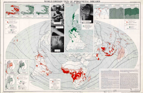
The “Atlas of Disease: World Distribution of Spirochetal Diseases” was created by Dr. Jacques May, a French surgeon, and the American Geographic Society in 1955 during the Cold War era. During our presentation on this map, we questioned why the curators of the map included unpleasant photographs of children with skin diseases, why they used the color red to represent the spread of disease in the Southern Hemisphere, why they used the Briesmeister equal-area projection, and why they choose to represent the skin diseases (bejel, yaws, and pinta) specifically. We also questioned how the time period of the map influenced how the map was portrayed. We came to the conclusion that this is not a bad map, it presents accurate information, but one must be smart when using it if they want to truly understand it and what it presents to its audience, since it does present biased opinions. We also decided that the “Atlas of Disease: World Distribution of Spirochetal Diseases” proves that even the maps backed by scientific evidence were political during the Cold War era. Lastly, we figured that this map shows us the importance of context in mapping, as if this map was made today, it would not have the same implications and insinuations it did when it was created. When classmates commented on our presentation, they said they enjoyed how we asked good questions and kept the class involved. They also said that we made good connections between our map and what we have learned previously this year. They enjoyed our visuals and presentation effects, as well. We greatly enjoyed following the rhetorical life of this map and critiquing what it presents to its audience. Never stop asking questions!
Sincerely, Anna Ricci and Kayla Connelly