
What?
You don’t understand what Africa specializes in? You don’t know which country has the largest amount of annual export? You have no clue about what life in the Middle East is like?
What?!
As the world becomes increasingly interconnected between nations and regions, the need to acquire a global perspective that relies on a basic understanding of the world is undoubtedly necessary. We need to enhance our understanding of the social, political and environmental forces that shape our existence. What better way to start learning the world than by looking through a map that combines the specialty of each country with cartographic features that illustrate the location of different countries in the world? By using such a map that contains unique, outstanding visuals and certain biases, the readers could explore different parts of the world and form their own understanding and critiques.
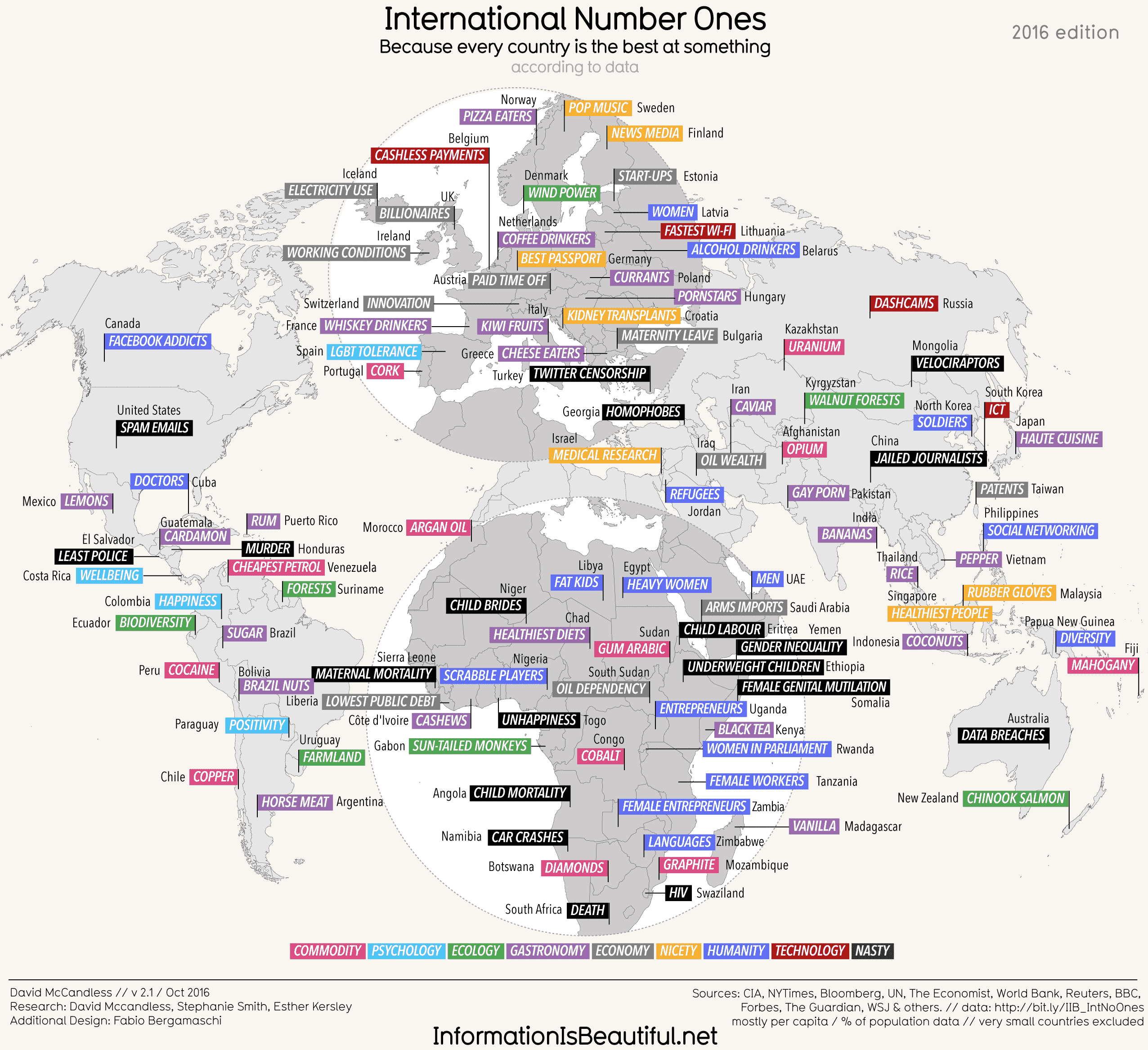
The map “International Number Ones,” published by Information is Beautiful, offers an illustration that contains particularly straightforward information about each country’s “No. 1” in the world. The British-based information design organization compiles statistics and visualizes them into a graphical representation to educate the public. This specific map allows the audience to gain insight into the underlying social, political, and environmental issues of each country. In addition, it(s map) form presents the audience with the information and issues more vividly and memorably than plain text, specializing data in a way that no other medium could achieve.
Despite having the challenge of displaying the entire world, the symbols, fonts, and colors used portray a strikingly simple map with an eye-catching and comprehensible cartographic layout. The map is broken down into different countries (marked with the color grey and the country name in lowercase letters), with each country having a subject that that particular country is best at in the world in all uppercase letters to attract attention, and a specific color assigned to the “specialty” of the country. The different colors correspond to different categories that are illustrated in the legend at the bottom of the map. There are nine colors in total, with categories ranging from commodity, ecology, gastronomy, psychology, economy, technology, to nicety, humanity, and, nasty. On a broader level, this color coding not only thoroughly portrays how each category is scattered throughout the world, but also may reveal any underlying patterns between each nation or region. For instance, Africa contains both the most blue and black colors, corresponding to the humanity and “nasty” categories respectively. Europe in particular appears to have the most grey, with the color representing “economy.” The colors purple and pink, representing gastronomy and commodity, are fairly scattered in all the continents, as both of the categories could be considered as “natural resources”, and each continent possesses different habitats that foster different resources. These hidden connections reinforce the idea of Wood, that a map links a territory to what comes with it, whether it is cultural values, certain phenomenon, or specific products.
In spite of the information portrayed in this map, the reaction that most people will have while looking at this map for the first time will probably be a shocking “WOW”, as the map contains several obvious unusual factors. The first apparent “oddity” is that the “No. ones” in this map are truly a mix between some “expected” ones that are seemingly plausible, some nearly unknown yet interesting ones only to be found in Trivia, and some that are extremely controversial, radical, almost “inappropriate” to be deemed as the country’s “best” thing to offer, and do not appear to have any scientific basis as support. For instance, the map speaks that Afghanistan is the world capital of opium production and Brazil produces the greatest amount of sugar, which is fairly reasonable. It also shows that the French people are the biggest whisky-drinkers and Sweden is the number one in pop music, which are interesting facts that are a less known. However, it also includes that Pakistan is the country that consumes the highest number of gay porns, that Togo is the country with the highest level of unhappiness. In fact, the controversial aspect of the information could already be noted in the legend, as one of the categories of specialties is labeled “nasty”. Furthermore, the map contains proactive humor in its text, heightening the dramatic/visual effects, which really subverts the expectations of how maps usually work
As Wood may suggest, every map has a purpose or intent that its author has injected into and hidden within the map. A country does not necessarily only have one “Number one”—it could be the number one in several different fields and industries; yet why does the author only choose this particular number one to put next to a country’s name? Why does the author rather list out some negative number ones instead of other possible positive things that the country may have which deserves to be admired about? For instance, the United States is universally recognized as being stellar on a global level in many different fields, including higher education institutions, scientific research, medicine etc. Nonetheless, the map only lists out a negative “No. 1” that the US has internationally—spam emails. Indeed, the author definitely manipulates the “No. ones” for each country to achieve the effect of benefiting certain countries and imposing negative impressions of other countries. On the other hand, however, this approach allows more developed countries such as America to be critiqued as well—it reminds us that not all “No. ones” absolutely great.
Another central idea from Wood is that maps are choices of politics and power—this particular map is critiquing expected uses of maps, which is a very political choice. The organization created this map is Britain-based; consequently, one can noticeably see that the European countries on the map are correlated with the most positive connotations of categories, such as “economy”, and contains the least amount of negative information. On the other hand, North America, where the United States and Canada are located, is only linked with negative information, such as the most Facebook addicts for Canada, and the most spam emails for the US. This information choice almost degrades US and Canada, for they are some of the most developed countries in the world, and could have possibly threatened the standing of certain European countries, such as Britain. Another obvious political bias reflected upon the map is that the cartographic feature of the world map is largely Europe-centric, most specifically Western Europe-centric; there is even a “globe” around the western European region! In addition, the size of Russia is altered to occupy a smaller space on the map to decrease the significance of Russia, and the position of the whole Europe is elevated in order to be not only centric, but also to be on the top of the map to grab the audience’s attention.
Wood also emphasizes the notion that maps are indeed social constructs. While reading the map, the first thing that stands out to me is the small number of countries drawn on the map, as some relatively “insignificant” countries are ignored by the author to be included in the map. For instance, North America in this map does not even contain Mexico within its region. Another use of social convention in this map is the colors used to represent each category: nasty is represented by black, and ecology is represented by green. These colors, although seemingly significant, actually plays a huge role in reinforcing the layout of the entire world. Social constructs are moreover ingrained in the author’s choice of picking each country’s number one; remember that Africa contains the most blue and black regions? Both of these colors correspond to categories that have a negative connotation, and the author has chosen to use these as the number ones for certain African countries, instead of other potentially positive ones. Through this mapping choice, the product is promoting particular stereotypes of certain regions and countries unconsciously.
One significant fact to keep in mind while reading this map is that the map is not designed by a professional cartographer, but by a graphic-design organization that compiles data to transform into their graphical forms. As a result, the data source might not be as reliable and credible, given that the map is used for entertainment. On the other hand, however, the simple layout, colorful visuals, proactive humor, and the rich cultural information indeed greatly engage the readers with this map. Furthermore, this map also provides many opportunities for the readers to interpret and re-examine certain countries with a different mindset, such as looking at America not from the “superpower” perspective but from a more humbling one. Although the map has certain biases, the map is truly an interesting and simple one that is able to provide most people with a basic understanding of the world.
Works Cited:
McCandless, David. “International Number Ones.” Information Is Beautiful, May 2010
Wood, Denis. The Power of Maps. The Guilford Press, 1992
Lucy,
I really love your map! It’s so eccentric and different. I like that you mentioned that the map is not designed by a traditional cartographer, per se. I had a similar situation with the map I chose; the cartographer was a comedian, so the map was designed for entertainment purposes. I assume that entertainment was a primary aim of your map, as well. It is really fascinating to discern non-scientific maps with an analytical eye, as you did very well. I like that you mentioned Wood’s idea that maps connect the territory to what comes with it… Wood’s assertion is particularly interesting here, for the map chooses to link the territory to very quirky features, not aspects of which we would often think first. Besides, the map also does not link the countries to scientific features like time zones or climate. Thanks for choosing such a cool map!
This map is very interesting, especially because of its expression of social, political, and environmental issues and its listings of unique and unexpected international number ones. The choice of information exposed on this map is very biased, and the inclusion of the colors and categories makes it clear to readers the countries that the map maker wants to display as having positive or negative reputations. I like that you point out the fact that the U.S. and Canada both have fairly awful number ones, and that the map is also not centered on the U.S. like the ones we’re used to seeing. This map favors certain European countries and places several number ones with negative connotations on many countries, especially certain African countries. This map would probably be added to Wood’s top ten favorite maps because of how much it incorporates the social aspect of countries and adds categories and colors that causes the reader to draw several conclusions both good and bad. I am surprised at the map’s opinion, it’s definitely different from the ones we usually see, and it is fair to see that the U.S. are not the only ones that can make country-favored maps.
I was automatically drawn to this map when I first saw it and was also surprised to read the eccentric “number one’s” put on some of the countries. I agree that this map is definitely politically stimulated and focused on Europe, specifically Western Europe, based on the physical emphasis on it for the eye of the reader and the positive number ones each European country is given compared to other countries. I would be interested to see where exactly the data is coming from and how each number one was chosen because I know that US is better at a lot more than being Facebook addicts. It was interesting to see which countries were shed in a positive light and which ones were shed in a negative light.