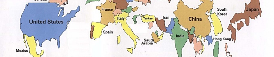

This map, at first glance, looks like an unfinished map of the world. In fact, this map, “Market Size By Gross Domestic Product, 1995,” is complete and was published in 1996 in The Handbook of International Economic Statistics. Coming from a textbook it was used by students to study the world at an economic view. With its simplicity, the map is able to clearly break down the world in terms of each country’s total value. By having each country’s size relative to its GDP, the world as it was in 1995 can be seen through an economic lens. While looking at this map, it is important to keep in mind that not all countries shown are labeled and, even more importantly, countries with too small of a GDP are not even on the map. By physically manifesting the world GDP on a map, the cartographer gives a better understanding of the world economy in 1995 and inevitably makes the United States and Japan the same size, shrinks Russia, conceals most of Africa, and entirely changes the realistic scale of the world.
What clearly draws the eye when first looking at this map are the larger countries, as those that are visible seem to jump off the map. The United States and Japan emerge from the edges of the map, consuming most of the space; this signifies the countries’ economic power and influence on the rest of the world. These two countries had the largest GDP in 1995, followed by China and Germany. The booming economies, from trade and advanced technology, of these countries at that time gave them the biggest spots on the map. For instance, it is no surprise that the United States is able to provide aid throughout the world as they continue to have the highest GDP in the world, just as they did in 1995.
If this map was made relative to size, the United States would look proportionate to the other countries, but when compared to Russia or the other shrunken countries it looks massive. The cartographer is able to portray the United States as the most powerful economically but also socially and politically with its huge physical presence on the map. This perspective of the world alters the proportions that the viewer would assume, yet it still portrays the exact GDP for these countries. For instance, when economics students are looking at this map, this is how they are learning to interpret the world, through the view of an economist. In addition, Germany, France, Spain, the United Kingdom, and Italy seem to fill all of Europe by taking the “spots” of the smaller countries that are not shown on the map. The first world countries of this time are not only expanded in size but seem to shrink the rest of the world. Similar to the way these countries take over Europe, India stretches in size across Asia along with China. Other noticeably large countries are South Korea, Taiwan, and Hong Kong. South Korea is expanded so intensely it makes North Korea almost unnoticeable. In the view of politicians or military specialists, North Korea is often a country to keep an eye on but from an economists perspective it appears almost irrelevant. The size of Hong Kong and Taiwan are eye-catching because on a scaled map of the world, these countries are barely seen due to their small-scale size. However, the size of the richer countries are able to highlight the world “superpowers” as this map emphasizes their wealth.
While the countries blown out of proportion are easy to spot, there are also the countries that aren’t visible that can make you question why they aren’t as visible on the map. What happened to most of Africa? What is going on with Russia? Why is most of the Middle East gone? The countries with little technology, low education, and lack of health care will not be seen because all these factors cause them to have a low GDP. Many countries in Africa are not shown on the map due to the fact that their GDPs are so low in comparison to the rest of the world. These countries that are shrunken and the ones that are not even shown are overlooked. The poorer countries are silenced on this map, therefore not only does this map give the wealthier countries a stronger economic voice but it is also able to enhance their political power by emphasizing the different sizes of the countries. Even the countries that are shown in Africa are minuscule in relationship to the rest of the world on the map. This is similar to the situation in the Middle East. The smaller countries are not shown due to lack of GDP, highlighting their status as third world countries. The absence of these countries is clear as India, China, Iran, and Pakistan take up the space of the Middle East while everywhere is empty space. By physically hiding these countries on the map, the cartographer is able to make the poor countries appear homeless, taking away their economic power but also their social and political power.
As opposed to Russia, the country which on an average map is always the biggest, here it is represented to be smaller than South Korea. This is a clear sign of the economic crisis in Russia which followed the fall of the Soviet Union. Before the 1990s, Russia had some of the greatest power and economic value as it controlled all of Eastern Europe as well. This map shows how much power Russia lost after the fall of the Soviet Union. Although it is important to remember this map was made almost ten years ago and Russia’s GDP is currently en route to being one of the highest. Many of the countries whose GDP is not substantial enough to be included on the map are still underdeveloped and wouldn’t be on a present day version of this GDP map. While looking at the world relative to GDPs the poorer countries are easily excluded. Does this make these countries less important or the people irrelevant? While this map may be useful to study the world economy it can cause the countries with small GDPs to be viewed as little worth, especially when they can’t even be seen on the map. This shows that while accurate, this map excludes part of the world and gives a stronger perspective on the wealthier countries.
Overall a map of GDP values is the only map that can make the continent of Europe the largest continent, Africa practically disappear, Japan essentially equal in size to the United States, and Russia shrink down to almost nothing. It is no surprise that the first world countries are quickly developing countries in 1990s and the ones with the greatest span on the map. The third world countries are the ones which appear microscopic, or do not even appear at all. When the world is not mapped relative to size and borders, but relative to wealth, the view of the world becomes distorted and the wealthier countries seem to take over the world.
Ellen, I think this map is very interesting and insightful. The map is almost elementary in its display, with childish colors being presented across the map. In a sense, it is pleasing to look with a type of nonchalant feel coming from it. Ironically, this map depicts a serious issue in the world, demonstrating countries’ dominances over one another with respect to economic success. Also, it relates back to what was discussed in class and from Dennis Wood’s readings about silence. The countries with small GDP’s fail to exist on this map entirely, depicting a large gap in the world’s economic activity. Overall, I think this map makes complete sense, while at the same time drawing out concerns from the public about what countries fail to be affluent, and which countries are economic superpowers.