
The Cassini Projection: How Should Earth Be Portrayed?
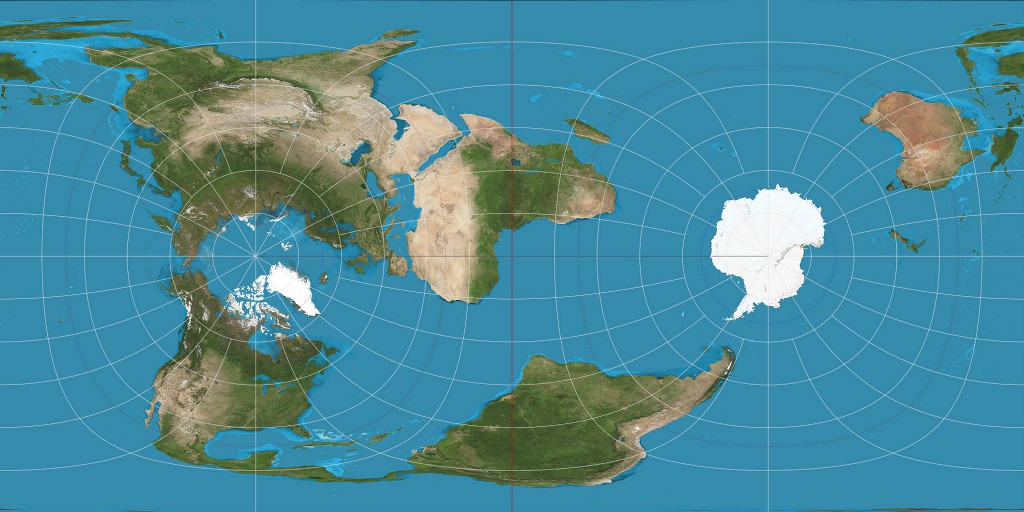
The map shown above detaches itself from traditional cartography. To the average person, this map looks strange. It’s looks different and feels unnatural, contrasting greatly from a conventional map. The map is portrayed in the “wrong” direction and gives a person the feeling that it should be adjusted and set straight. For example, South America is stretched in strange ways, Africa is completely rotated and Central America is almost unrecognizable. You may think that this new interpretation of the world was never used, but this map is actually dates back to the late 1740’s.
The map shown above is defined as “The Cassini Projection”, proposed by César-François Cassini de Thury, a French astronomer and cartographer. Before creating the Cassini projection, César-François studied space and the stars through his work in astronomy and generated several topographical maps of France, specifically Paris. In his projection, the globe is first rotated so the central meridian becomes the equator. In the Cassini projection, the scale along the central meridian and to the immediate right of it is correct. On other spots of the map, as one gets further from the central meridian, areas become more and more distorted. Despite the fact that this map looks as if it is gnarled and inaccurate, the Cassini map was used often up until the 1940’s, when it was eventually replaced with the multiple types of the Mercator style.2 The original purpose of the Cassini map and similar maps during the eighteenth and nineteenth century was to give accurate results of smaller countries that were believed to be complete on their own, including France, Great Britain, and Belgium.2
The Cassini map is unique and different from the traditional North/South East/West maps of today. The way the map is visually portrayed makes the audience think differently of conventional directions. The projection of maps has been defined a certain way for centuries, most following the North/South East/West projection. To the eye of the average person, the Cassini map seems odd and out of sorts, especially due to the fact that Antarctica is nearly dead center, North America is to the south and Africa is rotated ninety degrees. This puts into play the politics of projection. The map symbolizes a somewhat “smaller” world, a world that is thin and stretched. It also reminds the audience that the majority of the world consists of water and indicates that most of land activity is actually focused above the equator (in this case the meridian).
The orientation of a map controls a person’s perception. North, South, East, & West are all rhetorical & social constructions. To this day, the origin of maps depicting the typical North, South, East, West orientation can be traced back to early AD. The original cartographer who invented the typical projection set the standard of what every map “should” and “should not” look like. When a person sees a map that has a different orientation, such as the Cassini projection, that map feels strange and out of place. North and South are just inventions that are taken for granted. The world needs these strange projections in order to remind us that maps aren’t normal givens. For a United States citizen, one might say, “Why is my country not where it normally should be?” Another example is due to the fact that Africa is centered and “North” above the equator, political implications are put into play. This could cause cartographers and social activists of today to argue that Africa has a greater importance in the world.
The “oddness” of the Cassini projection map raises the questions, “How should a map be orientated?” and “How are we actually orientated in space?” As Denis Wood said in his novel The Power of Maps, “what the map shows us is…reality”. Maps create a sense that there is no reason to question the true orientation of the world. As one looks at the Cassini projection map, it helps us question the true idea of a map and where certain countries are located, and the importance of their location. The map itself is an argument presented rather than a reality. This argument is how should a country, some continents, or the earth as a whole be presented to an audience. The cartographer creates the map through his/her own bias, and as the audience views the map through the lens of the cartographer, our view is skewed. This allows maps of all different types to socially and culturally construct the earth through several different scales and perspectives. The true power of the map lies within the hands of the mapmaker and he/she decides which way the world should be depicted. The mapmaker does have a large amount of power when they choose to depict the world in a certain way, but the audience has a similar amount of power in the way they interpret and digest that particular projection. The power struggle creates a tension between the mapmaker and the audience.
The Cassini projection map portrays to us the difference in orientation. The world is still round and it is impossible to be captured on a single, flat page. If one looks specifically at the Artic and Antarctica, it is easy to acknowledge that the world is round. On conventional maps, these two locations are distorted but are not on this map. This relates directly to the mapmaker and his motives. Why would he/she put certain locations in certain spots on the map? Without the Cassini map and similar projections, millions of people would never be able see the world from a different perspective. This map sets the tone of how a different orientation can change one’s viewpoints and causes them to question how something should be orientated. The politics of projection can shape a person’s perspective without that person consciously realizing and whoever decides this positioning has an immense power to change their perspective. Cassini’s projection is almost never seen today and one might think, what if we began to use this map projection instead of the traditional map? Would our view of the world still be the same? The Cassini projection causes us to think of these questions and how the world should truly be portrayed.
—Ryan O’Reilly—
Works Cited
Wood, Denis, and John Fels. The Power of Maps. New York: Guilford, 1992. Print.
“The Cassini Projection.” [ARCHIVED CONTENT] GeoFacts from Ordnance Survey:. N.p., n.d. Web. 20 Oct. 2014.
The Cassini projection is one of the most interesting projections I have seen. I was surprised that this projection, which appears odd and distorted to us today, was actually commonly used for more than a century before the Mercator projection took its place. Some of the peculiar things I noticed about this map were how some continents were distorted while others were not: North America looks relatively normal, besides being pushed down the map; and Africa looks almost perfectly normal except for the fact that it is rotated 90 degrees. This causes these two continents to stand out in a way, especially Africa, as it is in the center of the map. Antarctica also naturally stands out for being a large area of whiteness on an otherwise green, tan, and blue map. One thing that interests me is why, given how the map has two distinctly different halves, the halves are in the locations that they are. They could have just as easily been flipped, although it would lead to Africa and South America being split into two. I really liked your analysis of how mapmakers have the power to depict the world in their own way while map-viewers have the power to interpret that depiction. This is an important aspect of determining whether a map could be propaganda: if the projection of a map appears to deliberately promote the power of one area, people can deliberately discredit that map. This map certainly challenges the way we look at orientation and how we are oriented in a way that few projections do. Great job!
Ryan,
I think this is a very interesting map. I’ve always been intrigued by different layouts and maps that take on unique orientations. What’s truly amazing about this map is that it is divided into two hemispheres, but is not displayed to us in a “normal” way. In fact, the mapmaker makes the audience question what should and should not be considered “normal.” Really, it calls upon innovation. Why stick to social norms? Why not think outside the box? And that’s the reason I find this map so meaningful – it causes us to question meaning.
– Mike Olano
really great article. makes me learn something new. i will bookmarked it