
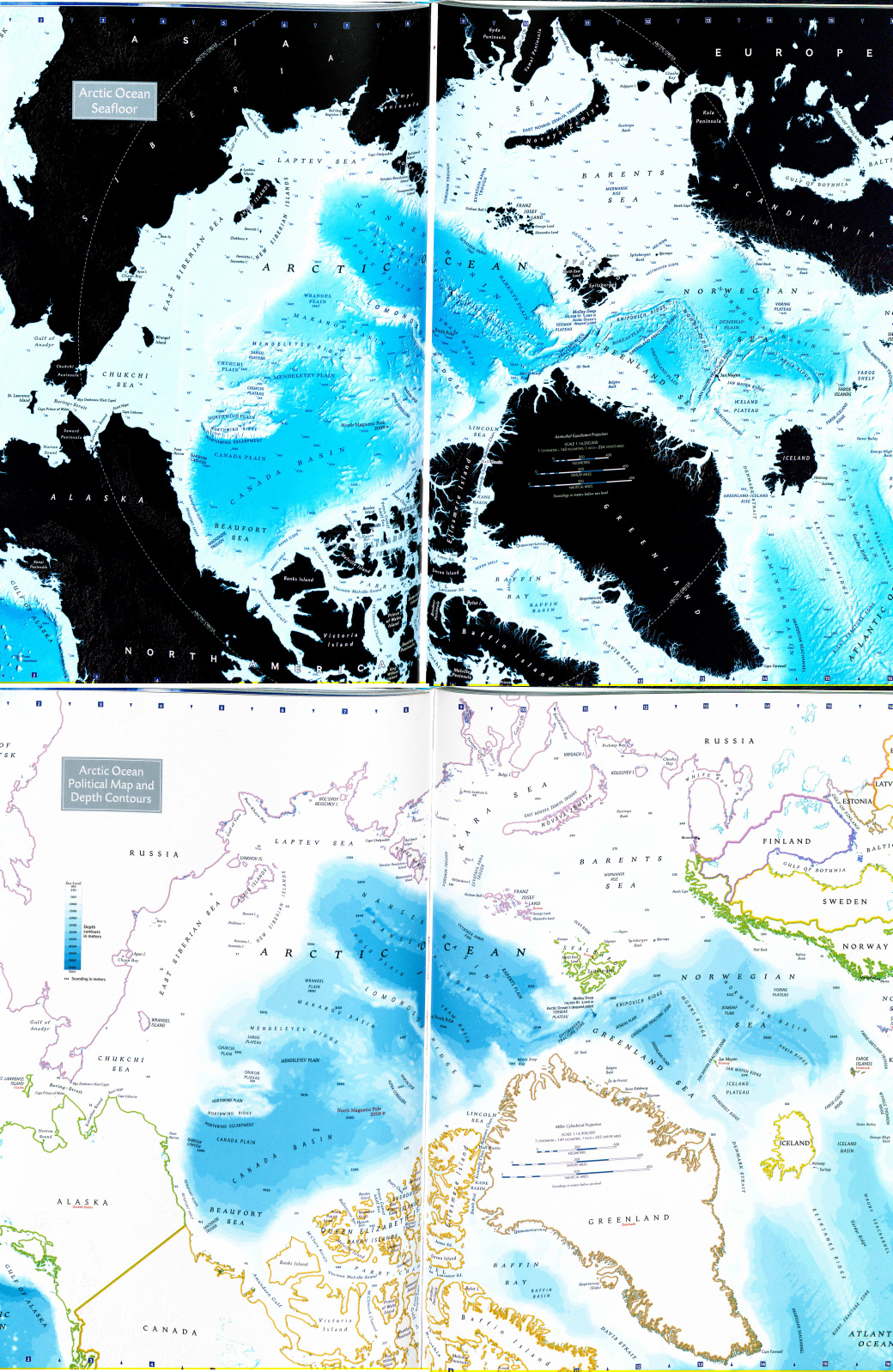
Maps of the land are circulated more than maps of the oceans, which gives land maps more power; however, this does not mean that charts cannot be just as intricate and bound up in issues of power and politics. In the atlas Ocean,1 National Geographic has published two maps of the Arctic Ocean, one shows the topography of the ocean and leaves the surrounding land in black, while the other contains the borders of the countries. These maps were made in 2008 and they are located on adjacent pages in the atlas. This is important to note because it allows the viewer to easily compare the two maps, thus drawing emphasis to their similarities and differences. The most pronounced similarities within the maps are the authorship and projection. These two things combine to give the viewer an overall sense of National Geographic as an institution. The differences in the map include the coloring of the land and the drawing in of country borders. Specifically, the inclusion of the country borders on the second map draws attention to the politics that surround the question of ownership of the Ocean. Both the similarities and differences in the map emphasize the social conventions that National Geographic perpetuates, as well as the international relations during the time period in which they were made.
The likenesses in the maps are important to notice because they represent the underlying social conventions that are reinforced over multiple maps. The most prominent similarity between the maps is that they were made by the same organization, National Geographic. National Geographic is a well-known cartographic institution that has made thousands of maps. It has a particular style that emphasizes scientific accuracy and includes a large amount of geographic information on each map. Because this style has become so recognizable, people often accept the facts shown on the maps without question or critique. In The Power of Maps, Wood mentions how people have lost the ability to critique maps because they have put complete trust in the author.2 Even if a scholar or a prominent institution like National Geographic made the map, the average person should still be able to question the map and ask why the author excluded and included certain information. For example, most maps are oriented with North at the top of the page, and because society is so used to this social convention, no one questions it anymore. But on the maps of the Arctic, there is no North because it is centered on the North Pole. The authors had the choice of facing the map any way they wanted without challenging the social convention that North is at the top of the page. They chose to put North America at the bottom of the page and Russia at the top, which gives the viewer the impression that North America and the United States is in a strategically advantageous position over Russia. This is an allusion to the propaganda maps that were made during the Cold War that always put the United States in positions of power. Since tensions have begun to increase again between Russia and the United States, this map would give American citizens the reassurance that they were still the dominant nation.
Political power and relationships are especially emphasized when looking at the differences between the two maps and how only the second map shows the countries borders. The first map, which shows the surrounding land in black, brings the viewer’s focus away from the social constructions of possession and back to the qualities of the water itself. The map shows the topography of the ocean floor and brings the ridges, plateaus and mountains to life as if they weren’t covered by water. This is particularly interesting because the map is showing land that can never really be seen. Wood would call this information “map knowledge” because the viewer assumes that it is true even though they have never, and probably will never see the bottom of the ocean.2 The second map leaves the water as blue, but it adds colors outlining the countries around the Arctic Ocean, which forces the viewer to focus on the political influences in the area. By bringing the maps together to compare, National Geographic has highlighted the questions of ownership that are present on most charts. Because one map shows the borders and the other does not, the viewer is reminded that the lines showing the edges of the countries are social constructions, and therefore show only an interpretation of the countries’ shapes. On maps of land, borders clearly show which countries have control of areas; however, it is not clear on charts who has jurisdiction of the water. This is made even more evident when comparing the two maps because the first map contains no borders, thus representing a world without the constructions and constraints of ownership.
Both charts represent the views of National Geographic as an institution. Just from looking at the maps, one can determine that National Geographic is a well-known organization that has the ability to amass large amounts of knowledge. The orientation of the maps puts the United States in a position of power, which means that National Geographic favors American views. The charts are more aesthetically pleasing rather than functional because they serve to educate the public about the Arctic Ocean and subtly remind them of the competing political powers in the area. The maps also bring into question the idea of ownership of an ocean, which is not defined by socially constructed borders. By having one map show the borders of countries and the other not, National Geographic has emphasized that borders and ownership are concepts made up by society and are subject to change and interpretation. Both maps are informative and influential by themselves, but by viewing them together one is able to notice the silences, political impacts and the social conventions that are expressed by the inclusions and exclusions within each map.
Endnotes
1. Earle, Sylvia A., and Linda K. Glover. Ocean: An Illustrated Atlas. Washington, D.C.: National Geographic, 2008.
2. Wood, Denis, and John Fels. The Power of Maps. New York: Guilford Press, 1992.
The double view of this map that is portrayed is what I find to be the most interesting. Not only is a topographical analysis of the ocean floor somewhat rare, but to focus on the Arctic Ocean distinguishes this map from many others like it. The black coloring of the countries in the first representation is akin to a negative image of a photograph, yet is extraordinarily useful in illuminating the intricate network of ocean around the North Pole. The secondary map is more traditional styling, having distinctly labeled the countries and provided color coded to delineate them. While some bias is present, namely having North America facing upwards, an attempt at being impartial is made, leaving the final product with little to no obvious political affiliation. Rather, I believe the focus of the map is on a rarely explored area that is not of common knowledge to many.
The double view of this map that is portrayed is what I find to be the most interesting. Not only is a topographical analysis of the ocean floor somewhat rare, but to focus on the Arctic Ocean distinguishes this map from many others like it. The black coloring of the countries in the first representation is akin to a negative image of a photograph, yet is extraordinarily useful in illuminating the intricate network of ocean around the North Pole. The secondary map is more traditional styling, having distinctly labeled the countries and provided color coded to delineate them. While some bias is present, namely having North America facing upwards, an attempt at being impartial is made, leaving the final product with little to no obvious political affiliation. Rather, I believe the focus of the map is on a rarely explored area that is not of common knowledge to many.