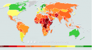
The failed states index map is a fairly modern map that relies on massive data sets to determine the stability and sustainability of each country in our world. This powerful map was put together by the independent, nonpartisan, non-profit research and educational organization known as the Fund for Peace. The Fund for Peace created the map as a tool for policy and decision makers to use when making important decisions concerning foreign policy. The map was published in 2005 and has been updated annually, which makes it extremely unique from the maps presented previously in our class. Unlike previous maps, the failed states index demonstrates progress in a more fluid manner and also incorporates interactive features that allow the user to be more immersed in the content of the map. Furthermore, with the massive data sets that are used to create this map, the failed states index has the power to make extremely bold arguments. To say that a state has failed is one of the most powerful and influential claims that can be made at the international stage.
During our class discussion, it was concluded that this map had a significant outlook to the future of cartography based on its many progressive aspects. The technological aspects of this map outline a basis for a new age mapping. We decided this map to be different from others we have studied in the class because it is updated annually, and therefore, a more useful map. However, after some class discussion their were some issues with the failed states index that were important to notice when determining the function of the map. Although there were massive data sets to backup their claims, many of the “indicators” used to determine the level of stability of a state seemed very difficult to quantify. The class brought up an important point that some of the data might be flawed due to its originally qualitative rather than quantitive nature.
Best,
Jill & Santiago

