Category Archives: Reading Responses

blog post 3/15

I found this chart very interesting, as it asks people from different countries what percentage of Fortune 500 CEOs are women. The results are very interesting as there is a huge overestimate, leading with Mexico who assumed 29% of the CEOs to be women, when in reality only 3% of Fortune 500 CEOs are women. This chart provides ample information, especially by outlining the question asked and the percentages asked. However, it does not list how many people participated in this survey per country, it only presents the overall number as n=19,428, making me believe the information may be skewed. Like noted in the podcast, statistical charts will purposefully exclude information to present skewed or biased information. Also, it would be beneficial to note the demographics of people asked: racially, socioeconomically, and age–all, which can provide very different results. Additionally, we do not know how the respondents were contacted, so that could have an effect on the results. Ultimately, I thought it was interesting that people all over the world overestimated the percentage of women as CEOs, but the reliability of the chart is questionable.

Blog post 3/16

I found this podcast very interesting because at first when I saw this week’s topic was about statistics, I was confused as to the role stats play in humanities. I had never actually considered how graphs we see regularly can be skewed or strategically misrepresented to falsely depict information. While statistics are supposed to be a tool for proving theories and providing insights, the display of these same statistics can be a tool of manipulation. 

I found this one graph, which was presented at a Congressional committee hearing in 2014. Not surprisingly, this graph was made by anti abortion advocators in attempts to defund Planned Parenthood. They are trying to show that Planned Parenthood has offered less and less cancer/health services and more abortions. This graph was meant to disprove the many supporters of Planned Parenthood who argue that the organization offers essential health services to women other than abortions. I find it interesting that this graph has no y-axis, so if you look at the actual numbers, the placement of the lines makes very little sense. Also, the fact that the lines intersect is bizarre. Political/social bias is often extremely prevalent when information is displayed to the public. Obviously, this graph is misleading. I am also going to include a second graph I found on the same website that more accurately displays the information. It includes a y axis and explanations, which greatly help in displaying the information more accurately. These two graphs give off two completely different messages. Absurd. This may be insignificant, but I also noticed the colors of the graph show bias. The cancer screening and prevention services line is in pink, which is globally recognized as a positive symbol of health awareness. The red line for abortions, to me, signifies that abortion is a bad thing (the color red has many negative connotations, including wrong, stop, and blood). 

https://huntercollegeqr.wordpress.com/activity-planned-parenthood-misleading-graph/

Blog Post 4

I know there are multiple charts here, but I like the way that they all work together and show the changes that have occurred in the world over the past 200 years. The reason I find this so intriguing and worth taking a look at is because it is positive. There are so many things that need changing in the world, and a lot of those issues are prevalent today, but it is sometimes nice to take a step back, without ignoring what still needs to change, and see how far we have come over our relatively recent history. In all six of the categories shown in the chart, things have gotten better gradually with the negatives decreasing and positives increasing. Interestingly, the two places with major dips in progress are democracy and literacy, both occurring at the time of World War II. I think it is so cool to look at charts like these and see the way major events affect specific parts of society and progress. I would like to see these charts up through 2020 as well to see how things change with respect to the pandemic. These six topics might not change much, but it will be interesting to see the lasting effects of the pandemic on other categories, like mental health, trust in government, etc.

What is also a positive about this chart is the lack of bias there is. The only end goal in these statistics is to educate people and help them better understand the world we are living in. In comparison to other charts that might be aimed at advertising to try to get people to feel a certain way about a product, group, or individual, this one does not have an ulterior motive, which makes the facts that much more believable and the source that much more trustworthy. In this globalized and media-driven world, we are constantly flooded with opinions, ideas, and information, and it can get tedious and difficult to sift through it all to find the sources and information that are trustworthy and worth looking into. When there is information like this one from the World Bank it is a refreshing change from the people and businesses who are trying to convince us to believe what they believe.

Chart-3/15

This chart that I found on https://ourworldindata.org/covid-vaccinations shows the vaccine doses per 100 people in different countries around the world. I find this chart really interesting, especially when looking at the growth in certain countries. Chile sees large growth just before February 4th whereas the United States, the UK, the UAE, and Israel all see steady growth since the beginning of the year. I am lucky enough to receive a vaccine (going on Wednesday for my first dose!!) but it is crazy to me that in only two countries, more than half of their population has received even one dose of the vaccine. It indicates to me that many different parts of the world are struggling to make the vaccine accessible to many. Perhaps we could look to the distribution in Israel in the UAE to work on our distribution here.

3-16-21 Post

My main takeaway from this week’s podcast and reading is that statistics are extremely powerful and can be used in a variety of ways. Most importantly, statistics matter in regards to history. My mind often gravitates to sports when I hear the word statistics, so the chart I chose for this week’s post is of course about sports. Before we get into the chart, the second most important lesson I learned was that presentation matters. Going back to the 25% chance of winning vs 1/4 chance winning analogy, this also happens when comparing athletes to one another. Ultimately, as we saw from the reading, statistics can be used to lie not just to others but ourselves.

The chart below is from January of 2020 and needs to be updated as Ovechkin has scored many more goals since then. The point is that looking at this chart can be deceptive. On one hand, we can see Wayne Gretzky’s “unbeatable” NHL goal record. Comparing him to Ovechkin it’s easy to assume that Gretzky’s record is unbeatable. However, if the chart was displayed in a way that showed how many goals Ovechkin needs to score vs. how many he actually has, people would be more optimistic that Ovechkin could break the record. In reality, just like the 25% vs 1/4 chance example, these two thoughts are the same thing. This chart helps emphasize that presentation matters when discussing statistics, especially when comparing statistics from two separate time periods. 

Post for 3/16

5 Ways Writers Use Misleading Graphs To Manipulate You [INFOGRAPHIC] -  Venngage

5 Ways Writers Use Misleading Graphs To Manipulate You

This graph is titled “Most Players Drafted in the First Round”. It does not specify the range of years, sport, or league to which the data refers. Any of these omissions on their own ruin the usefulness of the graph. Is this referring to football players? Basketball? Baseball? Are the players male or female? The data hasn’t been assigned a time frame, so I can’t infer any significant trend. For example, if the data dates back to the 1970s, it could be that USC used to have many players drafted, but hasn’t in recent years. Another factor to consider is the number of teams in the league, which impacts the number of choices in the first round of a given year’s draft. For example, the NFL has 32 teams. If Miami has had 60 players drafted in the first round since 2010, that would be 60/320, or 6 per year. However, if the data reflect the NFL’s “Super Bowl Era”, then the school has only had players chosen with 60/1,760 picks (actually a little less because the NFL hasn’t always had 32 teams, but you get the idea). Finally, the intervals on the graph aren’t specific enough. I know that Ohio State has had between 60 and 80 players drafted in the first round, but even if the graph is drawn exactly to scale, I can’t precisely tell how many players the bar represents.

The reading illustrates how graphs can be distorted so that they visually appear to convey data differently than it might sound when read aloud. This reminds me of when journalists will take a quote out of context and omit important information that clarifies a speaker’s point. In this day and age, we are so accustomed to taking in information in tiny chunks (tweets, notifications, short videos). The less information is present, the easier it is to manipulate an audience. We often unknowingly choose convenience and easily processed bits of data in favor of seeing the complete picture.

Blog 4 3/15

38 maps that explain the global economy - Vox

https://www.vox.com/2014/8/26/6063749/38-maps-that-explain-the-global-economy

The chart above is a breakdown of each countries main export, and summaries how the global economy is broken down. I find this chart interesting because it shows the distinctions between industrialized nations and developing nations very plainly but effectively. You can notice how the largely developed nations in North America, Western Europe, and Eastern Asia export goods that are consumer-based with fixed costs. Then you can see how many of the developing nations, largely in South and Central America, Central Asia, and Africa rely heavily on natural goods that are used primarily by developed nations. It’s a simple graph, but it shows the real distinction between the two and also sheds light on the issue of developed nations taking advantage of developing nations for their natural resources. We can use the example of De Beers and the diamond market where they control 80% of the global diamond supply. They have bought out huge diamond mines and Africa, and are notorious for violating workers’ rights and child labor laws.

In connection to the reading from class, this graph derives its data from the CIA Factbook. We can assume that majority of these figures are correct, however, there is much uncertainty if certain countries published their figures honestly. Data is so easily manipulated and can easily be amended to show a different intended perception. Many of the times, we must rely solely on reliable sources in order to ensure that the figures that are being represented are in fact honest. That being said, the graph above is honest in its projection of showing major exports. It doesn’t attempt to portray a certain argument and is completely informational. I think the largest issue that we typically see of data being skewed is for political reasons – especially on social media.  There are so many times where I see people post a graph on their story advocating for a certain cause. Sometimes, not always, these figures are derived from unreliable sources, yet these graphs are constructed in a manner that is visually appealing that it alludes the reader to respond positively to it.

Blog Post (3/16)

I was very surprised by the content of the Huff reading, because I had always assumed that statistical information would be representative and heavily researched/sampled. I was shocked at the realization that without context or with an unrepresentative sample, statistical information can be grossly misrepresentative of reality. I had also assumed that market research or polling questions would also be accurate, never taking into account people’s tendencies or abilities to lie in order to make themselves look better or worse. When looking at numbers it is difficult to remember that the data is likely being presented with the intention of convincing the reader of something, therefore it may be biased and even if it has correlation, the information may be entirely unrelated. Although I knew that in advertising, companies would present data that is in their best interest, purposely excluding information that does not serve them, or misrepresenting products similar to the way Old Gold cigarettes did, claiming them to be better for you than any other cigarette, neglecting to mention the statistics that showed very little difference between them and other cigarettes. 

I think that statistical figures claiming to represent a population should be required to clarify the number of people sampled and methods of sampling, so that readers can decide whether or not to believe the information at their own will. Just because things are strongly correlated does not mean that one is the cause or result of the other, which is very confusing, but basically it means that there are confounding factors that exist outside of the two presented that affect the outcome. 

I found it extremely interesting that my automatic instinct was to believe the information presented rather than question it, especially when it was specific instead of generalized, not understanding that there is no way that is accurate or representative of a given population. I realized that statistics can be applied similarly to stereotypes: they can generalize a population but be entirely inaccurate in representing an individual within that population.
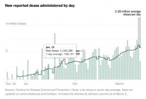
Source: NY Times

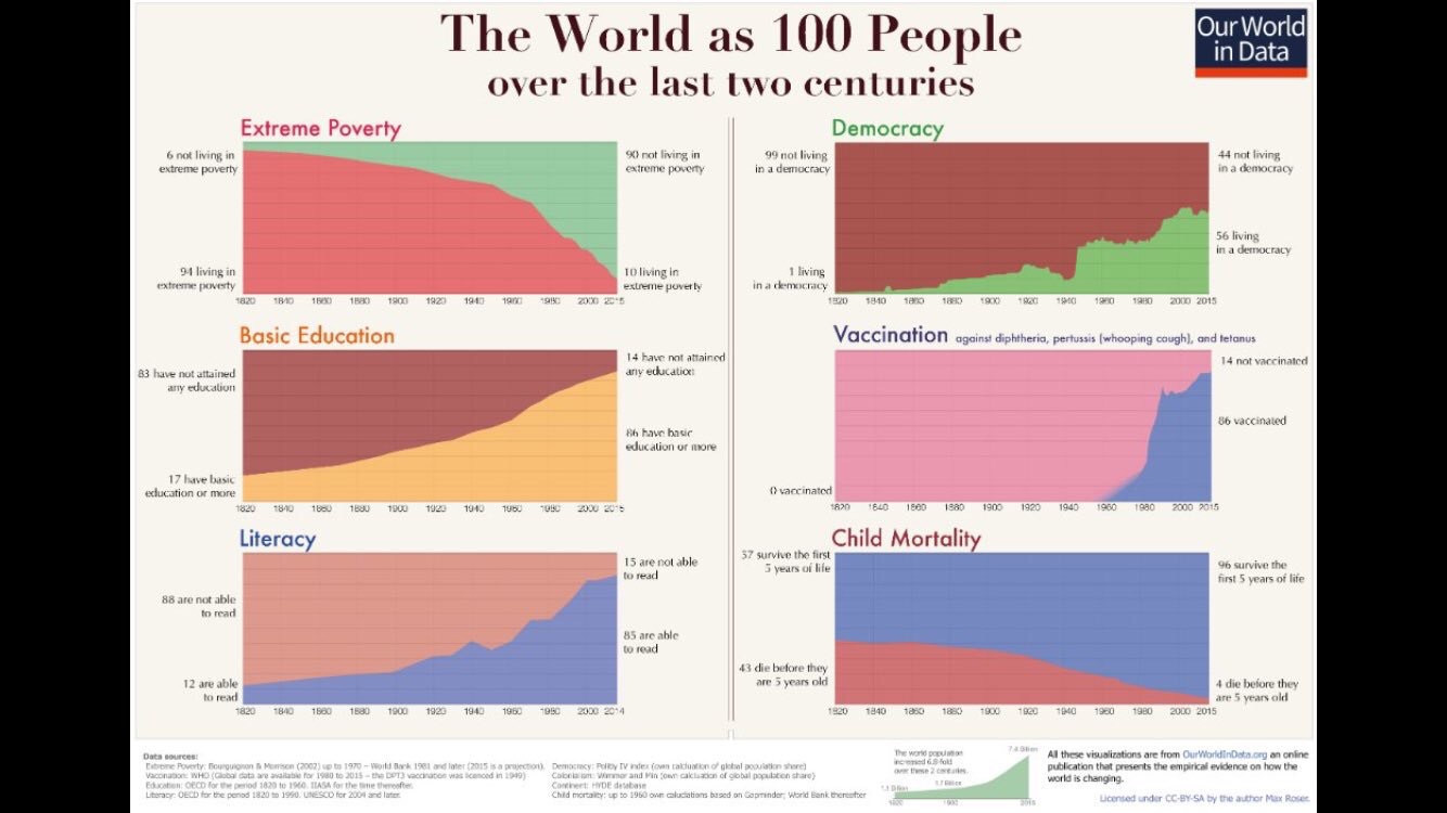
This is my favorite chart because it depicts the current vaccine administration, which is very exciting considering the pandemic took off at a similar rate a year ago this month.

Blog 4: Numbers game and Statistics

http://www.tylervigen.com/view_correlation?id=7

As I was listening to this podcast and reading the article, I couldn’t help but think about this chart that I saw in my Quantitative social science class last week. We were discussing the difference between causation and correlation, and like the podcast briefly mentioned with the Nicholas Cage vs swimming pool drownings connection, one does not necessarily cause the other; it can just be a crazy coincidence. When I first saw this chart, I couldn’t believe it. How could it be possible that the consumption of cheese was in any way correlated to dying by being tangled in bed sheets? I didn’t even know that people died that way, let alone hundreds of people and enough people to collect data on it. Then, my teacher explained that these two sets of data in fact have nothing to do with each other, and neither caused the other to happen, there are just two sets of statistics that happen to have an almost identical progression. Therefore, this chart is extremely mis-leading. For someone who hasn’t been educated on the proper ways to read and analyze information, whether its numbers or writing, could be extremely mislead by this chart if they took this chart at face value.  If someone saw this on the news, they could freak out and never eat cheese again! Just like Lindsey, I am glad to be taking both critical thinking and quantitative social science at Jepson to learn how to evaluate things we see in our everyday life.

Graph/Blog Post 3/15/21

Leisure time on an average day

Link: https://www.bls.gov/tus/charts/leisure.htm


The chart above displays what individuals in the United States, over the age of 15 years old, spend on each activity during their leisure time. According to this chart, individuals appear to spend the most time watching TV, followed by socializing and communicating, etc, and all together comes to just under 5 hours of leisure time per day. At first glance, this chart appears to be acceptable; however, there appears to be under the surface a number of potential issues with this data, issues that are described by Huff in his “How to Lie with Statistics”. One of the biggest issues is that this data was collected in a 2015 survey. With this survey method used, one potential issue is the idea that the sample who responded to the survey was a bad, or not representative, sample. Perhaps the individuals who responded to the survey lied about the amount of time they spent on each leisure activity, whether it be to fit what they think is a normal amount, or for some other reason. This potential for dishonesty calls into question the validity of this data, for it is possible that respondents did not respond truthfully, and thus the data is skewed from what reality is. Additionally, another issue that could arise is the issue of who responded to the survey. It is more likely than not that those of a higher socioeconomic status would respond to this survey, for individuals of lower socioeconomic status may not have as much time to respond, and could also be self-conscious if they do not have much or any leisure time. On the other hand, those of the higher socioeconomic status most likely have more leisure time, and may even be inclined to lie to indicate that they have more than they actually do. Either way, as Huff mentions in his writing, there is the potential for this survey to be biased towards people with more money and more time. There is the potential for this survey to be biased in a number of ways, particularly with a focus on the potential for dishonesty, and for a nonrepresentative sample.