I was very surprised by the content of the Huff reading, because I had always assumed that statistical information would be representative and heavily researched/sampled. I was shocked at the realization that without context or with an unrepresentative sample, statistical information can be grossly misrepresentative of reality. I had also assumed that market research or polling questions would also be accurate, never taking into account people’s tendencies or abilities to lie in order to make themselves look better or worse. When looking at numbers it is difficult to remember that the data is likely being presented with the intention of convincing the reader of something, therefore it may be biased and even if it has correlation, the information may be entirely unrelated. Although I knew that in advertising, companies would present data that is in their best interest, purposely excluding information that does not serve them, or misrepresenting products similar to the way Old Gold cigarettes did, claiming them to be better for you than any other cigarette, neglecting to mention the statistics that showed very little difference between them and other cigarettes.
I think that statistical figures claiming to represent a population should be required to clarify the number of people sampled and methods of sampling, so that readers can decide whether or not to believe the information at their own will. Just because things are strongly correlated does not mean that one is the cause or result of the other, which is very confusing, but basically it means that there are confounding factors that exist outside of the two presented that affect the outcome.
I found it extremely interesting that my automatic instinct was to believe the information presented rather than question it, especially when it was specific instead of generalized, not understanding that there is no way that is accurate or representative of a given population. I realized that statistics can be applied similarly to stereotypes: they can generalize a population but be entirely inaccurate in representing an individual within that population.
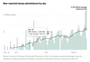
Source: NY Times
This is my favorite chart because it depicts the current vaccine administration, which is very exciting considering the pandemic took off at a similar rate a year ago this month.


I absolutely agree, i have the same automatic instinct about believe statistics and information when it is presented in any for of chart of graph that appears “official.” I think one of the ways that information is easily and frequently distorted in particular is with pie charts. If you ever look at the way pie charts are used or visually displayed, many of them are hugely misleading. One random thing I learned recently is how 3-dimensionally illustrated pie charts completely distort the sections of the graph and make them seem much larger or smaller than the percentage or amount that they are suppose to represent.
I agree as I usually also believe the information presented. My bstats professor keeps reiterating that his goal is to have us question all data that is presented to us, yet I find myself just seeing the data presented and accepting it as it is.