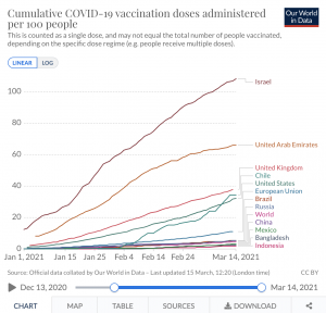
This chart that I found on https://ourworldindata.org/covid-vaccinations shows the vaccine doses per 100 people in different countries around the world. I find this chart really interesting, especially when looking at the growth in certain countries. Chile sees large growth just before February 4th whereas the United States, the UK, the UAE, and Israel all see steady growth since the beginning of the year. I am lucky enough to receive a vaccine (going on Wednesday for my first dose!!) but it is crazy to me that in only two countries, more than half of their population has received even one dose of the vaccine. It indicates to me that many different parts of the world are struggling to make the vaccine accessible to many. Perhaps we could look to the distribution in Israel in the UAE to work on our distribution here.
Critical Thinking


Congrats on getting the vaccine soon, that’s exciting! I appreciate the idea of looking at distribution mechanisms and frameworks in other countries. I think we often have a tendency in the United States to focus on what we are doing and how we are doing it, such as distributing the vaccine, and being able to look at other countries and open to other possibilities can be incredibly beneficial.
That’s so exciting!!! It is really interesting how the vaccine has become more accessible in the US yet there is also still a long procedure and waiting period if you pre register for the vaccine. I think it would be great for the US to look at the two countries who have successfully distributed the vaccine and see if there is anything that can be imitated here for the distribution in a more efficient manner.
It is crazy how developing countries and basically other countries other than great powers are barely receiving vaccinations and how this fact is rarely mentioned in the news. I have never even thought about the vaccinations in these other countries which is kind of scary to me because the US was so irresponsible in handling the pandemic within our borders that we cannot help other countries who are struggling. Congrats on the vaccine Hannah 😛
My focus on the pandemic has been completely surrounding the United States, so I am glad this chart gave me information regarding other countries. It is very interesting to view the high levels of vaccination in Israel and UAE–I would love to learn their strategy. Also, since this chart showcases vaccination distribution, it is not biased information. I hope developing countries will receive more access to vaccines quickly and soon.
Good luck getting your first dose! I’m jealous. It is interesting to see how other countries are progressing with the vaccine, as I have only really focused on how our country is doing. It is also interested to see how other parts of the world are doing with COVID, as many of us will be going abroad in the fall.