
My main takeaway from this week’s podcast and reading is that statistics are extremely powerful and can be used in a variety of ways. Most importantly, statistics matter in regards to history. My mind often gravitates to sports when I hear the word statistics, so the chart I chose for this week’s post is of course about sports. Before we get into the chart, the second most important lesson I learned was that presentation matters. Going back to the 25% chance of winning vs 1/4 chance winning analogy, this also happens when comparing athletes to one another. Ultimately, as we saw from the reading, statistics can be used to lie not just to others but ourselves.
The chart below is from January of 2020 and needs to be updated as Ovechkin has scored many more goals since then. The point is that looking at this chart can be deceptive. On one hand, we can see Wayne Gretzky’s “unbeatable” NHL goal record. Comparing him to Ovechkin it’s easy to assume that Gretzky’s record is unbeatable. However, if the chart was displayed in a way that showed how many goals Ovechkin needs to score vs. how many he actually has, people would be more optimistic that Ovechkin could break the record. In reality, just like the 25% vs 1/4 chance example, these two thoughts are the same thing. This chart helps emphasize that presentation matters when discussing statistics, especially when comparing statistics from two separate time periods. 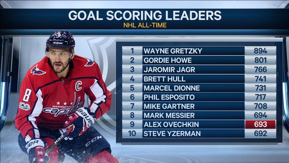
I think it is interesting how you point out that statistics are often used as a tool to “lie.” The creators of that chart definitely wanted to paint Wayne Gretsky out as the best of hockey players but didn’t provide enough information to demonstrate how and why that is their claim. I see this same problem occur all the time when comparing Michael Jordan and Lebron James. In these situations, it is necessary to look at the overall picture of their time periods and who and what they were up against.
you did an awesome point of showing a cool, yet misleading statistic in real life. I think this really just shows the fact that media has a job and a mission: to attract views, not necessarily provide the most accurate and complete conveyance of data. With this in mind, showing a statistic of the “great one” and placing his goal records on a pedestal like this will probably get more views. But wouldn’t data that accounted for goals per year played, or some sort of way to account for the fact that Ovechkin has more time left in his career be more effective?
The presentation does seem to skew our perception here. It’s presented as “201 more goals to go”, instead of “77.5% of the way there”. Also, this graphic doesn’t factor in the length of each player’s career, total games played, etc.
I really like how you connected this chart to the discussion about how 1/4 and 25% can be so differently perceived. I think you are right that if they had presented the information with how many goals he has left, it would be a lot more exciting to realize Ovechkin could totally beat Gretsky’s records. Also, Will brings up a great point that here there is no comparison to how long their careers are or how many years it is estimated Ovechkin will still play. And that alone makes a huge difference.