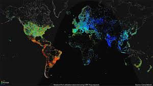
My Map of the Week, “Global Internet Usage Based on Time of Day,” is a unique outlook on the global internet usage of certain areas of the world, depending on the time of day. The map is almost like a short video which changes color depending on the time of day which is demonstrated by a wave like image showing daylight. The color changes vary from red to purple, red being the highest amount of internet usage and purple being the lowest. The map is interesting as it shows a measure of internet usage based on time of day around the world, however, one could argue the reliability of the map. There is a direct relationship between science and mapping, but Wood would argue that we can’t fully trust the science behind a map. Even if the map is scientific, this does not mean it is fully credible. For instance, where did the mapmaker find these statistics? Furthermore, there is no quantitative measurement, rather a qualitative one, which is extremely vague to the viewer of this map. This map conveys a quite obvious point in which the internet is most heavily used in the day time, and least used in the darkest hours of the night.
The justification of this map being the map of the week is because of its direct relation to our maps class. This map is relying on science to be accurate and justifiable. Also, this map gives certain outlooks on the world’s internet usage at a certain point in time. Studying mapmaking is dependent on analyzing maps in a screenshot of time and analyzing how the time affects the map. Wood would argue that this map can be critically analyzed in a specific location and time frame. The map is also a video, or a loop, which breaks mapping standards. One could argue this is a revolutionary map. This is a map thats gives a specific category, internet usage, a broad outlook worldwide. It gives a broad outlook on the world because the map uses a universal standard and color grade to depict internet usage. In doing so, the reader can easily view the map and see how internet usage varies in association to location and time.
The map is unique due to interactive movement and intelligent mapmaking decisions. By looking at this map we can further understand the world in which we live and further our knowledge of other countries and how they differ from us. This map gives the reader the ability to learn a plethora of information on different countries. This map not only informs us on how we have a greater and easier opportunity to access the internet, but how this gives an unfair advantage in education, research, economics and more. Although the internet is looked at as being a small perk of living in a Western nation, the mapmaker is implying how something small, can have a larger and more powerful effect on the world. The mapmaker used a black background and white borders in order to for the colors to pop and to show that the internet has no boundaries. The internet can be used in anywhere at any time, even the ocean. The water could have been blue, but the mapmaker intelligently chose to make the map black to demonstrate the power of Western nations, and the inability of third world countries to access the internet. Furthermore, the map helps demonstrate our privilege and the ways in which we differ from the rest of the world. By looking at the map, one can see that the larger first world countries have completely shaded in areas. This demonstrates that most people have access to the internet and are connected to and using it constantly throughout the day. Even in the nighttime, Western nations are constantly experiencing far greater internet usage than third world countries in peak daytime hours.
It makes you realize that the world is dominated by a new age of social media and internet usage for work, studies, socializing, and for our own personal reason and enjoyment. If you look at the other third world countries, there is little internet usage or certain smaller areas the have a small shaded area. This depicts the power we, as well as other first world countries have. Although internet doesn’t exactly correlate to power, it does give a sense of opportunity and privilege that others do not possess. The internet is used as a tool to further knowledge and research. The internet has many work benefits and the advance in technology almost wipes out labor work demand in third world countries.
Having the opportunity to use the internet for studying and working further benefits individuals and the country. It helps expand a countries knowledge and resources through things like research and trade. Countries that can expand knowledge through research are constantly growing and countries that can use the internet for trade help a country gain resources and expand. This map critically implies that internet usage is a colossal resource that first world countries possess which give an uneven edge and help them maintain and expand power.


The map is so vivid and interesting! Being an interactive map, its movement and change of color have been the greatest advantage to show us the differences of usage of internet across the world. It has corresponded so well to the theme it’s talking about.