
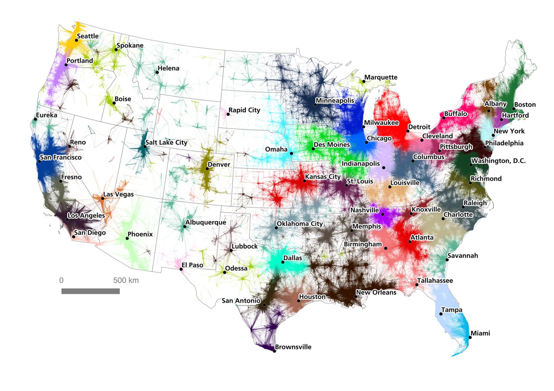
Perhaps more than any country in the world, the United States is an extremely varied fabric of interests and industries. More often than not, Americans associate themselves with their nearby city, region, or even sports team rather than the state in which they live in. Thus, the traditional, 50-state map of the US fails to accurately represent the true boundaries of American communities. Two university fellows created a map in 2016 to introduce the idea of US economy being composed of “megaregions”, large networks surrounding metropolitan hubs, rather than a single market. The territories in a megaregion share topography, infrastructure, culture, and economic ties. By analyzing commutes and mapping them, the mapmakers associate regionalization with the US economy, as commutes pertain to population and jobs. In this blog post, I will look to unpack the mapmakers’ decisions in order to acknowledge a new configuration of the United States.
How does one determine where one megaregion ends and another starts? The mapmakers had the difficult job of restructuring arbitrary state boundaries into economic and cultural networks. Just as for any map, the mapmakers had to make important stylistic choices. The size of the data clusters represents the size of the metropolitan area and the number of people who affiliate themselves with the area. The mapmakers’ decision to affix the data clusters with labels of major cities emphasizes their point that the main centers of work are in cities. In order to illustrate daily flows, this map uses lines as opposed to data points to define commutes. These flows of people and their cars also represent how resources and capital flow through regions. The mapmakers made an important decision with their selection and use of color. The data flows in the Western US are pale and lightly colored, in contrast to the dark and prominent colors used in the East and Midwest. The visual qualities of the map express the mapmakers’ intention to highlight the scant concentration of major economies in the West. Furthermore, the boldness of colors and data transcend state lines, reiterating that megaregions are not necessarily confined to states.
For example, the Memphis megaregion extends from Tennessee into Arkansas, Kentucky, Illinois, Missouri, Mississippi, Alabama, Oklahoma, and Texas. Surely these data flows do not demonstrate literal commutes to Memphis, but suggest that Memphis is the center of a fairly homogenous region. Nonetheless, the mapmakers deliberately chose not to omit state boundaries. They likely did not want the map to vary too much from the traditional map of the US, and in the process, give megaregions an abstract connotation. The course of making artificial boundaries such as megaregions is tricky for mapmakers, as they often have to mask their interests to appear scientific and credible.
The map itself appears straightforward, given the mapmakers’ hidden agenda of restructuring the communities of the United States and showing how megaregions could be connected to reap benefits for the economy. The mechanics of the map and the nature of data display emphasize the influence of cities on their surrounding areas. Clearly not all commutes were plotted, especially those in the West; the mapmakers had to decide when data was aesthetically irrelevant in order to maintain the outward interests of the map. The map argues that a greater number of megaregions and economic strongholds exist in the Eastern United States. It is uncomfortable to think of America without the context of state borders, but maps like these bring this reality closer. If this map was to become widely circulated through American culture, would Americans view it as an interesting approach to our extensive economy, or a threat to state lines and an American identity that has endured since the late 18th century? The concept of megaregions is fairly new, and the traditional accepted map of the US is rarely challenged. This map thus has immense power to shape our understanding and awareness of how we are a part of a greater economic community.
This is an excellent map that brings forth social and progressive questions about today’s society. The map does a good job detailing which major metropolites dominate American society. The map connects people through their commutes, and the cartographer makes specific choices in color to represent these areas. I think there is another hidden meaning behind the map. As large metropoles grow, and local governments in these cities grow, the map is suggesting a different form of governmental organization.the faded state borders could show a devolution of power from the states and towards a devolution of power. Overall, a great map.