
The m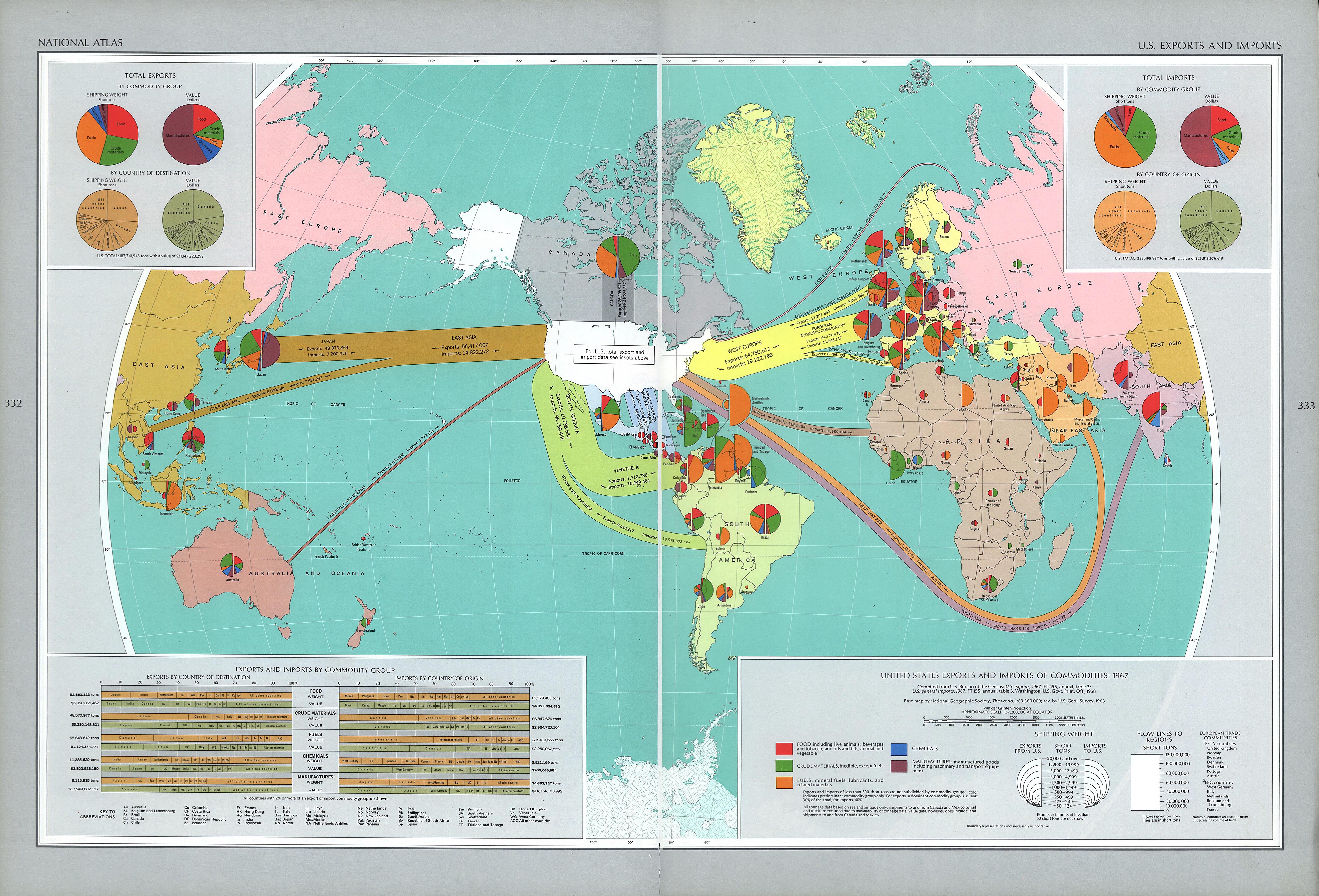 ap pictured is a representation of U.S. imports and exports of commodities from the year 1967. The National Geographic society compiled the data from the U.S. Bureau of the Consensus and included the map in a 1968 issue. Around this time, many maps were being created to convey geopolitical strategy. The Cold War was built on U.S. and Soviet Union ideological battle for influence over other nations, not to mention, the U.S. was at war with Vietnam at this time. The map also conveys the West vs. East cartographic theme; trading between NATO is predominantly shown whereas USSR involvement not as noticeable. Specifically, developing continents regions such as Middle and South America, Africa, Near East Asia, South and East Asia are shown as opportunistic battlegrounds for competing East vs. West post-war ideologies. Greater trade relationships of Northern Hemispheric regions show a dominance of trade between moreso developed “north” countries. On the contrary, a lesser concentrated pie chart array in the Southern Hemisphere give off the idea of a lesser developed “south.”
The map is projected using the U.S.-centric Van der Grinten Projection. The National Geographic society derived this projection from the more prominent Mercator projection in attempts of providing less latitudinal distortion in the map. The numerous pie charts showing imports and exports throughout the map reveal the vast U.S. economic influence post Word War, and also overall industrial power. It is shown that the U.S. held strong trading relations with many countries, particularly Canada, Japan, Venezuela, France, U.K., West Germany, Netherlands, and Italy. The pie charts themselves reflect overall shipping weight by commodity category in corresponding countries. The charts are scaled to overall weight with exports on left and imports on right. Regions are color-coded with a European split along NATO and Warsaw Pact borders. Canada, possesses its own distinctive region due to being U.S.’s largest trade partner. Specifically included is the West Europe trade split between EFTA countries, EEC ( a baseline for future EU), and independent countries.
The total imports and exports charts cover up the USSR land mass, diminishing its visual geopolitical and economic importance. The import and export arrows snake around developing countries and continents reflecting U.S.’s economic power while surrounding USSR. It can be determined that U.S. trade deficits with developing nations, such as Venezuela, increases economic and therefore political value of trading with U.S. Similarly, trade surpluses with developed nations in West Europe and Japan may reflect economic ties from post-war Europe reconstruction (Marshall Plan) and Japanese reconstruction. There are a few distinguishable features, such as the “West Indies” label which conveys imperialistic connotations. It can also de deduced that lack of trade with China was a result of Mao Zedong’s revolution, and Nixon had not yet made his visit to China. The map as a whole signifies how the U.S. seeks to influence developing countries economically while projecting its power.
-Will A. & Dan R.