Tag Archives: University of Richmond

GIS in Action: DC2RVA Field Trip

Post by Shaquille Christmas ’16

A couple weeks ago we visited the Richmond office of  Henningson, Durham, and Richardson, Inc (HDR), which is an architectural, engineering and consulting firm based in Omaha, Nebraska. UR alum and former SAL researcher extraordinaire Bridget Ward recently started working there as a GIS consultant in the transportation division. Bridget and her colleagues spoke to us about the DC to Richmond South East High Speed Rail project they are spearheading the planning for. They detailed the different ways in which HDR uses Geographic Information Systems (GIS) to support not only the DC to Richmond rail project, but also many of their other projects. These uses include preparing bids for contracts, performing analysis for various departments before and during construction, and especially communicating with the public. Below is a map they created showing the proposed rail route.

DC to Richmond (2)

One of the other interesting projects they talked about was an expansion of Route 460 that was delayed and ultimately drastically changed due to another contractor using inaccurate data to make decisions about impacts on wetland health. Since we have worked with wetland data on several projects over the summer it was cool to see how important accurate and detailed analysis is, and how detrimental careless errors can be!

20150710_131235

Overall, our time spent at HDR was both invaluable and inspiring. Bridget and her team gave us several homework projects of cool tool and methods we should learn to prepare for working in a professional and team environment. It is my hope that other students are getting experiences such as this, and are receiving advice on how to best put their GIS skills to use as they consider potential career paths.

20150710_125058

Identify #5: Dr. Elizabeth Baughan

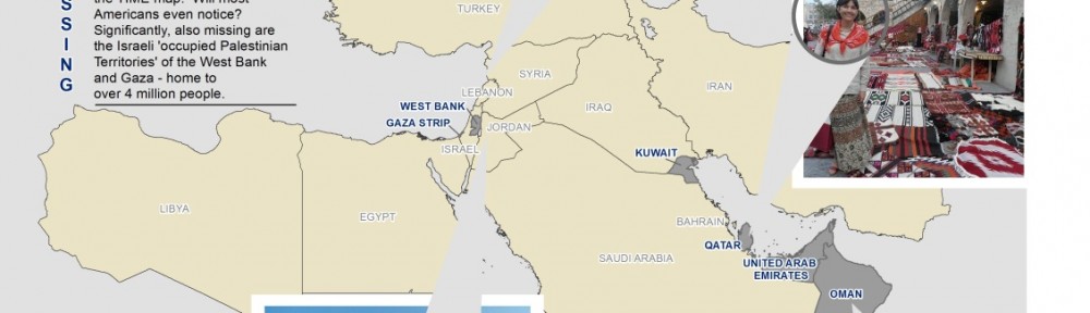
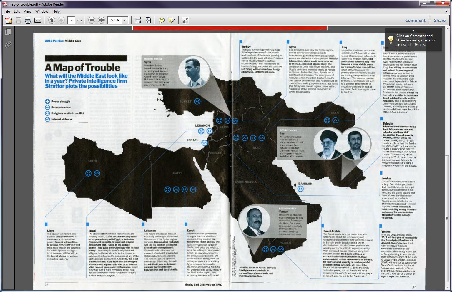
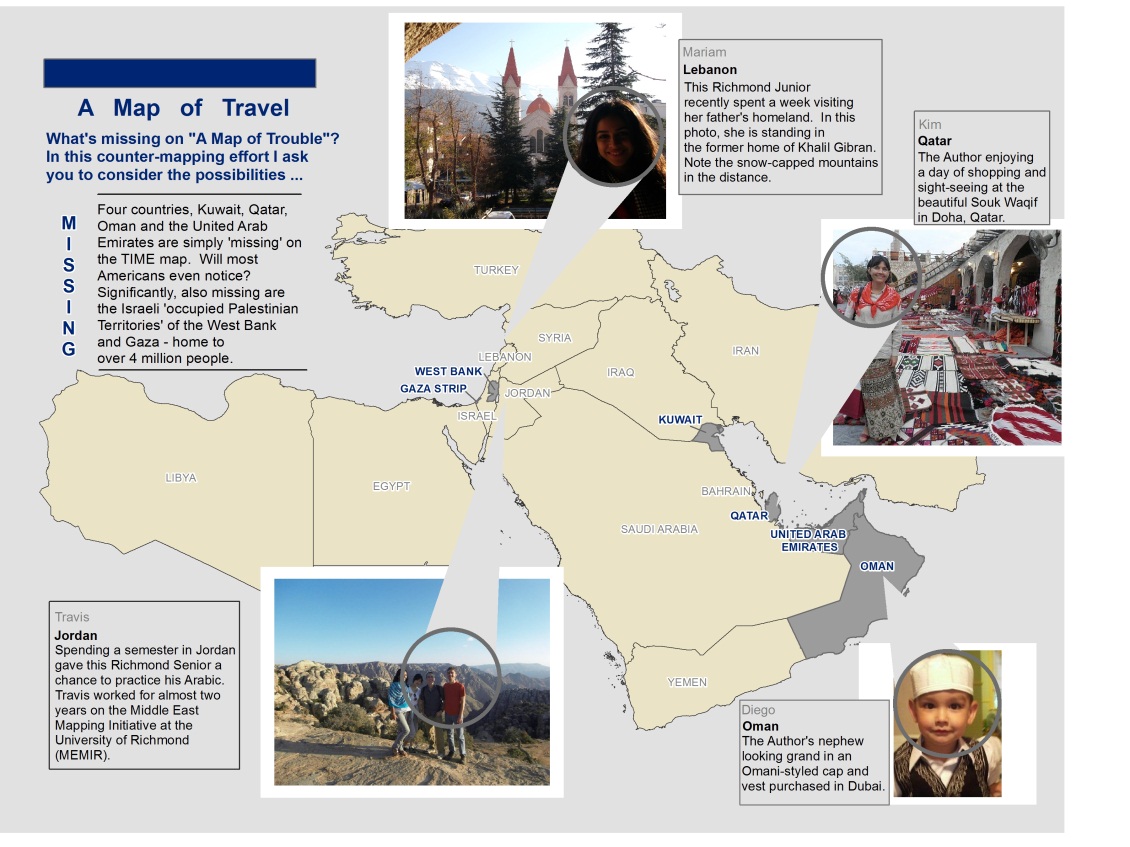
Identify is a monthly series here on the SAL blog, focusing on students, faculty, and alumni of University of Richmond who have used GIS in exciting ways. Come by each month to learn more about the interdisciplinary nature of GIS here at UR.

Imperial fora of Ancient Rome

An example of GIS in archaeology: the imperial fora of Rome. Click the image to access an interactive web map!

In the SAL, we like to emphasize how knowledge of GIS can benefit virtually every academic field. Having skill in GIS isn’t “only” for geography or environmental science; it can be applied to a wide range of other natural, physical, and social sciences too. One great example of this cross-disciplinary application of GIS is our partnership with Associate Professor of Classics and Archaeology Dr. Elizabeth Baughan. GIS, of course, is a perfect way to document the results of archaeological digs, and Dr. Baughan has thus made use of GIS both in class and in the field.

Dr. Baughan frequently brings her Introduction to Archaeology course to the SAL, to familiarize her students with GIS and to show them its power in displaying archaeological data. This class day is “usually a highlight of the semester,” she says, “and it is always interesting to see how many of [the students] have been [to the SAL] for other, very different classes. GIS helps students see unexpected connections across disciplines.” For those students who haven’t yet taken a formal GIS class, many decide to enroll and consequently apply their GIS skills to their own archaeological research. A great example of this process involves this map produced by Samantha Frandsen ’13, a student of Dr. Baughan, showing the locations of the imperial fora of Ancient Rome. You can read more about Frandsen’s work at this link.

Dr. Baughan also uses GIS while performing archaeological surveys. In particular, Dr. Baughan conducts research in Turkey; she and her colleagues meticulously document their finds and add those data to a GIS for future analysis. For archaeology, she says, GIS has “a wide range of uses and benefits, from the correlation of survey find locations with topographic data and subsurface features …, to understanding regional site distribution in the context of environmental conditions.”

But recently, Dr. Baughan ran into an issue: while the data collected for a recent project would show up in our ArcGIS software, its location would not appear correctly relative to other features on the ground—something was wrong with the data. Dr. Baughan came to the SAL and asked for our assistance; after looking at the data, we discovered an amusing, coincidental reason for the error.

As a necessary first step when working with GIS, a map projection had already been assigned to the data. A projection is a way to transform the spherical surface of the Earth into a flat, two-dimensional plane. In particular, the data had correctly been given a UTM projection for zone 35S, the zone describing the western part of Turkey in which lies one of the survey sites. Nonetheless, the data would not show up.

We noticed, however, that ArcGIS uses a slightly different naming structure for its UTM zones. Rather than adopting the Military Grid Reference System format of using the letters C through X to describe latitudes of north and south in a UTM grid, ArcGIS only uses longitudinal bands, splitting the UTM zones latitudinally just once at the equator. This method results in merely a northern and a southern zone, respectively labeled N and S, for each zone number. Thus, west Turkey rests in zone 35N in ArcMap—zone 35S is in the southern hemisphere instead!

Once we fixed this error, the data aligned well. Dr. Baughan will now be able to perform analyses on the data and further develop her academic research. The SAL was glad to help Dr. Baughan “repair” the data—we know that GIS can be confusing, even for people with experience with the tool, and that often the best results come from team efforts. We look forward to seeing how she will use GIS to analyze the data and to helping her work with any geospatial information she collects on future digs!

Bonus! Listen to Dr. Baughan discuss her research as well as her new book, Couched in Death: Klinai and Identity in Anatolia and Beyond, in the most recent Podcast@Boatwright.

Mapping toxic sites in Virginia with the UR Law School

Sachs reportThe University of Richmond comprises five schools serving both undergraduate and graduate students. The School of Arts & Sciences houses a majority of the undergraduate student body, but the School of Law is where most of the University’s full-time graduate students study. While the Spatial Analysis Lab falls under the purview School of Arts & Sciences, we are excited when we get to help some of the University’s other schools; we recently had such an opportunity when we got to assist the School of Law.

Law Professor and Director of the Robert R. Merhige Jr. Center for Environmental Studies Noah Sachs, alongside third-year law student Ryan Murphy, have released a report titled A Strategy to Protect Virginians from Toxic Chemicals, which is freely available at the preceding link. The report, which proclaims itself as “the first comprehensive examination of the sources of toxic releases in Virginia and the potential exposure of Virginians to harmful chemicals,” calls for increased attention regarding toxic chemicals in the environment because of their potential to lead to health problems and recommends how the Commonwealth can start to limit toxic exposures.

While the authors worded the report in common English, the release of toxic chemicals to the environment may not be a topic with which everybody has a lot of familiarity. That’s where the Spatial Analysis Lab stepped in, creating some simple-to-understand maps that showed the extent of sites containing toxic substances throughout Virginia. You can find these maps in the report, but we’ve included them in this post as well.


This first map looks at Superfund sites in Virginia. Superfund is the EPA’s program to clean up toxic waste sites; the NPL, or National Priorities List, is essentially a big list of these sites, so sites that have been removed may have already been sufficiently cleaned up.

The next map shows any facility in Virginia storing over one million pounds of toxic substances in 2011.

And this final map looks at Resource Conservation and Recovery Act (RCRA) corrective action sites in Virginia. RCRA is a law designed to regulate the disposal of toxic wastes. Click here to access the EPA’s interactive map.

The Spatial Analysis Lab is glad to offer assistance to Professor Sachs on this project. We look forward to continuing helping the Law School, and indeed the University of Richmond’s four other academic schools, in upcoming semesters!

from the director’s desk

TIME Magazine recently published this disturbing image titled “A Map of Trouble” (TIME, Jan. 3 2012; 26-27).  My response and my counter-map are inspired by the work of Mark Monmonier (How to Lie with Maps) and J.B. Harley (Maps, Knowledge and Power).

First, the title and the graphic shape of the “region” are linked together in the reader’s mind.  Trouble = Middle East = Bad is the not-so-subtle message.

TROUBLE  =   

In the same way that:

LOVE  =   

and

HAPPY =

Second, the lack of color, the choice of markers resembling hazardous waste dumps, and grey-scaled photographs of men (disturbing ‘others’) help to reinforce the negative message of the map.  Contrast these with the colorful photos included on my “Map of Travel”.  For Harley, “maps are never value-free images.”  “Both in the selectivity of their content and in their signs and styles of representation, maps are a way of conceiving, articulating, and structuring the human world which is biased towards, promoted by, and exerts influence upon particular sets of social relations (Harley 278).”  “A map can carry in its image such symbolism as may be associated with the particular area, geographical feature, city, or place which it represents (Harley 279).” How might our perspective change if we were constantly bombarded with maps and images of smiling people, beautiful scenery and colorful markets?

Third, the map contains several blatant omissions.  The countries of Kuwait, Oman, Qatar, and the United Arab Emirates are simply NOT THERE (neither is Afghanistan or Cyprus for that matter).  The four absent countries fall within the extent of the map – will they not be missed?  Why were they excluded?  Harley says “maps – just as much as examples of literature or the spoken word – exert a social influence thru their omissions as much as by the features they depict and emphasize (Harley 290).”  Significantly, the Israeli-occupied territories of  the Gaza Strip, and the West Bank (aka the PALESTINIAN TERRITORIES) are neither on the map nor mentioned in the vignette.  Could this be a case of the “predictive art of using maps to project and to legitimate future territorial ambitions? (Harley 289).”  Or was this simply an oversight?

“Map users seldom, if ever, question these [the map makers], and they often fail to appreciate the map’s power as a tool of deliberate falsification or subtle propaganda (Monmonier 42-45).”  “Savvy map viewers must recognize that not all maps are intended solely to inform the viewer about location or geographic relationships.  As visual stimuli, maps can look pretty, intriguing, or important.  As graphic fashion statements, maps not only decorate but send subtle or subliminal messages about their authors, sponsors, or publishers (Monmonier  43-45).”

Counter-maps – maps of peace, maps of potential – maps of nuance – must be created and shared to balance overly simplistic and negative maps.  This is one of the chief motivations behind MEMIR – the Middle East Mapping Initiative at Richmond.  Join us!


from the director’s desk

Got GIS?

My original plan for this blog entry was to shamelessly promote GIS Day (November 16th)  – write something about this year’s t-shirt – and link it somehow to Geography Awareness Week. Fortunately, one chance occurrence has changed all that.

Picture this: a Sunday afternoon spent grading and helping students in my lab, and a workshop in the next room.  A chance encounter in the hallway.  “So, I see you teach in the Spatial Analysis Lab?  What is that?”, she asks quite innocently.  I explain.  “Oh (awkward pause) … well … what department would something like that fall under?”  I ignore the “something like that” part and answer as sweetly as is possible while drawing blood on my tongue because I know what’s coming next.  “But,” she continues … not meaning to be ignorant or offensive in any way, “what is it called?”  “GEOGRAPHY”,  I repeat .  “Well, I’ve already got a GPS.”  And with that, my new friend exits and my heart races like something from Rocky and Chariots of Fire combined and the conviction I have to educate people about my discipline is so deep I consider wrapping myself in maps and walking around campus as “Geography Girl”.  Thankfully, I’ve got two teenage daughters at home who know how to draw the line so that they aren’t forever banished from public life.

There is a great article written by Dr. Jerome Dobson of the American Geographical Society called “Bring Back Geography!”  In it he addresses both the idea of geographic ignorance (not knowing where places are) and ignorance of Geography – the discipline, which, by the way, is much more than knowing your state capitals, longest rivers, and highest mountain peaks.  “Geography Awareness Week” was created in 1987 by the National Geography Society (and others) to address this knowledge gap.  GIS Day is held on the Wednesday of Geography Awareness Week – its purpose – demonstrate the important contributions GIS is making to the discipline of Geography and to our world.

Now for the t-shirts and shameless promotion.  Each fall my Introduction to GIS students help the University of Richmond celebrate GIS Day by hosting an open house in our lab, inviting speakers to campus, baking (and eating) cakes, and wearing cool t-shirts.  Visitors can spend 6 minutes or 6 hours at this year’s event.  Our shirt design – “got gis?” has taken on special significance for me after a recent encounter with one of my students.  She and her partner were attempting the first part of a fairly complex three part analysis.  Their task – areal interpolation – involves disaggregating data from census tracts and then reaggregating it for hydrologic units.  Numerous frustrating failed-attempts and numerous questions answered with more questions (“Professor, why xyz?” … “Well student,” I answer wisely and patiently, “have you considered abc? Or perhaps the impact of d and h?” … I try to direct the student to find the answer instead of giving the answer outright) had nearly driven this pair to the breakpoint when suddenly she jumps out of her seat (and I’m not exaggerating – while parts of this blog entry may be fictional this is not one of those parts) and yells “GET SOME!” which in this context means “Oh yes, I am so satisfied with myself and really excited that I solved this problem that was very challenging” – perhaps a raunchy equivalent of yippee or yahoo.  That’s deep learning. So, for those who don’t “got gis?” I say only this: get some.

– Kim Klinker

from the director’s desk

September 12, 2011.  Today was a great day.  I arrived early to make sure all the computers were working and that I had enough handouts for my Human Geography students.  Ethan arrived early to make sure the GPS units were charging for an outing with my GIS class.  My students arrived and began a lesson created to help them learn about Territorial Morphology and Boundary Typology using GIS.  Working with a partner they navigated the world map looking for prorupt and perforated states  – “Does Vatican City count?  What about Azerbaijan?”  – it’s clear that many of them haven’t looked this closely at a world map in a long time.  “Where’s the Danube?”  “What’s next to Egypt?”  I love hearing the students talk to one another, and help one another.  I love the occasional “oh cool” that slips from their mouths.  But mostly what I’m so happy about is that none of the computers crashed.  Not one.  For the entire class period.  Success!

I think back to September 2010.  Students enter the Spatial Analysis Lab in the brand new Carole Weinstein International Center and begin what I tell them is going to be a very exciting lab.  They open the file, as instructed, and within 5 minutes computers start crashing.  When they don’t crash they run so slowly that instead of hearing the occasional “oh cool” I hear the occasional “oh damn”.  Students are rubbing their heads in frustration. “GIS”, they say, “stinks”.  Some students must exit completely, others begin texting while they wait for the computers to restart.  I’ve lost them.  I’d spent so much time creating these lessons – with the help of a Course Enhancement grant from the CTLT – only to face this.  The problem?  Data storage and retrieval.  Netfiles.  The solution: a Server.  It’s the only way to efficiently serve large amounts of data to a lab (or classroom) full of students simultaneously.  But, how to get there?  Money, cooperation from IT and IS and many other acronyms.  Training.  More training.  Loading data onto Server and rewriting all lessons for the new year and BAM!

Today, students completed their GIS Lesson without any technical difficulties.  No performance issues.  No slow drawing maps.  No crashing.  This is beyond great.  This is where I wanted to be.  Instead of being frustrated by the technology they were able to complete their lesson during class time.  They are gaining familiarity with concepts of human geography, spatial thinking, and rudimentary GIS skills.  In the first 3 weeks of school, our lab has been used by: 4 SAL interns, 4 Geography Faculty, 1 Biology Faculty, 1 Chemistry Faculty, 20 FYS – Biology students, 23 GIS students, 22 Human Geography students, 13 Mapping & Sustainability students, and 30+ Physical Geography students.  We’ve made maps for the Law School, the School of Continuing Studies and the Jepson School of Leadership Studies.  I’m so proud of how far this lab has come, and so excited about its future.  Yes, Vatican City counts.  The Danube – Europe.  And it’s Libya.  Libya is next to Egypt.

from the director’s desk¦

The middle of a Hurricane seems as good a time as any to begin putting together content for the new University of Richmond Spatial Analysis Blog. GIS has taken campus by storm. And, the winds of change are certainly in the air.  This year, the SAL – our nickname for the Spatial Analysis Lab – will reach out to many more students, faculty and staff than ever before.  Most of our new outreach is made possible by the acquisition of a SQL Database Server – a giant storage device housed deep in the recesses of the University’s data center below Millhiser.  Meridian, our geographically-named server, can store 5 TB of geospatial data, serve it to a wide variety of users, and keep rock-solid backups of the same. The growing pains of the last few years have (I sincerely hope) been worth it. The goal, in simple terms, was to give us the space for large amounts of geospatial data and to be able to share data with as many folks on campus (and eventually in the world) as possible. Getting to this point was not easy.  The School of Arts and Sciences committed significant financial resources to this new endeavor.  I’ve committed a significant portion of the last 6-8 months figuring out how to work it. Okay, so I’m still figuring out how to work it.  One of our former Lab Interns (now a UR Alumna) and I spent 6 solid weeks learning how to create databases on the new server, and create users and logins so that folks on campus could access the data without breaking it.  We struggled to learn the distinction between Permissions and Privileges (what!?!).  We employed a fascinating training technique – trial and error.  Lots of errors.  There were bad days when I thought “what have I done?” And good days when I proclaimed “look what I did!”  In the end, we’ve got over a hundred pages of technical documentation to help us implement our plan.  Over the next few weeks and months, the SAL will be making available many different kinds of geospatial data sets to the UR Community.  We will be co-hosting 3 PETE workshops for folks interested in learning more about GIS Technology. We will be planning our 4th Annual GIS Day celebration (Wednesday, November 16).  Here’s to a great year!