Category Archives: Reading Responses

Favorite Graph/Chart Post for 3/16

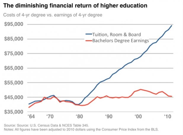
I think this graph is interesting because without any context, it makes sense and the viewer will initially accept the idea that college is not worth the immense cost because it will not produce sufficient earnings. However, there are a few key facts and statistics that this graph leaves out that disprove this idea. First, it fails to show that having a college degree will  produce far greater earnings than a high school degree. This gap in incomes between education levels has actually greatly increased since 1964, making a college degree more valuable today than in the past. Additionally, the earnings represented by the red line are for initial positions and starting salaries, which are typically far lower than one’s salary would be at the retirement age of 60 or 70 years old. When these salaries are taken into account, college degrees return far greater sums than their initial cost and end up being far more valuable in the long term. Rather than a short-term gain, a college education is long-term investment that will yield good results with time, not right away. Studies have shown that “the $102,000 investment in a four-year college yields a rate of return of 15.2 percent per year,” which accumulates to a far greater amount of money than its initial cost.

The key reason that this graph is so misleading is because it fails to account for the other options, which show that it is not the college education system that is failing us but inflation and lack of salary increases to match it. The cost of living has skyrocketed across the globe over the past few decades, but wages have remained relatively stagnant across the board. A college education has increased in value simply because of this inflation, and the economy has not yet matched it. This is the real reason that so many college students are drowning in student loan payments that they cannot avoid or afford to pay.

Thompson, Derek. Hey, Everyone, Don’t Fall for This Misleading Graph about College Costs. 8 June 2012, www.theatlantic.com/business/archive/2012/06/hey-everyone-dont-fall-for-this-misleading-graph-about-college-costs/258299/.

Extra Credit Blog Post- Teach-In

I think the tone used strikes a nice balance. It showed how much the issues matter without being overly combative. Furthermore, the length of the event found the sweet-spot of ensuring enough material was presented, while also not allowing the audience to grow bored by drawing out the time taken. It was a cool sight to look around campus and see groups of people gathering together to learn as a community. The decision to record the teach-in and post it was a great one with the benefit of hindsight. So many people wanted to attend the event that the zoom room filled up and did not allow additional people to join. That fact combined with the knowledge that many zoom logins consisted of groups of people watching together shows how large the audience was. Unfortunately, while sitting in the Westhampton Green it was apparent who those individuals that did not find the event worthy of their time were. Almost every individual I saw walking around and not watching the tech-in was white. While the campus is majority caucasian, statistics tell us that if I saw ten people walk by (I saw more than that), only six should be white (I am using the class of 2020 diversity breakdown). Clearly this is not a big enough sample size, but nevertheless it was disheartening. Renaming Mitchell-Freeman and Ryland Hall is necessary step, but the campus as a whole needs to grow and learn to solve the issues plaguing UR.


Blog Post for 3/16

usa-today-2

This is a graph from USA today that makes it look like the numbers of people receiving Federal Welfare is getting out of control as each quarter continues. It is extremely misleading as the Y-axis begins at 94,000,000. The graph did not just reach nearly 108,000,000 overnight, but instead has slowly grown from 96,000,000 in 2009.

It is very easy to see how different news outlets leaning left or right can put their own opinion onto statistics in order to mislead the public on things like policies to the growth of the economy. This is definitely where you can begin to see political parties widen the gap and become more polarized as the truth gets twisted towards their view and therefore limits the number of moderates. As a business major, I can certainly see how people could use misleading graphs in order to portray the economy or the success of a business a certain way – potentially in an attempt to influence economic policy or the way people invest overall. It just certainly makes you question what you are reading and only further shows the importance of varying the sources that you are getting your information from along with checking/fully examining what is in front of you.


Blog 3/15 Misleading Data and Charts

http://https://thesocietypages.org/socimages/files/2014/04/120.jpg

This is my favorite misleading chart because of just how absurd it is. In theory, charts and graphs make things easier to understand. Clearly, this is not always the case. This graph, conveniently labeled “Gun Deaths in Florida,” is just so misleading. First, and most obvious, it is upside down to how we typically read graphs, with the zero at the top of the graph. This situates it so that the most deaths are lowest on the graph. At first glance, it seems that death decreased after the Florida “Stand Your Ground” Law was enacted, and that total gun death have decreased since the 2000s. This is incorrect. Gun death actually dramatically increased after 2005. Despite the y-axis being flipped, the numbers are labeled fairly clearly. However, the x-axis could use a few more ticks on the axis bar to show exactly when the graph ends. The filled-in red just makes it more confusing overall as well. To make matters worse, this graph was not created by someone who was unfamiliar with graphing practices, or who was selling a product. It was instead from the Florida Department of Law Enforcement itself!

I was lucky in that I learned how to interpret graphs and charts in middle and high school, and so was quickly able to recognize the misleading aspects of this graph. However, this is a pretty obvious example. I can think of plenty of other graphs that are misleading, either on purpose to hint at a particular interpretation of data, or on accident in an effort to make the graph more aesthetic or fit on a page. I’ve even seen graphs with no labels or tick marks in magazines and popular media. Meanwhile, statistics are even more easily manipulated. The most common instance of this in popular media that I’ve seen are polling surveys, especially when they do not include their margin of error.

Blog Post 4: Favorite Graph

This is a pretty recent graph from 2019 based on information from a study at the University of California San Diego and the Brookings Institution. In the article that I saw this image from, it said that, “Now a new report from the University of California San Diego and the Brookings Institution says the states that tend to vote for politicians opposed to reining in greenhouse gases are likely to suffer the harshest economic toll from climate change. David Victor, a researcher at UC San Diego’s School of Global Policy and Strategy and contributor to the Intergovernmental Panel on Climate Change, even said that “The damages to the Republican-electing congressional districts is almost double what it is for the Democratic-voting districts.”.I thought that this was really strong language that indicated causation instead of correlation. More information can be found here: https://www.sandiegouniontribune.com/news/environment/sd-me-red-state-climate-impacts-20190131-story.html.

numbers/ chart blog post

Brian Klaas on Twitter: "My favorite spurious correlation, showing that  correlation and causation are not quite the same thing...… "

i thought that this was a very interesting and unique spurious correlation graph. I honestly had to spend some time to find a graph that was not something with a pretty dark/ distorted variable out of the options selected. This graph made me think of a couple things about Huff’s reading. One of the most important things I took from the Huff reading was the list of 5 questions to ask in chapter 10, “How to talk back to a statistic”. Yes, this is an absurdly similar correlation in terms of how well the graphs flow. However, when you really think about it it isn’t all that crazy. Think about how many words consist of 7 to 14 letters. Any of these could have been the word to win the National spelling bee. Additionally, I would assume that the total number of people killed by venomous spiders would be pretty small too. Here, we see that, one, the sample size is so small that this can’t be an accurate evaluation. There simply aren’t enough letters or bites to get that far away from each other’s number. Next, obviously, we have to ask Huff’s 5th question, “does it make sense?”. Here, the answer is obviously no. But when I step back and think for a second, I know that if I had seen the graph without the labels, I would’ve been shocked by the correlation between these variables. With this in mind, most variables used would have to be more believable than deaths from spiders and letters in the word to win the national spelling bee. Because of this, it’s so easy to want to believe things when they are shown in ways like this. Yes, this one happens to be true, but evaluating if something makes sense along with Huffs additional questions (Who says so? How does he know? Whats Missing? and Did someone change the subject) are absolutely essential when evaluating not only charts, but also tables, diagrams, and studies.

Blog Post 3: The Numbers Game

In Huff’s piece, he explains that bias is present in almost every piece of data that we see. Whether it be independent studies at scientific laboratories, or research projects at public universities, almost any study that is done will have bias. There’s conscious and unconscious biases that influence the way researchers gather information, and as a result, we often get information that isn’t necessarily reliable. What really stuck out to me was this quote: “Public pressure and hasty journalism often launch a treatment that is unproved, particularly when the demand is great and the statistical background hazy.”

In this quote, I think it goes to show how much the media influences our beliefs and views of the world around us. As a journalism major, I’m all too comfortable with how public pressure can sway the way journalists write, and in the case of COVID-19, I think that’s why we’ve had so much misinformation spread. News outlets tend to be focused on getting the news out faster than other outlets, and that leads to common mistakes and errors that could easily be avoided. I specifically remember when the pandemic was first gaining traction, it seemed that everyone was publishing contradicting opinions and recommendations on how to stay safe.

In order to report accurate information that is free of bias (as it can possibly be, since that’s practically impossible), it takes a two-pronged approach from both parties. The scientific entities that carry out these surveys need to share their raw data in a way that is clear and concise. Journalists and reporters then need to closely analyze the data they’re given, and report on it without jumping to conclusions. The scientific entity should then be able to approve the article before it is published, just to make sure everything is correct. Although this is really idealistic, and probably takes up a lot of time, it would lead to more accurate science news for the everyday reader.

Blog Post 4: Charts

It was very easy for me to think of my favorite chart, as this is one that does not lie. I think that Bitcoin is a very fascinating work of technology, especially while viewing the all-time chart. This specific chart is not even the all-time chart, as it should technically go back all the way to 2009, however, this was the easiest chart I could grab that reflected the current price. I believe the “all-time” on this reflects how long Bitcoin has been on Coindesk, which is a cryptocurrency exchange. Compared to the price of $60,000 now, the price in 2014 and before was virtually zero. I think that there are a few important takeaways from looking at this chart. The first is that the price of Bitcoin here is highly volatile and just a small portion of the chart (the far right half) tells a large story. Only looking at half the graph would make it seem worth next to nothing, but the other half shows the complete opposite. The second takeaway that I have is that the graph is that by zooming out all the way, Bitcoin appears to have parabolic growth, meaning there’s no telling how much higher it may rise.

Stock and other asset charts are very interesting. Some people think that you can conduct technical analysis, which is just a fancy way of saying charting, on stocks in order to predict future price points. In this case, there are many different patterns that charters look for on the chart in order to figure out where it will go. Other people consider the technical analysis of charts a waste of time, given that there are so many different external factors that play into determining the price of a stock that has nothing to do with its past price points. A single large announcement from a company could make the chart go crazy in either direction. There are many people that sell courses on how to interpret stock charts to make money, and while it may work sometimes, it isn’t always the case. I think stock/crypto charts provide a unique perspective on interpreting other data charts. Just because everything seems to be there does not mean that the full story is being told.

One side note about the reading, I thought it was funny how long statistics, ads, and charts have been manipulated for. Now there’s a big emphasis on fact-checking statistics and charts, but even that isn’t always accurate. I think over time more regulations have gone into play with commercials and advertising and using statistics, however, it isn’t hard to work around those.

Favorite Chart blog for 3/16

This is probably one of my favorite graphs. I just think how I found it is funny. CNN referenced it in a post they made about the news faking the numbers of COVID-19 cases and accused the numbers of being misleading – aka they think that corona is not as present/active in the US as this graph says it is. The graph was created by the Johns Hopkins University of Medicine, specifically in their Coronavirus resource center, and is updated daily for the number of cases and where they are. The line across the graph represents the positivity ratio versus the number os people tested, the orange represents new cases and the purple represents deaths from COVID-19. After studying the graph and checking the sources and numbers, this graph is a reliable one. It portrays accurate information and comes from a very reliable and honest source.

Blog Post for 3/16

This graph was one that I found interesting when looking into the world and growth of esports. At first glance I thought that this graph was a decent representation of the number of fans viewing esports events over time. It represents the number of total viewers, the increase in viewership from year to year and divides between consistent viewers (called esports enthusiasts) and occasional viewers. This graph was released in September of 2020 by the Global Esports Market Report so was estimating for the end of the 2020 year. After listening to the podcast, I went back to this graph and was able to notice some of the deceptive parts of it. First off, the growth goes year by year from 2018-2020, and then jumps from 2020 to 2023 with no intermediary years. This makes the growth look exponential but in reality the growth seems to be slowing year by year. Additionally, at the very bottom of the graph in small print there is a disclaimer stating: “Due to rounding, Esports Enthusiasts and Occasional Viewers do not add up to the total audience in 2020”. This sentence really made me question the graphs portrayal of the data because if the estimate for 2020 was rounded, it is possible that other years were also rounded. Additionally, what does “rounded” mean? Does it mean rounding up by one-hundred or by one-million? This really made me question how sound the data of the chart was.

I found the reading to be very helpful in terms of reading graphs for both this class and others. Most of my other classes are in the sciences and we often look at graphics and charts in the same way, but consider the error to more be coming from the size of the dataset or technique. I had not really considered the error possible from people’s answers to polls or from the people crafting the graphics before. Looking at this made me evaluate how I make graphs and the way that I represent data in many of my biology classes. The reading offered an interesting way to look at not only charts in the humanities, but also a basis of understanding that can be transferred to other field of study.