
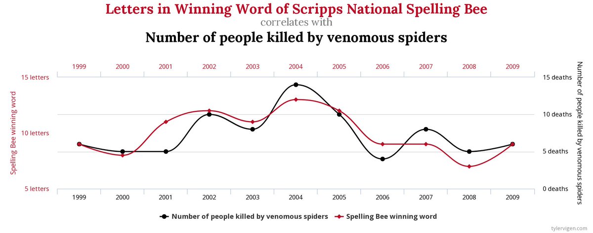
i thought that this was a very interesting and unique spurious correlation graph. I honestly had to spend some time to find a graph that was not something with a pretty dark/ distorted variable out of the options selected. This graph made me think of a couple things about Huff’s reading. One of the most important things I took from the Huff reading was the list of 5 questions to ask in chapter 10, “How to talk back to a statistic”. Yes, this is an absurdly similar correlation in terms of how well the graphs flow. However, when you really think about it it isn’t all that crazy. Think about how many words consist of 7 to 14 letters. Any of these could have been the word to win the National spelling bee. Additionally, I would assume that the total number of people killed by venomous spiders would be pretty small too. Here, we see that, one, the sample size is so small that this can’t be an accurate evaluation. There simply aren’t enough letters or bites to get that far away from each other’s number. Next, obviously, we have to ask Huff’s 5th question, “does it make sense?”. Here, the answer is obviously no. But when I step back and think for a second, I know that if I had seen the graph without the labels, I would’ve been shocked by the correlation between these variables. With this in mind, most variables used would have to be more believable than deaths from spiders and letters in the word to win the national spelling bee. Because of this, it’s so easy to want to believe things when they are shown in ways like this. Yes, this one happens to be true, but evaluating if something makes sense along with Huffs additional questions (Who says so? How does he know? Whats Missing? and Did someone change the subject) are absolutely essential when evaluating not only charts, but also tables, diagrams, and studies.
These kinds of graphs also illustrate how easy it is to make two things seem related when they’re actually not. If publication’s aren’t careful, they could publish complete nonsense.