
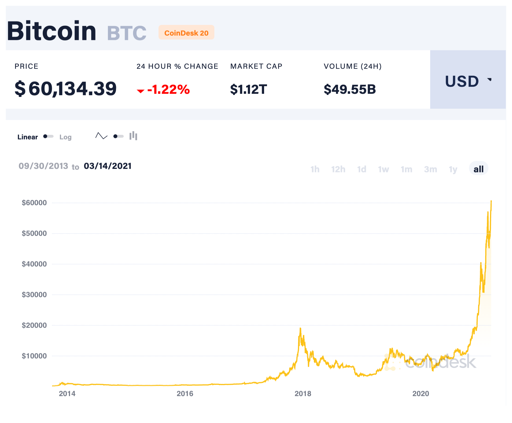
It was very easy for me to think of my favorite chart, as this is one that does not lie. I think that Bitcoin is a very fascinating work of technology, especially while viewing the all-time chart. This specific chart is not even the all-time chart, as it should technically go back all the way to 2009, however, this was the easiest chart I could grab that reflected the current price. I believe the “all-time” on this reflects how long Bitcoin has been on Coindesk, which is a cryptocurrency exchange. Compared to the price of $60,000 now, the price in 2014 and before was virtually zero. I think that there are a few important takeaways from looking at this chart. The first is that the price of Bitcoin here is highly volatile and just a small portion of the chart (the far right half) tells a large story. Only looking at half the graph would make it seem worth next to nothing, but the other half shows the complete opposite. The second takeaway that I have is that the graph is that by zooming out all the way, Bitcoin appears to have parabolic growth, meaning there’s no telling how much higher it may rise.
Stock and other asset charts are very interesting. Some people think that you can conduct technical analysis, which is just a fancy way of saying charting, on stocks in order to predict future price points. In this case, there are many different patterns that charters look for on the chart in order to figure out where it will go. Other people consider the technical analysis of charts a waste of time, given that there are so many different external factors that play into determining the price of a stock that has nothing to do with its past price points. A single large announcement from a company could make the chart go crazy in either direction. There are many people that sell courses on how to interpret stock charts to make money, and while it may work sometimes, it isn’t always the case. I think stock/crypto charts provide a unique perspective on interpreting other data charts. Just because everything seems to be there does not mean that the full story is being told.
One side note about the reading, I thought it was funny how long statistics, ads, and charts have been manipulated for. Now there’s a big emphasis on fact-checking statistics and charts, but even that isn’t always accurate. I think over time more regulations have gone into play with commercials and advertising and using statistics, however, it isn’t hard to work around those.
I found your incorporation of bitcoin into the idea of numbers very interesting. Bitcoin has always perplexed me a bit as far as how it fits into other assets and how volatile its value can be. This chart is definitely a good example of one to look at how viewing different parts of the graph can vastly change the impression the graph can make on the viewer.