Category Archives: Reading Responses

Blog Post 4 : The Numbers Game

One of my favorite data visualizations (more so subject of data visualizations) has got to be the self-reported “life satisfaction” graphs and charts we so often see when trying to compare countries and the wellbeing of their citizens. For example, for this post, let’s take this global map from the “World Happiness Report”

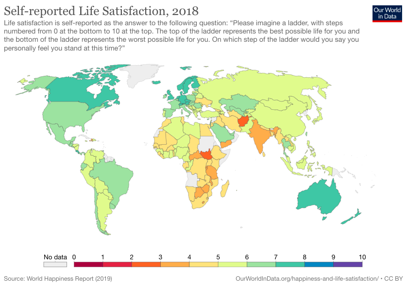
This map is so interesting to me because it is color coding each country on a scale from 0 to 10 based on how “happy” the overall population of each country is. However, this is super unreliable, and not just because self-reporting itself is unreliable and tends to skew data in the first place. It’s also unreliable because we may think two different ways, which neither of are true:

  1. The places in the red and orange are unhappy with life because their country and government has made them unhappy
  2. This country is in the red/orange because it is coincidentally full of unhappy people and attracts unhappy people.

And then we can say the same for the “happier countries” using those two conclusions as well. In reality, there is a LOT more that goes into these maps and there is much more thorough reasoning as to why, according to the World Happiness Report, some countries are overall “happier” than others. Again, it’s important to be skeptical of this whole concept of self-reported happiness as well, because people oftentimes lie and skew the data. For example, if someone whose data was collected for this project wanted to make their country look better, they may fib and say that they are more content than they actually are. It’s important to look at maps like this one critically and not just take it at face value because there’s a lot more that goes into it than meets the eye.

This is currently one of the graphics or charts I find most interesting. I have seen it circulating again recently, a little over a year after it came out. The reason I find it so interesting and that it is one of my favorite charts right now is because of how inaccurate it has proved to be in the past year since the covid-19 pandemic began. It combined a visual map and a bar chart below, and details the level of preparation of some countries on the bar chart, with the map showing all territories and countries. This graphic does not explain the criteria used to determine a country’s preparedness for an epidemic or pandemic, however, just from a glance there are some potential trends visible in what countries were determined to be the most or the least prepared. Many of the countries who were deemed the most prepared are countries that are considered “developed” countries, and countries that are sometimes called “underdeveloped” were deemed the least prepared. This graphic also seems very euro-centric as to which countries were determined to be most prepared. Additionally, although the map attempts to show all territories and countries, only certain countries appear on the bar chart with a numerical value assigned to its preparedness. I think this graph is interesting because it reminds me to question both what factors were considered in making an evaluation, as well as what factors or biases might influences how and what parts of the data are presented in a chart or graphic.

Source: https://www.statista.com/chart/20629/ability-to-respond-to-an-epidemic-or-pandemic/

Blog 4

I discussed this chart in my Quantitative Social Science class which is supposed to display the average female height per country. The title is clear and the x-axis is labeled well, but beyond that is where the problems begin and the graph becomes less representative of the main goal. The y-axis measurements paired with the use of a female stick figure visually misrepresent the actual difference between the female heights in the different countries. The y-axis starts at 5’0” and only goes up to measure 5’7”. The tallest females are in Latvia at 5’5” and the shortest is from India at 5’0”. That’s only a 5 inch difference, yet the size of the figures representing India and Latvia suggest the size difference is very noticeable, almost extreme. The larger the stick figure gets as well, the wider the figure becomes. This effect subconsciously makes us also picture a much skinner, tinier woman in India than in Latvia which is not supposed to be represented here at all. Whoever made this chart, let the desire to make the chart look appealing overshadow the goal to present the information in a straightforward way. 

From the reading this week, I found it interesting to read how misleading information manifested in 1954, when Huff wrote the book, in comparison to 2021. There were two points specifically that stood out to me. First, he claimed that “some of the strongest feeling against public-opinion polls is found in liberal or left-wing circles, where it is rather commonly believed that polls are generally rigged” (Huff 28). This claim echoed the sentiment felt throughout the most recent presidential election, but not necessarily most represented by “liberals or left-wing circles” (28). The public had a hard time trusting the polls whenever they said their candidate wasn’t going to win. It’s disheartening to read that even in 1954 sentiments like this were noteworthy to discuss and we continue that conversation today instead of making any real ideological change. Furthermore, the second point that stood out to me was Huff stating that “public pressure and hasty journalism often launch a treatment that is unproved, particularly when the demand is great and that statistical background is hazy” (43). The pressure for news outlets to provide information first or to have this amazing breaking news story still applies today, almost 60 years later. Many examples exist of news platforms misreporting a story because they had the wrong information and did not take the time to fact check themselves or they chose to create a narrative that they didn’t actually have evidence for, but it was entertaining. I think some of the charts that we all picked probably reflect these poor journalism habits as well. 

Blog 4

This topic on numbers is one that I always find really interesting and that is probably because there are different perspectives that can be taken. The podcast started talking about different examples where numbers can be misrepresented. The perspective of understanding how others report the data is something I have never really thought of as I always would look at how to understand and interpret provided. The fact that topic and presentation is key when coming to numbers, you need to also look at the bigger picture. By this I mean that many will truly believe the statistics without having a holistic perspective. There are many companies that have data that they use to their advantage even when the numbers are the best as the key element is how they share the information with their consumers and the public.

When it comes to collecting data, there are a lot of factors that play a role. The group represented or where data is collected on can be bias which is why many studies will use a random sample. Random sample can prevent bias and also provide more accurate results. The accuracy of information and data gather also comes from multiple studies/ trials. Now once the data is collected, the next step when sharing the data is finding the best way to present it to the public so that the information is appealing and can favor what is trying to be sold or something you try to persuade the public on.

I am currently taking Bstats and we focus on how data is presented and used. And my professor repeatedly states that his goal by the end of the semester is to get us to question the data presented and see if it is actually true through our own curiosity.

The chart I decided to use is pictured below.  I think one of the first things I noticed was how Netflix’s bar was so much higher and a different color of course. However, you can see that the chart goes to 80% not 100%. This can create a misconception as most associate it as higher which it is but in other circumstances can deceive the consumer of the numbers with this small minor detail.Netflix crushes rivals when it comes to subscriber exclusivity: CHARTS - Business Insider | Netflix, Hbo, Current movies

Blog Post 3/15

It is hard for us to escape the constant news cycle about COVID these days but these conversations are really important, especially in regards to how this virus is disproportionately affecting people of color. In the chart, 16 states in which Black people have a higher share of the population percentage than the national average are listed. Within these states, they then compared the % population share to the % COVID death share for Black people.  They found that in all but one state, Black people made up more of the percentage of COVID deaths than they even made up the percentage of the population. When it is broken down like this, it is simple to see — Black populations are being hit hard with COVID. I think that this graph is pretty standard and easy to read, but I could understand how someone may get confused figuring out the % of population bit. This data is extremely important, especially considering VA is on that list! It is graphed like this that can make numbers easier and express issues more effectively with these visuals. 

However, in general, I think that graphs in the news have been used in very misleading ways. While most people with some higher education might be able to see through some of their tricks (mostly because they have had more exposure to classes involving this) a lot of Americans are not as fortunate. Politically fueled new sources will show the data in a different way to push for their cause and make people want to believe it is true. In the second photo attached, it is clear that changing small things, like how many decimal points you make the y-axis go to, can change the graph completely. I think this is something for everyone to be aware of while looking at graphs because while it is easy to fall into their trap, with a little understanding of graphs and data, we all can avoid this.

Podcast 4- Numbers Game

Since I am a humanities major mostly due to my inability to work with numbers and statistics, i thought this chart was really funny. I will admit I did not have a favorite chart until I found this one, but I thought it was fitting for that reason and also because I work at Passport Cafe and have to stare at all that delicious food for my whole shift. Moreover, I am glad that critical thinking gives us the skills to analyze arguments in this quantitative form because, as Dr. Bezio mentioned in the podcast, that is often how people choose to back up their humanities-based arguments. I had also never really though about it before how data and statistics are often used to support evidence of demographics, but on second thought even the giving games paper that we just turned in that had sections just about ethics had some numerical forms of evidence. Overall, I will now look at numbers in a much different light when thinking about arguments. More specifically, I will think about how they are used within the argument and if it makes sense or aims to be deceiving, rather than just glancing at them and pretending I understand.

Chart Post

Recently, I was reading through the Collegian’s Weekly Newsletter when I stumbled upon this graph. As someone passionate about strengthening pathways to and through college for Black students, this graph triggered ambivalent feelings in me. On the one hand, I like this graph because it confirmed one major thing for me. The graph confirmed that predominantly white institutions, like UR, must do better at supporting their Black student population, given that fewer Black students are attending UR and other higher educational institutions in general. Whether this is because of obstacles to access, such as affordability, or because our nation has yet to provide a more adequate education for all students from all backgrounds and identities, work needs to be done. And it needs to be done now.

On another note, I am curious about one particular detail of this graph. Even though it says that the graph represents domestic UR undergraduates who identify as Black and/or African American, I am curious to know the disaggregation of the sample used for this graph. More specifically, what did the researcher intend by the word “domestic?” For me, I interpret the results of this graph to represent the number of UR undergraduates who identify as Black and/or African American and who live reside in one of the fifty states in America. To that end, is it possible that UR undergraduates who identify as Black/African American yet do not reside in the United States are included in this graph? Questions like these definitely made evaluating statistics and graphs a bit more complicated yet necessary if one is making decisions that could have long-term consequences for our society.

The graph and the Collegian article that references it can be found here: https://www.thecollegianur.com/article/2021/03/percentage-of-black-students-at-ur-decreased-in-past-decade?ct=content_open&cv=cbox_featured

Blog Post

I liked the part in the reading that talked about how you might get data from the questions you ask, but it might not be answering the question you thought you were asking. In the example about what magazines people had in their homes, the researchers knew based on the circulation data for the magazines that people were lying and saying that they had the “higher brow” magazine. This showed that they weren’t actually measuring the kind of magazine people had in their homes, but instead their level of “snobbery” (18). We’ve been discussing this in my Social Science Inquiry class for Political Science and Jepson about how to collect this information, so it’s really interesting to discuss how data’s presentation can be manipulated. In the podcast, Dr. Bezio discussed how cheating numbers is a trick as old as time, and even if the numbers aren’t entirely fabricated, they are sometimes “beat into submission” to say what the author wants them to say. 

I definitely fall into the trap of accepting numbers at face value. Even from the first example in the reading about the specific income of Yale Class of ‘24 students, I made the assumption that if the number was specific, that also meant it must be very accurate. Learning this is not the case and that can be due to sampling errors and bad assumptions was a little embarrassing because it made me aware of how much I take numbers at their face value. As a humanities student, I am guilty of thinking that numbers aren’t lying to me because they feel so scientific and concrete. Honestly, looking at lots of numbers scares me and I prefer not to do it, but Dr. Bezio made a good point in her podcast that understanding numbers and statistics is an essential part of making good arguments in humanities fields. Who knows, maybe if I’m actually learning statistics in the context of things I care about it will be more understandable and interesting. After doing this reading I’m more aware of the common tricks for falsifying data so I can pick it out better in the future. My other major is Political Science, so understanding when someone is BS-ing numbers will likely be of critical importance going forward in my career! Below is a graph that I made as a joke for my application to meet Hasan Minhaj. It is a bad chart. I falsified all of my data and probably based it on untrue assumptions,  my axis makes no sense and isn’t really labeled, but it was apparently pretty convincing to my audience because I achieved my goal of meeting him! I promise to never intentionally make a graph this trash again. 

Blog Post 03/16/2021

Listening to Podcast Episode 4 on “The Numbers Game” had an impact on my interactions with statistics. Currently, I’m enrolled in a Business Statistics course here at UR, where over the course of this semester, my peers and I have to work in groups to present three written and oral presentations on a research topic of our choice. My group decided to research the following question: During the COVID-19 pandemic, have some age groups in the United States been experiencing depression more frequently than other age groups in the U.S.? To effectively answer our research question, we retrieved reported data from the U.S. Census Bureau’s Household Pulse Survey conducted over thirteen days. Participants in this survey were part of the United States population. They self-reported various demographic information and their frequency of feeling down, depressed, or hopeless over the thirteen days that the study was conducted.

My group used relative frequency to test if 18 to 29 year-olds are more likely to experience depression more frequently than 40 to 49 year-olds and 60 to 69. We learned that if a person is between the ages of 18 to 29, there is a 71% chance that they experience depression more frequently than 40 to 49 year-olds and 60 to 69 year-olds. Knowing what I now know about statistics, I am highly skeptical of the people who self-reported not experiencing depression at all, specifically if these persons were older in age. From my viewpoint, older people generally do not admit that they are experiencing health issues even if their concession could save their lives. Whether this is because of their pride, upbringing in history, or other relevant factors, I wonder if, in reality, 40 to 49 year-olds or 60 to 69 year-olds experience depression more frequently than 18 to 29 year-olds.

Chart Blog Post

Highest Paid Athletes | Mekko Graphics

This is one of my favorite charts as it is a direct explanation and display of male dominance in sports. Unfortunately, males lead women in revenue when it comes athletics and a lot of the reason is due to the interest of the fans. While a lot of people enjoy women’s sports, the majority of people mainly watch the men, creating a large pay gap between genders. This graph shows the innate bias for mens sports within the world and is the reason why teams such as the Women’s National Soccer Team does not have the opportunity to be treated the same. Hopefully, in the future, these numbers are changed. Women, especially in soccer, are starting to prove that many people enjoy and respect their sport. While the fight for equal pay continues, many women are speaking up.

Graphs such as these are important because numbers make us feel something or sure of ourselves. This graph shows a lot of high numbers and therefore may infer differences within genders. Due to the lack of female representation, what does this graph insinuate about women? Does this suggest that females may lack talent or entertainment? This graph and the ways in which numbers work is interesting to look at as numbers are always manipulated.