
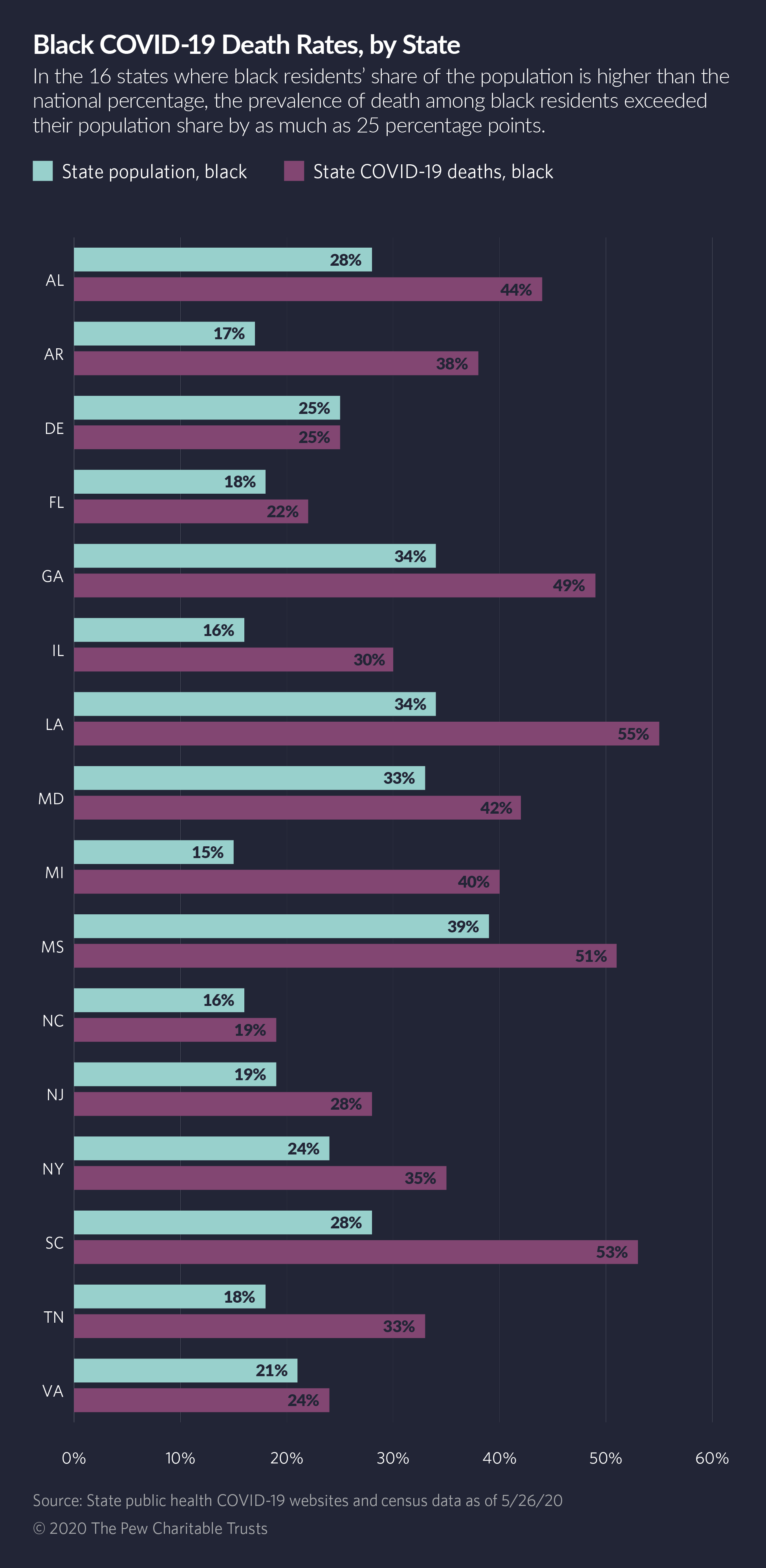
It is hard for us to escape the constant news cycle about COVID these days but these conversations are really important, especially in regards to how this virus is disproportionately affecting people of color. In the chart, 16 states in which Black people have a higher share of the population percentage than the national average are listed. Within these states, they then compared the % population share to the % COVID death share for Black people. They found that in all but one state, Black people made up more of the percentage of COVID deaths than they even made up the percentage of the population. When it is broken down like this, it is simple to see — Black populations are being hit hard with COVID. I think that this graph is pretty standard and easy to read, but I could understand how someone may get confused figuring out the % of population bit. This data is extremely important, especially considering VA is on that list! It is graphed like this that can make numbers easier and express issues more effectively with these visuals.
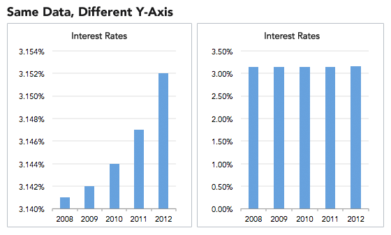
However, in general, I think that graphs in the news have been used in very misleading ways. While most people with some higher education might be able to see through some of their tricks (mostly because they have had more exposure to classes involving this) a lot of Americans are not as fortunate. Politically fueled new sources will show the data in a different way to push for their cause and make people want to believe it is true. In the second photo attached, it is clear that changing small things, like how many decimal points you make the y-axis go to, can change the graph completely. I think this is something for everyone to be aware of while looking at graphs because while it is easy to fall into their trap, with a little understanding of graphs and data, we all can avoid this.
I agree with you, there are many charts in the daily news that manipulate the general public. While looking at graphs on the tv, it is common to trust the source it is coming from. Especially with the coronavirus we have seen a manipulation of numbers. I believe that it is more common than we all think.
I agree with everything that you said, especially in regards to how COVID is portrayed on television. When it comes to the idea that data manipulation can be misleading if one is unable to properly find the flaws of the chart, I think this act is sometimes necessary in order to prove a point. Looking at COVID graphs from a year ago in comparison to today, many more graphs and charts exist that are less scary and more optimistic. I think the context of the environment in which the graph is being used matters. At first, graphs and charts needed to be used to make others stay at home. With millions of people getting vaccinated every day, these graphs and charts have shifted to a more optimistic tone.