
One of my favorite data visualizations (more so subject of data visualizations) has got to be the self-reported “life satisfaction” graphs and charts we so often see when trying to compare countries and the wellbeing of their citizens. For example, for this post, let’s take this global map from the “World Happiness Report”
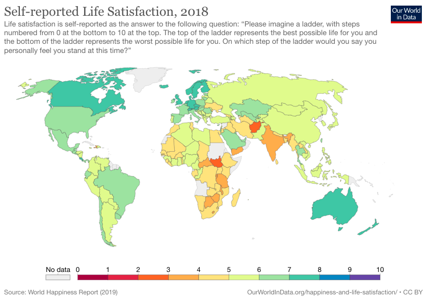
This map is so interesting to me because it is color coding each country on a scale from 0 to 10 based on how “happy” the overall population of each country is. However, this is super unreliable, and not just because self-reporting itself is unreliable and tends to skew data in the first place. It’s also unreliable because we may think two different ways, which neither of are true:
- The places in the red and orange are unhappy with life because their country and government has made them unhappy
- This country is in the red/orange because it is coincidentally full of unhappy people and attracts unhappy people.
And then we can say the same for the “happier countries” using those two conclusions as well. In reality, there is a LOT more that goes into these maps and there is much more thorough reasoning as to why, according to the World Happiness Report, some countries are overall “happier” than others. Again, it’s important to be skeptical of this whole concept of self-reported happiness as well, because people oftentimes lie and skew the data. For example, if someone whose data was collected for this project wanted to make their country look better, they may fib and say that they are more content than they actually are. It’s important to look at maps like this one critically and not just take it at face value because there’s a lot more that goes into it than meets the eye.
I’ve always found charts like this one fascinating, and believed that they were representative of the actual happiness of people within these countries. It was very surprising to me to do the reading and realize that self-reporting is fairly inaccurate, and oftentimes excludes large groups of people within a population for one reason or another. I also think that this information at face value can lead us to conclusions or lines of reasoning that are not true.
I think you raise an important point that the sample survey is really important in collecting data for a chart like this, because respondents might feel completely different about their happiness level and the overall happiness of their country if surveyed at a different time.
This is an interesting chart. I guess one thing that I am wondering is was how can you provide an accurate representation of happiness since everyone can define it differently. This is overall difficult to demonstrate in a chart due to the fact that there is no singular definition for happiness.
I completely agree with what you said Alejandra. Happiness can mean so many things to so many different people and every individual forms their own definition of what it feels like to be happy, so charts like this, although interesting, are pretty unreliable. I think a lot of people assume access to basic needs like food, water, healthcare, etc. can be a foundation for happiness and sometimes happiness is measured in regard to societal policies, however that is not something that can be judged from an outside perspective.