Category Archives: Reading Responses

Blog Post 4: Numbers Game


From today’s reading/podcast, but more specifically the podcast, Dr.Bezio discussed the importance of statics and numbers in humanities work, as well as how easily numbers can be manipulated, used to manipulate people, and how inaccurate they can be. There were a few examples she gave that stuck out to me the most. One being how the way you present data can change someone’s feelings and interpretation on it. The example Dr.Bezio gave was “only 25 percent of covid patients will be asymptomatic”, versus “One in four people who catch covid will not be symptomatic”. The second example sounds like a lot more people, and also sounds like a one in four chance of winning. It really made me start thinking about information and data I have heard within my own life, and thinking about how the way data is presented can change someone’s feelings. This makes me think about the classic “glass is half full” verus “glass is half empty” saying. One example has a more positive connotation, making you feel better about the amount you have in the glass, while the other has a more negative connotation, just like the  example Dr.Bezio gave that I explained above. 


Another example Dr.Bezio gave that was very interesting and important to me was the  idea that how we get numbers and where you get samples from is important in the validity of data. The example given  was about if college students like chicken nuggets, and how evaluating just our class based off of this was not enough people,diversity, etc in order to determine if it is accurate. This really shows you that when you are examining a set of data, you need to think carefully and really investigate the data you are looking at and using. This ties into the big concept of checking your sources.


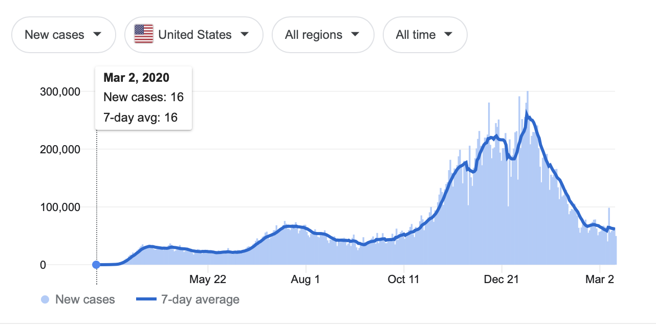
For the chart/graph we need to add to this blog post today, Because of the current state of our world, I decided to find a graph that shows our positive progression of COVID19 by looking at the amount of people who have been vaccinated.This graph shows specifically the cumulative COVID-19 vaccination doses administered per 100 people per country since January of 2021. I like this graph because not only does it show positive progression towards herd immunity with the amount of people being vaccinated (and which countries are having the most people vaccinated per 100 people in their countries currently), but the chart on this website seems to be the most accurate with some of the most detailed information out there. This graph is updated daily (with the graph below being from today, march 14th), and by going onto the website there is even more detailed data. They also list a full dataset of sources, showing that they are coming to these conclusions from valid sources, and that they are really doing their research before sharing it with the public (for some reason the chart is not showing up clearly on this blog post, but you can use the link below to see this chart in detail).

https://ourworldindata.org/covid-vaccinations

Blog Post 4 – Chart


Before this class, I thought this chart regarding fans betting on the 2021 Bucs and Chiefs Superbowl was helpful. The part I loved was how 76% of the people didn’t care or thought the Chiefs were going to win the game, and Brady and the Bucs came out on top. However, the podcast taught me that you need to look deeper into where the material is coming from and the sample size of the data used.  The poll us sourced by a reliable place, but with only 2,200 U.S adults as the sample size, that raises some flags (you probably don’t get it, but each time the Bucs win, we raise the flags, so that was supposed to be a little funny). They do not say how the sample was taken (randomized) or just people who wanted to respond. That will have a huge impact on the data. Also, generalizing to the entire U.S population could have been a stretch since the US comprises 332 million people… So we just need to be careful when looking at graphics because the numbers can be quite confusing and significantly off if not calculated correctly.

Blog Post Due 3/16


:https://twitter.com/NextGenStats/status/1370439909400543233

This particular chart is not my favorite. I wanted to use a win probability added for defense and offense that showed all 32 NFL teams. However, I was not able to find the chart very easily. I like the Patriots Run Action Rate by Season chart for a few different reasons. The graphic has clear, easy-to-read numbers and titles. Furthermore, I like how the focus is explicitly drawn to the Patriots by using their logo as the data point instead of just a dot. The axes also make it pretty easy to identify increases or decreases in run action rate by selecting axis ranges that are relevant. I like the inclusion of all the other 31 teams’ data points on the chart. While we do not know which dot corresponds to which team (I have a feeling that the color of the dot denotes which team it is, but NFL teams color schemes are very unoriginal), we can see where the Patriots fall with regards to the rest of the league. It is interesting to see that while the New England Patriots have always skewed towards a more run-heavy attack even with Tom Brady at quarterback (statistics show that he thrives off the play-action), the addition of Cam Newton at QB led to a drastic spike in Run Action Rate. The 2019 Patriots dealt with injuries to the running back core, so they added more short passes and screens to help alleviate the run game. The 2020 Patriots played a ball-control game style. As a result, most games they played were close, which allowed the continued use of the run. However, they were also blown out a few times, so having a run action rate as high as it surprises me. The coaching staff likely knew the deficiencies in the passing game and determined that despite being behind multiple scores, running the ball would still be the most effective way to score points.

For more selfish reasons, I really like this chart because it is about football and my favorite team, the Patriots. Sports Statistics in general, interest me more than other statistical charts and graphs because I have more innate knowledge on the subject. Additionally, my knowledge helps me spot more biases present in the data. Sports Statistics charts that are purely informational, such as the one above, tend to be as free of bias as is possible for a chart that was at least partially designed by a human being. Charts and graphs used on talk shows on ESPN, FOX Sports, CBS, etc., are typically used to spin a story one way or another, and the creators often try to skew the perception of the viewer. As with most things, it is best to take a step back and analyze the information you are being presented with.

black student activist teach in

I was impressed at the amount of historical examples the black student activist group brought up as comparisons for what they are asking today. For example, they cited 3 different pushes to create a black student Union or alliance in 1968,1969, and 1999. From there, they showed that these groups have been formed throughout history, therefore administering to these concerns of the group should not be anything new or crazy when we think about bigger picture history. Next, I hadn’t thought about the lacking of black mental health counselors at school. If I ever have had an issue to discuss, there has been a white counselor either in the athletics department or in the general school that has been able to help. I really haven’t had to feel like I wasn’t as connected to someone like this from a race standpoint. From here, if someone wasn’t as comfortable or didn’t feel as close, I could see why it would be harder to express real concerns or worries, leading to less effective results. There were also mentions of wanting to rename Freeman Mitchell hall, and concerns about Covid stressors and academic performance, but I think the conversation around mental health, especially providing black student access to counselors of similar race is very important, as the mental health of everyone should be a concern right now, but especially those with less resources.

Post for 3/16

The readings and podcast were extremely interesting to me. It all sounded very familiar as I am also majoring in psychology and a big part of that subject is dealing with data and statistics. While it sounded familiar, it was interesting to look at it through a leadership lens. In the podcast, Dr. Bezio discussed the importance of looking at what information is collected and how. Specifically, she talked about numbers in statistics and how they are presented. I think the presentation aspect stuck out to me most because it isn’t something I’d normally think about. The example Dr. Bezio mentioned was that saying 1 in 4 people will be asymptomatic with COVID-19 sounds different than saying there is a 1 in 4 chance of winning. I’ve never really thought about the fact that while these chances sound slightly different, they are actually exactly the same.

Another thing that stuck out to me was in the reading when Huff discussed the different types of correlations. A correlation can happen completely by chance. It be a real correlation, but you can’t tell which variables are the cause and effect. Lastly, it can be a real correlation but the variables don’t affect each other at all. I think for me this was most interesting because I have always thought of correlations as something that means the two variables effect each other. I also thought it was very interesting that correlations can be real and still be worthless to the data. Personally, I have always thought that if there is a correlation, it is showing something and is meaningful to the data. Thinking more about it in terms of leadership and what we’ve been doing, this makes sense to me when I think about the articles we’re reading for our project. Some of the articles have correlations that mean nothing to our subject. I’m not sure if this is exactly what Huff was saying, but this is what I took from it.


This is my favorite chart because it shows that we are FINALLY going down with COVID-19 cases instead of up. Hopefully we remain this way.

EC

It has been too long without any change. They need to make a  change and meet with students about the demands being asked for. I have also heard that at the next board meeting, it is not on the agenda tot be discussed and there is also no real statement being put out to address the situation. It shows a lack of leadership and initiative on their part, however, I am not surprised at the response. I hope that as a university, we as students will take action such as displays in the forum, protests, etc. I know some discussions about that have been brought up,  but as of now no real plans have been set in order to pressure the board to meet the demands.

Building Names – Extra Credit

I’m not surprised at this point anymore when the university makes decisions like this. The way I interpret those emails is that the university does not want to make these changes to “protect their image”. It is obvious that the university is still salivating for money, even though they have much more than they need. Eventually, the people, alumni, donors, and even major benefactors will die, and with them, this so-called “need” to keep these names. If the university does not change its ways, current students and recent alumni will choose not to support a university that fails to listen to students. The fact of the matter is that the people who are making these decisions are not living through what current students are living through on a daily basis. They should not be the ones making the decisions. Students are deeply offended and hurt by the history of both Ryland and Freeman. It’s time for a change. 

Building Names Extra Blog:

I have struggled putting my thoughts into words because I have so much emotion surrounding this topic. Let me start out by saying that I understand that the donors and board give millions of dollars to the university every year and help it function. But when it comes to issues of racial inequality, I struggle to find any sympathy for people who put money over people’s emotions and social justice.

Douglas S. Freeman was a man who supported segregated schools and the Confederacy. So UR claims they are making efforts to strive for more diversity, equity, and inclusion, but they can’t take Freeman’s name off of a building. They care more about the money than what Freeman’s name represents. On top of that, I find it extremely disrespectful to put Mitchell’s name next to his. The horrible things that Freeman stood for are not fixed or healed by this. Mitchell’s legacy is not honored when his name is next to his perpetrator. It is just a constant reminder that people like Freeman will continue to be honored and celebrated. It’s decisions like these that have gotten us to where we are today, and why we are barely seeing any change in our country.

What if this was in Germany and there was a building named after Hitler. Now I am not saying that Freeman organized a mass genocide that killed millions of people. But the same concept still applies. If we put Hitler’s name and a Holocaust survivor’s name on the same building, does that honor the Holocaust survivor’s life and legacy? Is that showing that our current values go against Hitler’s, or are we celebrating his name because we are too scared to take it down if we lose money from it? These are just some of the things that are going through my head as I saw the University’s decision on the buildings. And the fact that Ryland Hall will not be changed at all, Ryland who actually owned slaves, just shows how poor of an effort this was. I find it incredibly sad and disheartening that this is supposedly the best the University could do.

Blog Post 3

I found the comments on what is normal in a given society or group versus another really compelling as I’ve experienced bits and pieces of this throughout my life. I was raised in a homogenous, mostly white town in Upstate New York for my entire life.  I had very few real life cultural experiences, save for a handful of trips abroad. When I went to Italy, I learned that families often eat dinner late in the night, anywhere from 8-10pm, which shocked me. In America, at least where I come from, dinner is usually at 6:30pm sharp. Why would they eat dinner that later? But an Italian could just as soon ask me “why do you eat dinner so early?” it’s all cultural norms. I turn up my nose and laugh at the amount of young people I meet who don’t have drivers licenses, but realize that many people- especially those in larger cities- don’t need one due to widely available mass transportation (which I never have had), or it its too prohibitively expensive for them to own a car. I come from a wealthier family, so that was something I never really had to sit and think about too hard about.

I think the insights on the war on drugs were fascinating and accurate. However I do have a personal critique on the comments about drug scheduling. I fully understand that the policies against marijuana and drugs in general are steeped in racism and continue to be to this day. But regarding marijuana’s scheduling in the drug schedules I don’t have the world’s largest problem with it. I am pro recreational marijuana, to the fullest extent. But when critically analyzing the drug scheduling, understanding that drugs are scheduled in potential for abuse, harm, and understood medical use, Marijuana seems to be almost accurately placed. While marijuana is most likely the least harmful drug in schedule I and was certainly placed there so it laws could be enforced harder on it- in a manner targeting minority communities- the rest of it’s scheduling (when taken objectively) makes sense. When the scheduling was created there was no accepted medical use for marijuana, and it is a drug that is extremely commonly used, meaning taking those two alone it should be placed in schedule I. There hasn’t been a medical community wide consensus on the actual medicinal benefits of marijuana since (although there are some), so i feel conflicted about it. I feel it should be moved down a schedule, to schedule II, acknowledging its potential for medicinal use and the fact that it is not as harmful as schedule I drugs. But it should stay there, recognizing it is a widely used drug that is not by any means harmless. Simply my opinion, but if we are to make marijuana legal it needs to be acknowledged that- like alcohol and tobacco- it is not a harmless plant that many make it out to be.

Building Names

I find it ridiculous that the change made by the university after all of this talk was to just add Mitchell’s name to Freeman’s and then not change Ryland at all. I honestly just don’t see the logic. I feel like at that point, you’re better off doing nothing – this was just done as a way to show the students and the community that they are trying to make a change, but it feels so forced and not genuine at all. As we talked about in class, the problem is partly stemming from the fact that alumni and donors are threatening to withdraw donations to the school if the names of the buildings are changed. It always comes back to money. The school will make decisions based first and foremost on what will bring in the most money, even if that means negatively affecting the students’ and faculty’s wellbeing and sense of belonging at the university. In my opinion, not that I know anything, UR would be much better off losing some donors while making positive change rather than keeping those donors and hurting its community. And to be completely honest, if we’re still talking money, I think a decision to change the names of the buildings and a decision to improve inclusion at UR would bring in more money from alumni in the future because right now, with the decisions being made, I bet a lot of the students who graduate from here will be hesitant to donate back.