Category Archives: Reading Responses

Blog Post for 3/18

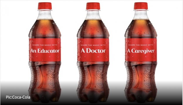
This is one of my favorite advertisements and campaign in general even though I am not really a big Coca-Cola drinker. The original campaign uses color and words to draw in the viewer with a familiar product. This ad uses ad populum and appeals to the masses with a popular product. Coca-Cola has used their brand to appeal to different things in the masses and in this case, they adjusted the ad to appeal to the public after the covid-19 pandemic. This creates a sense of empathy and understanding between everyone who sees this advertisement as we have all lived through this pandemic together. This ad is one of my favorites for two reasons. The first reason is that it resonates with something so impactful in the lives of everyone around the world right now. I think its versatility strengthens people’s engagement and attraction to this advertisement as they have seen it before, yet at the same time it is something different. The second reason I like this ad is because it is in a way giving thanks to those who have kept our country going during this challenging time. The use of a popular product to make us stop and think about those who have saved lives and made differences in lives. This makes me feel more like a viewer of the advertisement that this company cares about more than themselves, even if that is false and is all just a publicity stunt. I see this more as a type of equivocation that in the mind makes the viewer associate Coca-Cola with good moral actions of appreciation. Using the platform that Coca-Cola has already built to show appreciation for essential workers makes me more drawn into the ad. Overall, I find this ad to be interesting and it draws me in as a viewer

Post for 3/18 Ads

https://www.youtube.com/watch?v=TPKgC8KPBMg

This ad is for Budweiser beer played during one of the previous Super Bowls. It’s my favorite ad because I love puppies and it has a really sweet message of forming family with others who are different than you. And although Budweiser or beer is not even mentioned, any viewer during the Super bowl would know that this is the Budweiser commercial. I think this is because the Budweiser organization is known for their commercials that inspire community among the beer-drinking commercials.

This ad targets beer-drinkers but also farmers and animal lovers, creating a large pool of people that would be invested in watching this ad and then going out to purchase Budweiser. By showing this bond between a horse and a puppy, and the heartbroken farmer at the puppy’s disappearance, the audience assumes that this beer fosters relationships between friends and family of this magnitude of love. If you drink Budweiser, then your friends will come save you and be so happy to see you when you return from anywhere else.

Favorite Ad and Why

This is a screenshot from one of my family’s favorite ads which is a skittle commercial where the boy has teeth for skittles.  A girl walks up to him and kisses him and then walks away with skittles in her mouth. The commercial ends with the famous slogan “Taste The Rainbow” and even adds another slogan that is only apart of this ad which is “french the rainbow”. It is really random and funny and my family has always quoted skittles ads in general because they follow this common thread of just being really odd and attention grabbing. They are all also really short and follow the same format of something random happening, then a large voice comes in and yells the slogan and rainbow pictures of skittles basically get thrown in your face. The ads are short and sweet so they are always fun to watch, however now learning more about marketing strategies I am looking at them differently.

For example, my family would always look skittle commercials up on youtube and watch them for fun, unknowingly being targeted by skittles to buy their products. We would always walk around the house quoting some of the jokes in the commercials and we would all know what we were referring to – the skittles commercials. Now looking back, the commercials actually never say anything about the product and just are full of chaotic, random scenes. I also noticed that they really focus on the rainbow and colorful aspect of skittles (even though that has nothing to do with the taste) and purposefully have either not a lot of colors then have the skittles stand out in the ad, or the whole ad is covered in rainbow. They basically throw their marketing at the audience, and we never consciously realized that it was a part of a marketing strategy. Our “lizard brains” were getting more and more used to seeing and even quoting these ads that it definitely affected our purchasing habits subconsciously. I find this so weird to me because none of these ads say anything about the actual candy, and it actually is kind of gross and unhygienic when you think about someone having teeth of skittles, which are horrible for your teeth. However, none of this reflection actually occurred in me or any of my family members when we were subconsciously being targeted.

Teach-in Response

I want to begin by commending the students who put the teach-in together and spoke about their demands for change at this university. I have been so impressed by my peers, and all people my age, throughout this difficult time who have found the strength to speak up, voice their opinion, and be a catalyst for change. One of the most interesting parts of the teach-in to me was the discussion about the university’s empty gestures on a number of levels. With empty gestures in mind, the students spoke about the “light workload week” we were given and the fact that putting that up for interpretation from each faculty member individually was only a way to act as though they care about the students’ wellbeing. More importantly, though, the renaming of Freeman Hall to Mitchell-Freeman Hall is also an even more disrespectful empty gesture made by the Board of Trustees and the university. It was news to me that concerns over the names of the buildings had been brought up to the university in the past, and those concerns were ignored. Now that the university was under greater scrutiny, they decided to have a name change, but it does not even come close to fulfilling the requests made by faculty and students. It is clear the name was changed just to make it look like they were helping or doing something beneficial for the Richmond community. Clearly, it did not work. The Board of Trustees and others making decisions on behalf of this university have made it crystal clear that money is more important to them than the welfare of their students, and especially the welfare of Black students who have voiced concerns that have not been respected. Additionally, I think it is very important that it was emphasized that the burden to start and hold conversations about racial injustice is falling on black students and faculty, which is extremely damaging. As stated in the teach-in, it should not take the suffering of black lives for people to notice, and we all need to be held accountable in making changes to this university, the larger Richmond community, and the world.

Statistics Blog Post


This podcast and reading combination were particularly interesting, statists being manipulated and lied about are something I think about a lot in my daily life. I try combat it like Dr. Bezio said in the podcast by checking my sources and trying to find other sources to substitute them but as the Huff says, “You can’t win”. Numbers are such a powerful tool and many of us depend on them for the “truth” but I wonder in the modern day with all of the media we have and the unregulated nature of the internet can we trust anything we don’t find it at least two peer reviewed studies? When reading How to Lie with Statistics I thought a lot about assumptions, especially on page 26 when Huff was talking about the two groups of interviewers. I found myself expecting the outcome to be what it was when asked a question such as “would blacks be treated better or worse here if the Japanese conquered the U.S.A?” more people answered yes when asked by the black interviewer. I thought about assumptions because I assumed people would be more comfortable sharing their (racist) opinion with a white person. This part also stood out to because it emphasizes that having a bad sample is not the only way to get skewed statistics there are so many other factors some of which are simply uncontrollable.

I found this graph extremely intriguing because it confronted my own personal biases. Through high school and definitely into college, the amount of people I know who vape is quite large. It was impossible to go to a part at college without seeing multiple people pull out a vape, with even more people clamoring around to have a “hit” of it. Based on my own limited observations, I would have personally estimated that around 50% of college students vape, if not more. But of course that is not the case. I only saw people who were going to parties, and that usually means these people are more likely to participate in riskier behavior like vaping or drug use. I didn’t mentally take into account the people who don’t go to parties and who don’t take part in these activities. But it is likely that the stats presented in this graph aren’t entirely accurate. How can you accurately measure how many college students vape when there are millions of college students at thousands of schools across the country? A very large sample size would be needed for this data to be accurate. Furthermore, the survey could’ve unintentionally reached a greater population of students who vape than don’t vape. Also, this data is older, when vaping was less popular; I am aware that vaping has exploded amongst younger people since then. This sample in general might not be the most representative sample possible. The sample also isn’t purely random, as some metric had to decide which students and young adults  were getting the survey or not.  All in all, it is likely that the true incidence of vaping amongst teens and college students is either higher or lower than this graphic would lead you to believe.


Chart

Food Guide Pyramid - an overview | ScienceDirect Topics


I chose this commonly used chart that depicts what healthy eating the United States should look like. Off the batt, I noticed that the pyramid only lists five good groups, but reveals six divisions of color, with the smallest section being the yellow one–a section that is unlabeled. I wonder if yellow is supposed to represent a room in one’s diet for more unhealthy foods, but it seems pretty ambiguous. I also think that the tagline “steps to a healthier you” is misleading, because the chart does not discuss other aspects of health such as exercise, sleep, and therapy. Rather, it shows a figure walking up to the top of the pyramid, implying that if you eat these foods, you will be at peak health. Furthermore. the width of each section within the pyramid does not adequately reveal how much of these foods one should eat. Finally, it refers to the dairy section as solely “milk” and the protein section as “meat & beans,” leaving out options for people with diatary restrictions. The MyPlate graphic was developed in response to the misleading information within this graph.

Blog Post 3/15

I found the podcast today about statistics particularly interesting because I have previously discussed similar topics in my past psychology and sociology classes. In sociology we talked about how all statistics are biased and are being used by the person who is presenting it to accomplish a particular agenda. As the podcast went over we often trust statistics because we think they are scientific and seem rational but we need to dig deeper because not only the numbers in the statistic could be wrong but the way the author chooses to present or the reader chooses to interpret the statistic could be wrong or change the meaning. Even the census which seems like a neutral source of statistics can be used to accomplish an agenda such as allocating resources. So it is really important to be critical of statistics and not accept them purely at face value.

The graph I chose is similar to the example that Dr. Bezio mentioned in the podcast about how the number of people who drowned by falling into a pool correlated with films Nicolas Cage appeared in. My graph shows that per capita consumption of mozzarella cheese is highly positively correlated with civil engineering doctorates awarded. This is a spurious association because these two variables alone, mozzarella cheese consumption and civil engineering doctorates, are associated but either due to coincidence or another third factor. I chose this graph in particular because I think it is interesting that these two variables are seemingly so random and one would think that they should not show any association when in fact they show a quite strong association. The statistics presented in the graph are bad statistics and is an example of why one needs to be critical of the statistics we encounter and not accept them at face value.


I chose this graphic because I found it relatable but also an interesting presentation of stress levels. The coronavirus pandemic has certainly been a source of stress for a great deal of people of the last year and with its impact on the human life, the economy, schooling, and nearly every other aspect of normal life, it is important to take its impact on mental health into consideration. Knowing this, I am inclined to believe the information that is being presented in this graphic. I am reminded of a statistics class I took in high school where we talked about how different graphs can actually be misleading when they are not presented in very clear cut and minimally artistic ways. In the case of this graphic, it makes sense to use the people symbols to represent the data as we are talking about stress impacts on American people. But, it is not completely clear where this data was collected. If you were to scroll all the way down to the page where the APA reports this data, they have multiple PDFs about their studies. The American Psychological Association is certainly a trustworthy source, but they are not super forthcoming about the methods in which they collected this data. If it were convenience sampling, say in one particular region, the results may be skewed and not applicable to the whole American population. I trust the APA and read about how they got their information based on what I read, but applying a critical lens to statistical reports is really important.

I was also reminded of this during Dr. Bezio’s podcast. If we are not critical and engaged with the information we consume, we may very well misinterpret what we are hearing. And this is especially true for our generation where we are exposed to such massive amounts of information every day on the internet that it is really challenging to look into sources and check the reliability of everything we read. We have been somewhat conditioned to assume that the sources we read, especially those that adhere to our personal opinions, are factual.

Mental Health, Substance Use, and Suicidal Ideation During the COVID-19  Pandemic — United States, June 24–30, 2020 | MMWR

The chart that I picked is from the CDC regarding mental health during the Covid-19 pandemic. I find this chart fascinating, specifically because I think a national mental health crisis is going to be one of the biggest issues we face as we try to return to normalcy. Specifically, I appreciate the ways in which this chart is choosing the depict the information necessary. Instead of making the information seem much more intense than it is (These numbers are terrifying, don’t get me wrong, but I feel like other charts that I’ve seen on mental health always try and make it seem like everyone is just miserable all the time), the CDC choose to display their information in a proportionate way. Additionally, in regards to the reading, I feel confident in the bias that this source may have with its data. Luckily, because of the pandemic, I believe it is safe to assume the CDC is a reliable source, whose main concern is public safety. Unlike other charts on mental health that I’ve seen, this one isn’t trying to “sell” you on some sort of action you should take on your mental health. Mainly, I believe its purpose lies in educating and validating the experiences of US citizens.

The chart mentions that the data collected and reflected is not only from a very specific time frame (June 24-30, 2020), but also from a more narrow age pool. Because mental health issues in teenagers can be seen as more complicated (Hormones change the way we perceive things and can have a huge impact on what causes our mental health crises), I find greater validity in this chart because they chose to omit teenagers. Additionally, every section of their data has been distributed into different subsections outside of just 40% of adults feeling like their mental health is worse. They also acknowledge some of the more complicated forms of mental health issues (Like substance abuse) which allows for us to get a more genuine idea of what is happening and what is causing things to happen.