
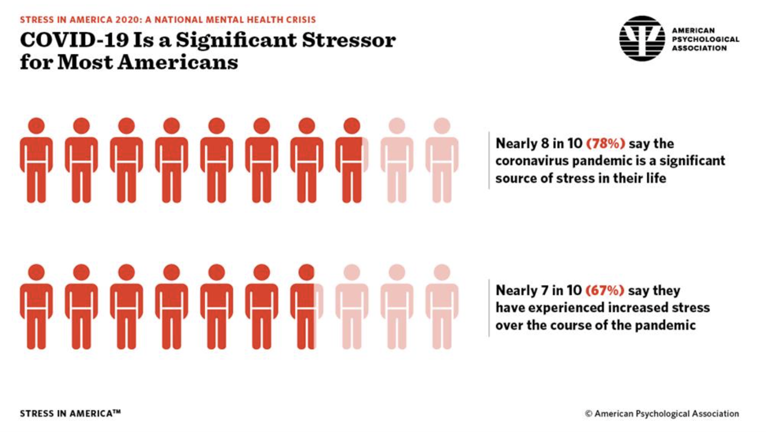
I chose this graphic because I found it relatable but also an interesting presentation of stress levels. The coronavirus pandemic has certainly been a source of stress for a great deal of people of the last year and with its impact on the human life, the economy, schooling, and nearly every other aspect of normal life, it is important to take its impact on mental health into consideration. Knowing this, I am inclined to believe the information that is being presented in this graphic. I am reminded of a statistics class I took in high school where we talked about how different graphs can actually be misleading when they are not presented in very clear cut and minimally artistic ways. In the case of this graphic, it makes sense to use the people symbols to represent the data as we are talking about stress impacts on American people. But, it is not completely clear where this data was collected. If you were to scroll all the way down to the page where the APA reports this data, they have multiple PDFs about their studies. The American Psychological Association is certainly a trustworthy source, but they are not super forthcoming about the methods in which they collected this data. If it were convenience sampling, say in one particular region, the results may be skewed and not applicable to the whole American population. I trust the APA and read about how they got their information based on what I read, but applying a critical lens to statistical reports is really important.
I was also reminded of this during Dr. Bezio’s podcast. If we are not critical and engaged with the information we consume, we may very well misinterpret what we are hearing. And this is especially true for our generation where we are exposed to such massive amounts of information every day on the internet that it is really challenging to look into sources and check the reliability of everything we read. We have been somewhat conditioned to assume that the sources we read, especially those that adhere to our personal opinions, are factual.
I completely agree with you Grace, especially when it comes to acknowledging our own personal bias and how that influences our perspective on the information we get. I am definitely guilty of being a lot more skeptical of right leaning news sources then left leaning, when in reality both political parties do extensive work to “sell” their ideology. I liked the chart you picked and the way that they chose to display the increasing rates of stress.
I agree with what you are saying! There is also no information in this graphic that shows how large the sample of people were that were asked in this survey, and from both the reading and Dr.Bezios podcast, it was made very clear how knowing your sources/sample sizes of different graphs is really important in order for information to not mislead you.
I particularly like your point about how we are constantly surrounded with statistics everyday on the internet. Personally I know when I scroll through social media I come across different news sources of varying reliability that often rely on the most catchy or eye grabbing headline. While the headline may gain their article views, it often does not fully reflect the data being presented in the article. So like you were when you came across your graph, we need to look into where the statistics we are viewing come from and how they were collected in order to get a better understanding of them and to make sure were are not being misled.
I really like the graph you chose, especially because of how relevant it is to us and our lives now. I also really liked how you connected it to this class and Dr. Bezios podcast. I agree with you that we have been conditioned to believe that sources we read are true, which makes it hard to convincer yourself something might not be factual.